This novel purportedly tells the autobiographical life history of the titular Tristram Shandy. Unfortunately, he's prone to diversions, and isn't born until half-way through the book or so.
Let me put up the images here.
Plate I: The Effects of Trim's Eloquence
Plate II: Obadiah leading in Dr. Slop
Plate III: The Jack-boots transformed into Mortars
Plate IV: The long-nosed Stranger of Strasburg
Plate V: My Uncle Toby on his Hobby-horse
Plate VI: Trim's relation of Tristram's misfortune
Plate VII: The Quarrel of Slop and Susannah
Plate VIII: The Smoking Batteries (Already an FP, listed for completeness)
The set shows some interesting aspects of George Cruikshank's art. A lot of these happen in the same room, and Cruikshank does a rather good job of giving a coherent sense of place. For instance, compare plates II, III and VI.
All you really need to know about this book is that it's something like a 1950's sitcom, only set in the 18th century. Something like I Love Lucy if there was more men in the cast, fewer women, and no censorship.
I'll just cover a few of the plates: Plate I introduces the servant Trim, whose eloquence is such as to awe all listeners. Plate III is one of the sitcom-like situations: Trim has used a pair of old boots to hold plaster while he was doing some repairs. But they turn out to have been old heirlooms. You've got some splainin' to do, Trim! Plate IV is about Walter (Tristram's father)'s favourite book, a bizarre little book about how important noses are. As I recall (I don't have the book to hand), everyone is so interested in the funny nose of the stranger that they follow him out of the city, and while they do, the Germans slip in and take it over. Plate V is about Uncle Toby, an old soldier, now crippled, falling into discussion of the military with Trim, and his enthusiasm for the military takes hold, and pulls Trim in so much that they begin acting things out with props at hand. In Plate VII, Dr. Slop is trying to make medicine for baby Tristram, gets in a quarrel with the maid Susannah, and they end up having a medicine fight. Poor baby Tristram! Plate VIII is about cannons powered by hookahs, we discussed this last FP.
What more to say? I think that, for what they are, they're pretty good. Let me know if you spot any problems. I had honestly thought I had already nominated these, but am on the laptop just now, so it's a little impractical to get a full check in.
Comment: There seem to be tone discrepencies- this is most obvious in IV, which seems much yellower/browner than the others. If presented as a set, consistency would be good. J Milburn (talk) 11:58, 13 October 2009 (UTC)[reply]
Comment These are great, but there's no way we should promote them as a set without properly grouping them. You need to select a key image for the FP category page, PoD, etc and place the thumbnails of all member image on the description pages of each member so people can browse them as a set without navigating the labyrinthian FP archives. Oppose until that's done. --mikaultalk21:53, 14 October 2009 (UTC)[reply]
Of course not, why on earth would I say that if I had :-? I'm not clear as to which the "key" image is and I'm keen to support, but I'd like to see the issues J Milburn raised addressed first. I guess the existing FP will be the main image, right?mikaultalk06:20, 15 October 2009 (UTC)[reply]
Weak support. Supporting per ev and artwork, weakly per tonal differences. Would change to full support with better tonal consistency. Durova32706:02, 18 October 2009 (UTC)[reply]
Request suspension for revision. The suggested edits are not at all trivial, unless you want images on a plain white background. For realistic paper tone, where the paper tone differs wildly in the original, this is a ridiculous amount of work. Shoemaker's HolidayOver 213 FCs served07:11, 18 October 2009 (UTC)[reply]
Oppose - Low EV, no strong emphasis on the articles. I don't really understand what "food drops" are; can the captions be improved a little? Also, background noise and artificially human-made birdhouse is unnatural. ZooFari01:12, 24 November 2009 (UTC)[reply]
Original - A Bell 407 helicopter of the White Eagle Aviation airline at the Góraszka Air Picnic 2009
Reason
High quality, nice colours, no wow, but shows the subject in its natural environemt, i.e. in flight. Lots of details of the airframe can be seen. (If it's important: featured on es.wiki, VI on Commons).
Weak oppose I find the reflections in the two rear window panes quite distracting at full size, and given the dark paint and interior, I'd say it's also underexposed. Papa Lima Whiskey (talk) 01:39, 23 November 2009 (UTC)[reply]
Weak Support. Lack of wow is limiting my full support, but the composition and detail is good. It also has three dust spots that should really be removed. Two near the top-left corner and one to the bottom-right of the cloud underneath the heli. Ðiliff«»(Talk)13:56, 23 November 2009 (UTC)[reply]
Oppose The helicopter is too dark and the reflections from its windows and clouds in the background are distracting. It's a nice photo with EV, but not of FP technical standards in my view. Nick-D (talk) 10:48, 26 November 2009 (UTC)[reply]
Oppose. Lack of contrast between subject and background. Light reflections disturbing. Not a bad image but not FP. Tighter crop might help a bit. Elekhh (talk) 09:47, 27 November 2009 (UTC)[reply]
This tank was one of the first to be used ever in combat, during the Battle of the Somme. What makes this picture special is the fact that its design is quite unique, the picture quality is very high for a photograph from 1916, and the subject is enhanced by several British Army soldiers.
Yes, I did create a larger one, albeit the rules do allow exceptions for historical photographs. The derivative I created is at the Commons here, so that is not a problem.
It is one of the first to be used in combat because of the period (September, 1916), and it is unlike others because of the large amount of other features in the photo, as I mentioned. Monsieurdlmon talk13:52, 22 November 2009 (UTC)[reply]
Oppose. Upsampling is not a good way to attempt to meet featured picture criteria, and the restoration was uploaded over the original filename. Certainly encyclopedic, but not feature-worthy. As a side note, fellow FPC regulars please review the WWI FP gallery, especially the oldest promotions near the top of the page. Our project's refusal to delist that material may have contributed to the misunderstandings in this discussion. Durova36918:23, 22 November 2009 (UTC)[reply]
I have met the criteria, as it is a historical photograph where no example of a larger resolution is available, so that most certainly is not a reason to oppose. However, not feature-worthy is an opinion to oppose that I can accept as legitimate even though IMO I think it is feature worthy. Monsieurdlmon talk18:33, 22 November 2009 (UTC)[reply]
Oppose As the image Cheshire Regiment trench Somme 1916.jpg illustrates, there are WWI photos of high quality and sufficient size for FP status. This is not one of them... Nezzadar[SPEAK]19:19, 22 November 2009 (UTC)[reply]
Once again, it does not go against the 'usual guidelines, and I quote: "Exceptions to this rule may be made for historical or otherwise unique images. If it is considered impossible to find a technically superior image of a given subject, lower quality may sometimes be allowed" and "Exceptions to this rule may be made for historical or otherwise unique images, if no higher resolution could be acquired." If you will judge this photograph based upon standards of color images taken with modern land cameras, digital cameras, what have you, then by this standard you are rejecting outstanding historical photographs, and that to me is a shame. Call it not as interesting, call it not your cup of tea, but please do not tell me that it doesn't meet the basic guidelines for consideration. Monsieurdlmon talk00:36, 23 November 2009 (UTC)[reply]
Oppose There is a wealth of other tank images on most of the pages where this image appears. While it is certainly more dramatic than most, I don't see a compelling reason to ignore the size requirments as we do with other images. Cowtowner (talk) 23:04, 22 November 2009 (UTC)[reply]
Original - World War I poster in Yiddish. Translated caption: "Food will win the war - You came here seeking freedom, now you must help to preserve it - Wheat is needed for the allies - waste nothing". Color lithograph, 1917.
Reason
Well designed historic poster communicates a part of Jewish history in the United States with visual symbolism that needs no translation. The text (translated in caption) urges a Yiddish speaking audience to conserve food during wartime shortages. Restored version of File:Yiddish WWI poster.jpg.
Support I'm not crazy about the crispness of image when in full view size, but the problem is clearly in the artistic technique, not the image itself. Also, perhaps due to the text being grey, it seems like the contrast is a bit low in the bottom. Overall though, a faithful representation of the image, so I approve. Nezzadar[SPEAK]19:02, 22 November 2009 (UTC)[reply]
Comment: I love the image, but there's one thing bothering me- was this widely distributed? As in, is this a government commissioned poster, or is it just something that went up in someone's village hall? J Milburn (talk) 22:05, 22 November 2009 (UTC)[reply]
Not sure. Probably wasn't posted on the wall of city hall in Peoria. Still, relevant to the history of the Yiddish language and the target audience. Durova36922:32, 23 November 2009 (UTC)[reply]
Support Excellent image. Criterion 3 is especially strong for me here: I'm instantly compelled to read more about this subject. Meets all the criteria. JujutacularT · C20:04, 23 November 2009 (UTC)[reply]
Support High quality and historic. I do, however, think the description on the photo page should mention that this was posted in the U.S..—DMCer™03:42, 29 November 2009 (UTC)[reply]
Oppose. Not only below specs, but significant undocumented changes. The histogram looks downright weird. It's been edited--not well--and there's no record of what changes have been made nor access to an unaltered version. Filesize upgrade would not be sufficient to consider this nomination. Durova37118:54, 30 November 2009 (UTC)[reply]
This image immediately and powerfully conveys a complicated idea; That a material, like mud, will begin to crack when dried. It shows more about dessication than words ever can. It is also an extremely high quality image.
Comment I discovered this nomination by looking at the list of links for this image. I can't find any reason that this was never added to the featured pictures candidates page, so I've added it there. I have no opinion on supporting or opposing. Nyttend (talk) 00:16, 1 December 2009 (UTC)[reply]
Comment It is a good picture, but it doesn't seem to be supporting anything in the article. There is no mention of what this image is illustrating despite several similar images. Noodle snacks (talk) 22:43, 4 December 2009 (UTC)[reply]
Comment; I think that the date when the photograph was taken should be included in the image description. The camera metadata says; "28 February 2008" - is that correct? Going on your previous submitted images, I think that any discrepancy between dates should be explained in the image description, prior to any possible promotion. Snowman (talk) 12:12, 1 December 2009 (UTC)[reply]
A famous building of a famous architect. The picture is one of very few optically shifted pictures available here. In this example shifting does not only correct perspective distortion. It allowed to choose a much closer point of view to avoid the bus station and power poles being on the image. Refer to the unshifted image to see what I mean.
Weak Support. I'm not convinced that optically shifted images are better than when correcting the distortion in a panorama. Both achieve the same results, but the panorama would tend to be sharper by virtue of being comprised of more frames. Getting closer to the subject obviously has side effects though, and the distortion isn't ideal. It also seems a touch overexposed, but a minor issue. Ðiliff«»(Talk)21:59, 29 November 2009 (UTC)[reply]
Weak Support. Happy to finally see a nomination for an architectural piece. Good composition and fortunate background, however as noted above, slightly overexposed and distorted, as well as lack of human scale make it a less easy decision. As EV for Gottfried Semper I think a frontal view would have been better both because the architecture would have been more prominent and the flag would have been less distracting. Elekhh (talk) 07:17, 30 November 2009 (UTC)[reply]
Weak Oppose as the EV for this image seems only so-so. It has the most EV for the city hall itself, less so for the town as a whole. Similarly the article on Semper mentions the building as an example, but doesn't seem to ascribe a lot of importance to it or discuss it in depth. It sounds like the Opera House in Dresden is the more representative example of his work. And yeah the image is a little bright to me but still pretty decent. Fletcher (talk) 03:18, 2 December 2009 (UTC)[reply]
I agree that is insufficient EV for Semper, however I would argue that EV for Winterthur is sufficient given that the town hall is the politically most representative building of the city, and I imagine also one of the most important monuments. In this regard is advantageous that the image does capture the public space in front of it as well, and the presence of the flag is a plus too. There are precedents for town hall FPs which appear in an article about a city, such as Graz or Werdau. Elekhh (talk) 22:21, 2 December 2009 (UTC)[reply]
I agree it does have EV; I only meant it's not especially strong, as a city should not be defined solely by its government. If there were no other criticisms to be made of it (such as those above) it would be tempting to support. Fletcher (talk) 02:49, 3 December 2009 (UTC)[reply]
Based on what measurement? I don't see the tinge, but it's always a bit harder to tell with overexposed images. The only way to be sure about the accuracy of white balance is when you have a known white/grey object in the scene, and it doesn't look like there are any to me. The closest I could find was the umbrella in the background, and it seems to be in the region R=254 G=254 B=252 under sunlight. Only the tiniest deviation, and more of a yellow tinge than magenta, but probably close enough. Ðiliff«»(Talk)10:47, 2 December 2009 (UTC)[reply]
I just realised that the cross in the Swiss flag is a rather more obvious white. :-) I get R=241 G=238 B=246 which is slightly purple, but only slightly, and it isn't visibly tinged until significantly enhanced... Ðiliff«»(Talk)11:58, 2 December 2009 (UTC)[reply]
Okay, cool.. But I don't really see it. Don't mean to sound condescending but would probably be best to phrase it as "I think that.." rather than state it as fact, as it seemed like you had measured it. Ðiliff«»(Talk)09:34, 3 December 2009 (UTC)[reply]
Original - Pilgrims performing Tawaf (circumambulating) the Kaaba during the Hajj. This picture taken from the gate of Abdul Aziz seems to divide the Kaaba and the minarets into mirror images of one another
Reason
Different edits of this picture were nominated twice before, first in 2007 and then in 2008. Each time, there was a clear consensus on the encyclopedic value of the image and the only reason for opposing was quality and "...we'll get something better". In the last 2 years, we have not received any picture which surpasses this one in quality or EV. IMO, the latest edit fixes some quality issues as well. Since the purpose of FP is to recognize the best we currently have, this is a good candidate IMO. If and when a better version shows up, I will personally put this one up for a delist but since taking pictures in the place is prohibited , I doubt we'll receive any in the neat future. FWIW, I have been approached by tens of writers and students who wished to use my images in their books, brochures and projects. The picture was also used by travel agencies (without my permission) to promote their packages. Third time's a charm?
Support Most likely the best image we have of the Kaaba and most likely the best we'll have for a long time. Doesn't illustrate the circumambulation, you'd need a longer exposure from a higher advantage to show that, but it does a great job of illustrating the Kaaba. — raeky(talk | edits)17:44, 26 November 2009 (UTC)[reply]
Strong oppose. The rarity of this shot is not so much that the poor quality can be opposed. There are thousands of shots of the Kaaba - this is a bad one. Mostlyharmless (talk) 01:20, 27 November 2009 (UTC)[reply]
Key words there was we have and with the photographs being forbidden there, quality may of course be a problem considering I doubt many people would risk loosing their fancy DSLR if caught with it there. — raeky(talk | edits)03:02, 27 November 2009 (UTC)[reply]
I've just shown you that plenty of much better examples exist. None of them appear to be under free license? Well that's too bad. No Featured Picture. Mostlyharmless (talk) 03:48, 27 November 2009 (UTC)[reply]
Mostlyharmless, the google image search you linked to, I followed the link and guess what? This image is the first one there. And it appears again on the first page. Doesn't this just show you how feature worthy this image is? --Muhammad(talk)05:25, 27 November 2009 (UTC)[reply]
What does that prove? Absolutely nothing. All it shows is that Google's algorithm thinks that Wikipedia content is more likely to be linked to than random pages on the internet. It says nothing about its quality or encyclopedic value. Mostlyharmless (talk) 06:51, 27 November 2009 (UTC)[reply]
I would also go so far as to say that for overall quality, this is better than all the other images on that first page, having looked at them all. upstateNYer01:24, 29 November 2009 (UTC)[reply]
Oppose The image has obvious EV, but I don't think it meets the standards otherwise unfortunately. I'm afraid that there are better examples to be had on the internet. The "until a better one comes along" argument is inapplicable given that the shot is ultimately repeatable. To raeky I highly doubt that anyone has the right to confiscate camera equipment. It would most likely just be a matter of apologising profusely if caught (this is my usual attitude when climbing fences and the like). I think it might be emailing a few people about the best examples on flickr, hoping for a CC-BY-SA release or two. There are 250 images in the kaaba pool. Noodle snacks (talk) 04:43, 27 November 2009 (UTC)[reply]
No apologies would work. I know people who lost their p&S there. Good luck with the e-mailing, I would be happy to see something good come along. --Muhammad(talk)05:16, 27 November 2009 (UTC)[reply]
I must admit I am quite surprised. Unless it is regarded as evidence for some crime not even the police could legally confiscate a camera here. Do you think that it would be possible with written permission from the appropriate authority? Noodle snacks (talk) 06:07, 27 November 2009 (UTC)[reply]
By here do you mean Saudi Arabia? I'm going to defer to Muhammad here since he's actually been to this mosque. My understanding is the prohibition of photographs in Islamic mosques isn't by national law but Islamic law, ergo no one is going to have power to grant permission to take these photographs per Islamic law. — raeky(talk | edits)08:27, 27 November 2009 (UTC)[reply]
Also like to add, i've spent some time looking for good images of the Kaaba, almost all the images I've seen taken clearly within the mosque grounds was by cell phones or P&S cameras. Only SLR images I've seen was taken from the high-rise buildings outside of the mosque grounds that overlook it. If you can find someone who does have high-quality close-up images of the Kaaba that will release it under a compatible free license, that would be simply amazing for this project. I'm not going to hold my breath on that though. — raeky(talk | edits)08:33, 27 November 2009 (UTC)[reply]
Just went through the whole pool, didn't see any DSLR images from within the mosque of the Kaaba, except for the one above that is skeptical that it is a DSLR based on quality, (Didn't look at birds-eye views of it from the high-rise buildings outside of the mosque since those would not be relevant for a FP of the Kaaba, maybe of the mosque but not the Kaaba, and no camera restrictions would be in those hotels to my understanding.) Are the images your referring too one of the ones taken from a hotel and not inside the mosque? — raeky(talk | edits)08:13, 29 November 2009 (UTC)[reply]
Taking this as a working example the focal length is 175mm. It is clearly possible to get a longer lens for the kaaba if required. That particular shot would be better from lower in my opinion though. Noodle snacks (talk) 08:25, 29 November 2009 (UTC)[reply]
Maybe, but you'd need one heck of a powerful telephoto lens to get a high resolution closeup of the Kaaba from one of those high-rise hotels around it. And as you said it would be better to have a picture from ground-level or lower instead of a overhead shot from the high-rises. The linked too image is cropped to give the illusion of a closeup, but the image becomes small when you do that. An image like this would be most ideal, imho. — raeky(talk | edits)10:14, 29 November 2009 (UTC)[reply]
Assuming the shot with the 175mm was not cropped then 300mm would be more than adequate for tight framing. I wouldn't take the image from one of the tall high rises, but rather one of the shorter ones (10 stories or something). Agree that such an image is ideal. Noodle snacks (talk) 10:46, 29 November 2009 (UTC)[reply]
Re NS, according to some people's understanding of Islam photography is considered forbidden. Unfortunately, these people are the vast majority of Saudi Arabians. And you must remember, this is SA we are talking about, T\there is not much democracy going on there. I have taken pictures inside mosques in Tanzania without any problems but I did face some opposition in Indian mosques. --Muhammad(talk)09:57, 27 November 2009 (UTC)[reply]
I was forgetting that Saudi Arabia has Sharia law. It therefore does make sense that a camera could be confiscated if it is interpreted to be against the law. My opposition still stands however. Some photographs just require risking camera equipment - many of my own photos would not be possible without considerable risk to my equipment (standing in salt water swell). I did not have any trouble in the Indian Mosques that I visited whilst I was there, though they were more likely to be tourist destinations, and it was in a different area. I doubt anyone would legally be allowed to take your camera in India. Noodle snacks (talk) 10:58, 27 November 2009 (UTC)[reply]
Oppose Somehow, despite getting my @$$ handed to me last time, I feel the need to bring this up again: If your culture bans photography in certain areas, don't complain that those areas have no good photographs. This is not anti-muslim, it's just a general statement. I would look over the Flickr image pool for a better one, if not, no featured picture. It's what has been done for the longest time. Sorry, but I oppose this image for its lack of quality. I would love to see a good Kaaba image finally get through, but this isn't it. Nezzadar[SPEAK]18:09, 27 November 2009 (UTC)[reply]
Comment Your logic is odd. Sure, a conservative Saudi Arabian who thinks photography is sinful has no right to complain about the lack of good pictures. But our perspective in this forum is not as anti-photography Saudis but as Wikipedians. We didn't ban photos of the Kaaba (including the nominator). To us, a ban on photos just means good photos are hard to get. Anytime a photo is hard to get, you have to balance the rarity against the desire for good technical quality. For example, it would be stupid to hold a picture from Antartica to the same high standard as one from London or New York. Not that we want bad quality, but let's just keep in mind the point of an encyclopedia is to convey information, not to have a gallery of pretty pictures. Fletcher (talk) 05:22, 2 December 2009 (UTC)[reply]
Comment. Your logic is odd. There are much much better examples of photos of the Kaaba. As far as photos of the Kaaba go, this one is just awful. Yes, it may be difficult to get one from the ground - but plenty exist. Even more exist illustrating it from a high vantage point. This thing has been there for some time, at least a few decades (so I've heard), and it's not likely to be demolished any time soon. Exceptions in the quality are there for things that are exceptional. I've demonstrated very clearly that this is in no way so. Mostlyharmless (talk) 06:16, 2 December 2009 (UTC)[reply]
I have never been more insulted for my pictures Mostlyharmless than your just awful comment. This nomination is probably going to fail due to its quality but I would love to hear what you find so awful about it. The tens of people who used the image worldwide clearly didn't think so and neither did the wiki editors who placed it in the articles. --Muhammad(talk)09:07, 2 December 2009 (UTC)[reply]
I thought that it is very obvious that the entire image is extremely unsharp and overblown all over the place. As a result, it looks like a watercolour painting. It's very obviously a cellphone image, and as such comes with the limitations of the technology. I really do appreciate that you took the effort to make this image at some personal risk, and I feel bad for criticising you as someone who makes a strong contribution to FPC. "Just awful" was rude. I'm not going to censor my opinions completely, but I'll endeavour to be nicer. Mostlyharmless (talk) 06:19, 3 December 2009 (UTC)[reply]
The picture is not extremely unsharp. It looks extremely unsharp on the image page, because of an unfavourable ratio between its actual resolution and the resolution it is shown in on the picture page. Viewed at Full Resolution, the image is not "extremely unsharp" by any reasonable interpretation of that phrase. --JN46612:35, 6 December 2009 (UTC)[reply]
Oppose While clearly a rare picture with a huge amount of EV, I don't think that this photo meets the FP technical standards. Its current status as a valued picture seems highly appropriate. Nick-D (talk) 00:50, 28 November 2009 (UTC)[reply]
Strong Support I'm disappointed to see people forgetting that this is an encyclopedia not a photo contest. This is a good composition and a very encyclopedic image showing one of Islam's most important rituals and holy sites. While technical quality is weak, the criteria state: "Exceptions to this rule may be made for historical or otherwise unique images." This image is "otherwise unique" in that it is very difficult to reproduce: if I am right that the Kaaba is not open to tourists, you must be a Muslim worshipper, or lie about being one, and you must be willing to break the rules against photography risking your camera. Even for Muslims, the Hajj is something many are able to do only once. Thus the pool of Wikipedian photographers able to take this shot has got to be quite small compared to the pool of nature and landscape shooters in Western countries. I also note that people saying it can be reproduced, are not offering to do so themselves. And it doesn't work to cite non-free images on google and flickr, which can't be used on this project. Most of them I looked at are not much better quality anyway, if at all. If a better, free image is someday found, there's no reason we couldn't delist and replace this one. Objecting to a rare high EV image on technical grounds just shows a lack of perspective. Fletcher (talk) 04:55, 2 December 2009 (UTC)[reply]
That fact actually works against your argument, because with that many Muslims, all of whom are supposed to visit this site at least once (if physically able), we would expect to have tons of high quality photos to choose from by now. That we don't indicates something is getting in the way of good photos, maybe security is too tight, or photography is too widely considered offensive, I don't know. But we have very little in Commons, and even non-free searches of Flickr or Google turn up mostly lousy undersized P&S images. I noticed some that were a bit better quality than this one, but still non-free. So good images do seem hard to get. Fletcher (talk) 04:26, 3 December 2009 (UTC)[reply]
No, logically, it does not. Including Muhammad's image there are about 25 of the Kabaa on commons and it is only a matter of time until a featured quality one is available. We even had another Kaaba nomination here recently.There are 110 images in the exterior of taj mahal category on commons, but only one or two could be featured. The image is not irreplaceable (another shot can be taken) or historic (doesn't show the structure 100 years ago) consequently the criteria exceptions do not apply when applied consistently. Noodle snacks (talk) 06:51, 3 December 2009 (UTC)[reply]
I wouldn't say it's not historic. The main structure has not changed much during the last century. The major constructions have all been made to the grand mosque not the kaaba. --Muhammad(talk)07:20, 3 December 2009 (UTC)[reply]
I still think due to the high encyclopedic value this is a better one to delist and replace in the future if a better one is nominated.Fletcher (talk) 02:08, 4 December 2009 (UTC)[reply]
Oppose Best we currently have doesn't override other quality criteria. If it did then the lead image in every article, if it's free, should be a featured picture since it must be the best we have (or it would have been replaced). Staxringoldtalkcontribs18:16, 3 December 2009 (UTC)[reply]
No, not every article has equal encyclopedic value (compare Kaaba vs., say, filing cabinet). And the argument is not that it's the best we currently have but that it's the best we have in light of the difficulty of producing alternates. Many articles can be illustrated by a tourist or local resident with a good camera, so there is no reason not to be demanding of technical quality. We can be more lenient with pictures of places that are difficult to get to, or places where cameras are banned. The goal is to help the encyclopedia, not to have a gallery of perfect pictures... the technical requirements are just the result of competition - we don't have to settle for an ok image when great images are easily obtained. Unfortunately this is not true of every subject. Fletcher (talk) 02:08, 4 December 2009 (UTC)[reply]
I think you completely miss the point of Staxringold's argument. The argument from supporters of this image has been: this is the best Wikipedia has, ergo this is the best that has been made, ergo it is a featured picture, if a better featured picture comes along we can d & r. I have demonstrated very clearly that there are much, much, better versions of images of the Kabaah, and supporters of this image decided to completely ignore that fact. Mostlyharmless (talk) 04:47, 7 December 2009 (UTC)[reply]
Please try and address what I wrote instead of distilling it into a simplified version you can easily knock down. I did not say the best we have should be a featured picture, full stop (and I have opposed other recent nominations that could well be the best we have of the subject). I also did not say the best we have is therefore the best that has been made, which doesn't even make sense. Obviously not every picture in the world is uploaded to Commons. As far as I can see your only suggestion was to do a google image search, which includes non-free images that are not eligible for consideration. That's like arguing the runner cannot win the race because your car can go faster. You need to pay attention to context and not misrepresent people. Fletcher (talk) 01:15, 8 December 2009 (UTC)[reply]
Strong support Rare photo, not easily reproducible, and outstanding EV. Viewed at full resolution, the sharpness is satisfactory. --JN46612:28, 6 December 2009 (UTC)[reply]
Original - Destruction of Godesburg fortress during the Cologne War 1583; the walls were breached by mines, and most of the defenders were put to death.Edit 2 - upsampled to 2048 2400, noise-reduced and deskewed.Edit 3 - original resolution (1200), noise-reduced and deskewed.
Reason
This historically significant engraving depicts the Siege of Godesberg 1583, the first major siege of the Cologne War. It is beautifully rendered, showing the Tercios, Fussvolk (foot folk, or infantry), and cavalry units. It is the primary (box) picture of the Featured Article Cologne War.
Support either Edit or original (prefer Edit 2) It's a very nicely executed image which superbly illustrates an important and dramatic event of the Cologne War. --JN46621:54, 20 November 2009 (UTC)[reply]
Nearly full support Mark in lower RH corner should be explained or perhaps cloned out; use of shearing tool could make the image more rectangular, but sharpness might suffer. Papa Lima Whiskey (talk) 20:37, 29 November 2009 (UTC)[reply]
I believe that is the accession mark from the museum. I'm not positive, but it would be characteristic of such pieces, thus part of the picture's provenance. Auntieruth55 (talk) 23:51, 29 November 2009 (UTC)[reply]
Weak oppose original, Oppose upsampled edits. On the fence about this for a long time. But really, our standards should be consistent. I'd get annihilated if I nommed something at this quality. Durova37122:44, 1 December 2009 (UTC)[reply]
I realize it is not of the quality of current digital photography. It is, however, a very good engraving of an important siege in the "Sewer War" (Cologne War. That said, and knowing we won't get a different digital copy, can something be done with the one we have to improve it? It could be downloaded again from here. Auntieruth55 (talk) 01:09, 2 December 2009 (UTC)[reply]
I've been thinking about what you wrote, Durova. You might disapprove of the quality of this image by 21st century digital standards. This picture was drawn in 1585 or so, and is outstanding in its quality and detail. Imagine the technical work that went into this project. This was not accomplished with computers and lasers, but with every line, and every curve done by hand. Kupferstich was an incredibly difficult process, both in terms of its artistic process, its science, and its mechanics. Mechanical print was barely a century old. I'm disturbed at your statement, you'd be annihilated if you nommed anything of this quality. This piece of work is a miracle. Auntieruth55 (talk) 02:32, 2 December 2009 (UTC)[reply]
I feel pretty certain Durova was referring to the quality of the scan rather than the quality of the original artwork. I had misgivings about that as well. The resolution is not the highest, only barely above 1k. If you zoom in, the lines are not as sharp as one might wish. Balanced against that is, as you say, the exceptional quality of the orginal artwork, and its superb educational value in illustrating articles mentioning the event. If anything can be done in Photoshop to sharpen the image, Durova is probably the best-qualified person to do so, but it may just be impossible, and we may have to judge the image as it is, weighing educational value against scan quality. --JN46611:22, 2 December 2009 (UTC)[reply]
that makes sense. I certainly have not seen better scans of 16th century engravings. Perhaps one of the folks who has better picture-skills can improve this one in some way. Auntieruth55 (talk) 16:49, 2 December 2009 (UTC)[reply]
I've had a go in Photoshop; see Edit 1 (upsampled to 2048, and noise-reduced). Is this a step in the right direction? --JN46619:46, 2 December 2009 (UTC)[reply]
Compare to Wikipedia:Featured picture candidates/London, 1616 and Wikipedia:Featured picture candidates/Delaware Bay 1639. Both originals date from the seventeenth century and were well over 10MB; legibility issues in certain areas prevented one from getting promoted and in the other instance an editor made his support contingent upon translation of archaic Dutch. I'm not sure it's right to uphold such standards for early modern graphic art, but since those standards are being applied it's rather hard to support an image that is not legible, not translated, and an order of magnitude smaller in filesize. And I categorically oppose upsampling. Durova37117:05, 5 December 2009 (UTC)[reply]
The German and the French are both translated. The translations are on the commons page. Shall I copy them on to here (see below)? I have no idea what upsampling is. Auntieruth55 (talk) 21:05, 5 December 2009 (UTC)[reply]
Inscriptions / Inscripties:
GODESBERG
7.
Vor Godesberg, eim festen Schloß // Thet Hertzog Ernst gar manchen schos // Als sichs damit nit schricken ließ, // Mit sprengen ers angreiffen hieß, // Auch steigen vil vom fußvolck sein // Durch ein heimlich gemach hinein, // Als er nun sturmet drinn und drauß // Erobert er diß feste Hauß.
Godesbergh enuiron vne lieu de la ville de Bonn, vng chasteau fort, apres // que ceulx de la part de Truchseß, estoient dedens, se auoient braueme’t // deffenduz, a este des gens du nouueau Archeuecque, rompu en pieches par // moien de miner et force pouldres. Le 17. de Decembre L’an 1583.
English Translation of German inscription
At the fortified castle of Godesberg // Duke Ernst fired many shots // When that did not frighten it // He had it attacked with explosives // In addition, many of his infantry // Entered through a secret chamber // So when he stormed it from inside and out // He conquered this fortified house.
English Translation of French inscription
Godesberg, about a league from the city of Bonn, a fortified castle, after // those inside who were on the side of Truchseß had bravely // defended themselves, was broken to pieces by people of the new archbishop, // by means of tunnelling and gunpowder. The 17th of December in the year 1583.
I've relabelled the edits for ease of reference. If there is interest, I can do another edit based on the original to deskew it, i.e. make the vertical edges straighter, as they are in Edit 2, without upsampling.
Personally, I find the upsampled and noise-reduced edit 2 more pleasing to view; somehow the depicted scene feels more alive that way. But I accept it is not everybody's cup of tea. I am new to FPC and not familiar with established conventions here, so please bear with me.
Upsampling is the same as increasing the size. When you tell Photoshop to double the image width and height, it divides each of the original pixels into four pixels, and tries to do so as cleverly as it can. --JN46618:18, 6 December 2009 (UTC)[reply]
I've added Edit 3. This retains the original resolution (no upsampling), but deskews the picture and reduces noise. (I've removed Edit 1 from consideration). Is this better for you, Durova? --JN46622:56, 6 December 2009 (UTC)[reply]
High resolution, useful to both articles, and shows an interesting and important segment of the River Thames flowing through London on a clear, bright day.
Support. The Big Ben clock tower gives the time at 10 minutes to 8 O'clock. The left shows a very good image of the London Eye. The first bridge is Westminster Bridge. Although, most of it is water and sky and there are a lot of trees, it is interesting to inspect the photograph at maximum resolution and see the details of London. I see what a difference a good camera makes. Some of the pictures on commons are from the top of the London Eye and some of them show a very good view without too many buildings being obscured by trees. I have changed my mind about this image again - I think that the detail and high resolution should win it an FP rating. Snowman (talk) 21:15, 30 November 2009 (UTC)[reply]
Question Lovely resolution and clear. Lighting and composition less good. Bottom 20% is brown water--why not lower the horizon per the rule of thirds and get more of that sky?--why not shoot early morning or late afternoon when the light is more interesting? The only landmark that takes up a significant portion of the image is the London Eye. You do a lot of great work, Diliff, so could you explain for an ignorant Yank who's never been to your city how it is necessary to supplement several existing featured pictures with this panorama? Durova37119:24, 30 November 2009 (UTC)[reply]
Well, in simple terms, I would say that this image isn't intended to illustrate either the Houses of Parliament or the London Eye, it illustrates the River Thames as it flows through London. It just so happens that this particular scene incorporates some subjects that have their own FPs. I agree that it doesn't really conform to the rule of thirds but given the scene and the intended EV, to crop the water further would only fuel opposition on the basis that the subject is a such small proportion of the frame. And obviously the top can't be cropped too much or it'd lose the Eye, so the framing options are a bit limited. If it isn't to your tastes, that's fine, but I wanted to explain why it is the way it is. As for taking it early morning or late afternoon, this particular image was actually shot at 7:50am, but at that time of year a sunrise shot would have required me to take it at about 4:50am! I suppose at this time of year it might be more practical to get a sunrise photo when it rises at about 7:45am - assuming I could actually strike it lucky with a clear, sunny morning at this time of year! I took a similar photo in the evening (8:10pm) which you might prefer, but it's not used in any articles. In terms of lighting, because it's a fairly wide panorama, one side will inevitably be lit while the other is in shadow. And because we're looking south in this image, we'll never really get the sun shining directly behind either in the morning or the evening (or indeed at any time of day). As for the need for this FP given we have another FP showing the River Thames, they're obviously fairly different images, showing different sections of the river, and on the River Thames talk page, a request was made to take a quality daylight shot of this part of the river, as it was considered to be the 'premier' section of the river in London. So there are a lot of factors working against this being a perfect shot. Hope this answers your questions anyway. No need to butter me up. You know what the sure-fire cure for Ignorant Yankitis is, though? Visit London for yourself! ;-) (no disrespect intended!) Ðiliff«»(Talk)21:33, 30 November 2009 (UTC)[reply]
For an image of the River Thames, I think it is unfortunate that only one bridge is seen well, and the second bridge is obscured by the first. Snowman (talk) 21:48, 30 November 2009 (UTC)[reply]
Unfortunately, it's difficult to show more than one bridge from at-bridge-level. They tend to all be the same height and overlap. They're also spaced fairly wide so you'd have to be pretty high to get a good view of more than one of them. The London Eye is one of the few accessible vantage points, but then you're not able to get great photos as there are significant reflections from the glass. I don't mean to be cynical, but it's easy to put together a wishlist, but a little more difficult to create an image that delivers it! I've lost count of the number of times I wished I had access to a helicopter for good aerial vantage points. In the real world, we're unfortunately limited to where we can stand and point a camera from. Ðiliff«»(Talk)22:15, 30 November 2009 (UTC)[reply]
Yeah, I know. I've been up there too, and I wouldn't say any of the photos taken were of particularly high quality. It's really just not possible when shooting through glass. Anyway, as much as I welcome discussion of this image, all the galleries are getting a bit messy on the page! Perhaps you could just link to them instead? ;-) Ðiliff«»(Talk)08:00, 1 December 2009 (UTC)[reply]
Okay, weak support per explanation. Photographic opportunities over the water are necessarily limited. This does give a sense not conveyed in any other FP of the relative geographies. Would really prefer a delist/replace in spring or summer, perhaps from a weather deck if they run river cruises? Durova37122:35, 1 December 2009 (UTC)[reply]
Opposeper Durova. Low EV for London and not Wikipedia's best (see gallery examples below). Insufficient EV for Thames as well (shows a very short section of the river within London, with only one bridge and few buildings visible in the distance; at standard wiki article size of 300px not much is recognisable). Elekhh (talk) 20:29, 30 November 2009 (UTC)[reply]
A bit confused by your comments (and Durova's for that matter). This photo was taken in early summer so I'm not sure why you would support the delisting of this image for a different one taken in spring/summer. Besides, you opposed on the basis that it had low EV, not because of the time of year, so I'm not sure why you would say that. I quite like the Thames sunset panorama of mine, and I think it has value in the article, but I would say that it has slightly lower EV for the River Thames article than this one, given the time of day and the relatively monochromatic lighting of it. Ðiliff«»(Talk)10:34, 2 December 2009 (UTC)[reply]
Sorry, should have been more explicit (see added comments in brackets above). My primary reason for opposing was the lack of EV for the river and especially London, resulting from the chosen vantage point and angle. I should have added also that the technical quality of the image is very high and pleasing. However I think an FP should be recognisable at standard article size (i.e. 250-300px). Elaborating on the EV, the image doesn't show much: is ca. 90% blue pixels (sky and water) and 10% the two triangles on the sides (of which again half are the trees). It's true that some major landmarks of London appear in the image, but only a few, and are only recognisable after significant zoom-in. I think a higher vantage point could reveal much more. In terms of composition I find it problematic that it lacks centrality. There is nothing to fix the eye on and generates confusion as to where to look... Elekhh (talk) 20:17, 2 December 2009 (UTC)[reply]
Heh, I can recall making the exact same criticism of another of his landscapes. I think maybe they are meant to be enjoyed with a glass of wine.... Fletcher (talk) 04:39, 3 December 2009 (UTC)[reply]
Support per Durova. I knew I was missing these great panoramas. Agree the composition and midday lighting are a little plain, but the EV and technical quality are there. Also note the FP criteria only state the image must be among Wikipedia's best, not necessarily the best, so if you favor a different image that doesn't necessarily rule out FP for this one. Fletcher (talk) 01:44, 2 December 2009 (UTC)[reply]
Thanks. For the record though, and as mentioned in my reply to Durova above, it was shot at 7:50am, so it doesn't have midday lighting. You can see that the left side is in shadow. It doesn't have the warm hues that you might expect - not sure why exactly, but it was probably slightly too late in the morning (the sun rose at 4:50am the day this photo was taken). Ðiliff«»(Talk)10:24, 2 December 2009 (UTC)[reply]
Oppose on compositional grounds. The contrails look like scratches, and having one pass across the Eye just ruins this one for me. Plus I agree there's a little too much distracting open water in the foreground. Daniel Case (talk) 18:31, 2 December 2009 (UTC)[reply]
Can I just clarify something here? This image illustrates the Thames river. It doesn't illustrate the London Eye. If the water is brown, that's just reality. I don't see how it's distracting or that there is too much of it when it's supposed to be the focus. Ðiliff«»(Talk)13:49, 4 December 2009 (UTC)[reply]
Support. Good technical quality. Good EV showing the size of the River Thames and where the Houses of Parliament and London Eye are located on it; it's also one of our best pictures of the Victoria Embankment and of Westminster Bridge from the perspective of the upstream approach by water. I like the composition and would not support a crop: the large expanse of water is pleasing, and the position of the boat on the right nicely balances the Eye on the left and creates a pleasingly 'deep' perspective. NotFromUtrecht (talk) 17:55, 9 December 2009 (UTC)[reply]
Original - This portion of a recent high-resolution picture from the HiRISE camera on board the Mars Reconnaissance Orbiter shows twisting dark trails criss-crossing light coloured terrain on the Martian surface.
Comment Very cool image but what is the blue/white band running thru the image? Doesn't seem to be mentioned in the image page caption. upstateNYer01:16, 29 November 2009 (UTC)[reply]
Support I think this can make many read more. I will take the opportunity to also ask for more explanation from someone who managed to understand what we are seing. I read in the image description that the trails are the darkened paths but they dont look like like trails, they have the same texture as the light terrain but dark. I don't understand what I am seing. The light band is also a mistery to me. franklin.vp 19:54, 29 November 2009 (UTC)[reply]
Oh, I understood now. They have a greyscale image (the original) and then they project that on a map. I think that explains why the trails also have the texture of the terrain although they are supposed to be trails of a dust devil. The white band is also there but is not so anoying in the greyscale image. Hopefully NASA knows their business. (which many times seems to be chock people or amaze them to justify or sell their research or games) franklin.vp 20:04, 29 November 2009 (UTC)[reply]
Conditional support if someone can translate "Latitude (centered): 26.7 °. Longitude (East): 62.8 °. Range to target site: 284.9 km. Original image scale range: 57.0 cm/pixel (with 2 x 2 binning) so objects ~171 cm across are resolved. Map projected scale: 50 cm/pixel and north is up. Map projection: EQUIRECTANGULAR. Emission angle: 0.3 °. Phase angle: 51.3 °. Solar incidence angle: 51 °, with the Sun about 39 ° above the horizon. Solar longitude: 326.8 °, Northern Winter." into some appropriate language in the caption that explains the size of the area depicted in this photograph and of the features shown in it. Translating Martian longitude-latitude coordinates into kilometers is left as an exercise for the reader. Spikebrennan (talk) 16:17, 30 November 2009 (UTC)[reply]
Original - Great coat of arms of Russian Empire, presented to Emperor Paul I on 13 October, 1800Edit 1.Edit 2 by Diliff. Removed horizontal band but left background untouched.
Reason
In my opinion the most representative coat of the empire out of several others. Actually, was unaware of it until now.
In the first line of the article it says "Quite often the Russian state emblems are incorrectly called "coats of arms"." How should we understand the caption then? Is it that the caption is not good, or the image is misplaced in that article? franklin.vp 23:30, 27 November 2009 (UTC) PS: Whatever it is that Russian emblem is wonderful. franklin.vp 23:30, 27 November 2009 (UTC)[reply]
I think I understand now. the national emblems should not be called coat of arms but this is the coat of arms that lies in the center of the Great State Emblem. franklin.vp 04:28, 28 November 2009 (UTC)[reply]
Sorry for comfucing you with my comfution. In the great state emblem it sas that it contains the coat of arms in the middle. So this is the coat of arms as you said in the begining. In any case you added the picture to the article, you can check in the refference you used. franklin.vp 18:24, 29 November 2009 (UTC)[reply]
Comment Agree with Kaldari that the crease is too obvious. Also, the corners are obviously corners. It would be much nicer if they faced into white (especially since most of the background is white anyway). upstateNYer06:15, 28 November 2009 (UTC)[reply]
Photo editor would be a nightmare for editing this sort of thing with... Edit 1 is a decent attempt but I'm not sure if I like the abesence of a background texture, and there are some patches that were missed which stick out like a sore thumb. Ðiliff«»(Talk)16:55, 28 November 2009 (UTC)[reply]
I've added edit 2 which I think removes the horizontal band a bit more cleanly than edit 1. I'm not sure of the best way to remove or fade the background (or even if it is a good thing) so I've left it untouched. Ðiliff«»(Talk)17:49, 28 November 2009 (UTC)[reply]
I'm sure it is a scan, but that's neither here or there really. I agree it's a matter of taste, but it's hard to tell if the shading around it is part of the illustration, or aging of the paper. The other issue is that if the background is faded away, the texture of the paper is lost and I think it look peculiar. As it is, the texture is patchy though, which is why I was unsure what to do with it. Ðiliff«»(Talk)18:03, 28 November 2009 (UTC)[reply]
The bottom right corner of the original background looks like an aging (yellowing) to me, so are probably the other parts. Brand[t] 18:14, 28 November 2009 (UTC)[reply]
comment. In some ways it seems a bit pointless having the background since it is almost completely white, and there are lots of random speckles all over the page. I don't mind the background being left with the shading, but I can easily edit my version a bit more to clean up patches I missed, if people do prefer a version with a totally white background? And Brand, you can download GIMP for free which is what I use. --SilversmithHewwo02:23, 29 November 2009 (UTC)[reply]
I'm not fussed if you think it's important to remove the texture on the background, but the edit of the horizontal band wasn't done quite as well (IMHO, sorry), so I'd ask that you remove the background from edit 2 if you were to do that. Ðiliff«»(Talk)18:50, 29 November 2009 (UTC)[reply]
Support edit 2. Although I would like no background. For some reason the nice golden color got damaged in edit 1. I don't know if it is important for FPC or Wikipedia, but if I want to use the image for something else (as many kids do for school projects) the background can be a problem. Maybe some blur can be applyed to the background to at least eliminate the speckles, which can be ugly in some printers. I can do that if it is not a bad practice in these cases. franklin.vp 18:47, 29 November 2009 (UTC)[reply]
I didn't make any changes to the colour or contrast or anything so I don't know why there would be any difference in the golden colour. :/ I think it's probably best not doing more editing until a consensus is formed on which option would be best. --SilversmithHewwo07:09, 1 December 2009 (UTC)[reply]
What I think they might be referring to is the fact that you saved Edit 1 in PNG format. Aside from it being about four times bigger than the equivalent JPEG, it tends to have an effect on the thumbnail as Imagemagick does a poor job of scaling PNG thumbnails and they tend to look less 'punchy' as a result. I'm only guessing though. You can see it in the thumbnails but there shouldn't be such a difference when viewed at 100%. Ðiliff«»(Talk)10:44, 1 December 2009 (UTC)[reply]
I chose PNG because I've heard that every time you save in jpg you lose some quality due to compression, whereas png is lossless compression. It certainly wouldn't be hard for me to go and save it in jpg though if png is an issue. --SilversmithHewwo21:02, 2 December 2009 (UTC)[reply]
It's true that in theory you can loose some quality with compression but it's so minor that you likely wouldn't notice - especially if you set the quality high when saving the JPEG. There are times when PNG files are superior (for diagrams and the like usually, and even then, SVG tends to be superior again as it's scalable without loss of quality), but when dealing with scanned images or photos, where there is a lot of texture, then my preference is for JPEG. Just because one person has requested PNG, it doesn't make it the best format to use. Ðiliff«»(Talk)09:40, 4 December 2009 (UTC)[reply]
Original - Dunrobin Castle and gardens, Sutherland, Scotland (photo 26 May 2008)Alt 1 - less 25% saturation, castle centralised by extending sky upwards and cropping from right and bottom (which also removed blurred zones)
Comment. The image in the article is File:Dunrobin Castle -Sutherland -Scotland-26May2006.jpg, the one presented here is Dunrobin Castle -Sutherland -Scotland-26May2008.jpg. Caption should make reference to the garden as well, which is in the foreground and occupies half the image. Elekhh (talk) 20:12, 27 November 2009 (UTC)[reply]
I was referring to the sharpness of the image. I don't think it is sharp enough; I do realise that this can have the appearance of being improved by downsampling, but even at the minimum (by FP standards) size, the foreground is still fuzzy. Just my opinion, and clearly in the minority, ;-). I also agree that there is oversaturation. Maedin\talk08:23, 30 November 2009 (UTC)[reply]
I think that the chromatic aberration is slight considering the high resolution of this 3,872 × 2,592 px image, which even shows brickwork details. Snowman (talk) 22:37, 28 November 2009 (UTC)[reply]
I don't see much connection between CA and resolution. Apart from the (okay, minor) CA on the building, there is rather a lot of purple fringing on the leaves of the tree at the left. I know we're our own worst critics, but I get this sort of CA (and softness) on my images because I have two terrible, cheap lenses, and I would consider my photographs unsuitable for FP, on account of these faults alone. Maedin\talk08:23, 30 November 2009 (UTC)[reply]
I see what you mean about the leaves and perhaps some other features in the periphery of the image. I meant when everything is downsized then the smaller features, including the chromatic aberration, are less easy to see. Are these problems bad enough to bring down a well framed detailed image of the castle? I might crop off a bit from the left side on the next revision, but I will see what it looks like first. Snowman (talk) 14:21, 30 November 2009 (UTC)[reply]
The revised version (Alt 1) has been cropped and the trees on the extreme left and a portion of lawn at the extreme bottom have been left out. Snowman (talk) 10:24, 1 December 2009 (UTC)[reply]
What is saturation anyway? I still do not know what EV is. Is there a list defining the jargon used here somewhere? Anyway, it looks better with the saturation reduced by 25% using the saturation feature in GIMP. To me it seems that this modification makes the slight chromatic aberration less noticeable too. What happens to this nomination now? Do I scrap this nomination? Is it acceptable to upload the saturation reduced image over the previous image like I did after the minor edit of removing the birds from the sky (I thought the birds were interesting and not a distraction, but I am not questioning how it appeared to others). Should I then link the original image (above) from the archives? I might crop off a bit from the bottom on the next revision as well, but I will see what it looks like first, and, if cropped, upload to a new name file. It may need more sky at the top too, and I might paint that in, if I think it will looks better in the next revision. Snowman (talk) 14:03, 30 November 2009 (UTC)[reply]
For a short while we linked to a list of terms used here at FPC, but it was removed in August. Not really sure why, as it seems uncontroversial! Anyway, there is this list of terminology (which I note doesn't include saturation, :-/) and there's this list of abbreviations. Hope those two links are helpful. I was perplexed by EV (encyclopaedic value) for a while, too, but it's basically referring to the value added to an article by an image . . . how encyclopaedic is it? How well does it illustrate the subject matter? There are more facets, of course, but that's the biggest application, I suppose. The colorfulness article is what you want to read, to get an idea about saturation. As for the edit, you should upload it as a derivative work, and not over the top of the original. For small edits like the removal of the birds, that's okay, but generally it's preferred to offer an alternative version for consideration. You can just thumbnail the new edit, like it's been done in this nomination. Hope that helps! Maedin\talk14:34, 30 November 2009 (UTC)[reply]
Weak Support Alt 1 Thanks for the changes in the caption. I also like the reduced saturation and the crop on the bottom and left, which provide a much better framing. I am not sure about the extended sky - I liked how the castle dominated the landscape in the original. Digital manipulation should be minimised per FPC (Featured Picture Criteria). PS. I suggest the links to the abreviations and jargon to be reintroduced to this page, as the hermetic language in use deters new participants. Elekhh (talk) 20:20, 30 November 2009 (UTC)[reply]
Weak Oppose Subject has great potential but is shot with harsh, uneven lighting with some clipped highlights on the left, and a general softness in the foreground. Speaking of the foreground, there seems to be either too much or too little of it; if the garden is to be included, I'd like to see more of it from a better vantage point; or in the alternate maybe it would be better to cut out the garden altogether and focus entirely on the castle. Fletcher (talk) 04:01, 2 December 2009 (UTC)[reply]
Original - Painted Cliffs after sunset, Maria Island, Tasmania, AustraliaEdit - auto white balance to remove blue cast, reduce vignetteEdit 2 - spot white balance, reduce vignette
Reason
As a notable geological feature on Maria Island it has the enc in my view. I'm not sure if there are appropriate geology articles present. It is also pretty. The article needs some work but that will probably come tomorrow.
Comment To PLW: Much of the vignette was caused by the use of a circuilar polariser (which helped knock back the sky and improve the saturation). The edit doesn't look bad though and I have no particular preference. Noodle snacks (talk) 22:12, 27 November 2009 (UTC)[reply]
I'm not convinced that edit 1 is preferable. It looks like it's knocked out the blue tone in the sky (looks rather grey and flat to me now) and also made the tone of the white chalky parts of the cliffs look a little yellow, not to mention the coastline on the left looks a bit messed up. The original version is a little cool in WB, but I think it's still the most natural looking (not having been there, I'd leave it up to you to confirm). I'd Weak Oppose Edit 1 and Strong Oppose Edit 2 (looks very oversaturated, particularly in the sky). Ðiliff«»(Talk)13:33, 30 November 2009 (UTC)[reply]
Comment; I think that the date when the photograph was taken should be included in the image description. The camera metadata says; "23 November 2009" - is that correct? Going on your previous submitted images, I think that any discrepancy between dates should be explained in the image description, prior to any possible promotion. Snowman (talk) 12:19, 1 December 2009 (UTC)[reply]
Comment; I think that the file name is not adequately descriptive. I think that "Maria Island" should appear in the file name for clarity, and possibly also Australia. Snowman (talk) 16:11, 2 December 2009 (UTC)[reply]
Agree with the sentiment of your argument, but I think you're taking a overly fundamentalist approach with your voting. The filename is fairly inconsequential to the image's value to articles. As is EXIF data. It's nice if they're extra descriptive, but it is the image page infobox that needs to be fully populated really. Ðiliff«»(Talk)16:16, 2 December 2009 (UTC)[reply]
It may appear pernickety (a caring attention to detail), but I feel that there is no room for complacency for FPs - the finest on the wiki. I think that the guideline that the file name should be descriptive should be one of the fundamental considerations for FPCs. I have changed this a comment, and I hope that it is taken seriously as a technical issue prior to possible FP status. Snowman (talk) 16:23, 2 December 2009 (UTC)[reply]
Oooh, comment: I just noticed that there is some strange clone-like artifacting going on. A horizontal strip on the bottom right edge, and a vertical strip on the bottom left edge that reaches all the way up to the coastline. What could have caused that NS? Ðiliff«»(Talk)19:51, 2 December 2009 (UTC)[reply]
The photo is a blend between two exposures with a stop or less between them, didn't notice the edges that didn't line up when they were aligned I'm guessing. I'll crop it marginally. Noodle snacks (talk) 23:02, 2 December 2009 (UTC)[reply]
If the spirit of this vote is for reasons other than the merits of the image with associated text, then I think this vote should be disregarded.Snowman (talk) 23:40, 2 December 2009 (UTC)[reply]
Are you implying that my vote might be 'for reasons other than the merits of the image with associated text'? Care to elaborate? That comment seemed to come out of nowhere... are you assuming good faith!? Ðiliff«»(Talk)23:45, 2 December 2009 (UTC)[reply]
I have striken out my comment. Instead, I would ask you to explain your comment; "only as per above comments." I am puzzled by that. Snowman (talk) 23:55, 2 December 2009 (UTC)[reply]
I was referring to my comments to Noodle Snacks near the top where I mentioned the issues I had with the edits, so I supported the original only. Ðiliff«»(Talk)23:59, 2 December 2009 (UTC)[reply]
Support Excellent resolution. I support both of them, but alt 1 is my favorite. More sky and landscape features stick out a bit more. Cant find anything wrong with it Tim1337 (talk) 08:49, 3 December 2009 (UTC)[reply]
Support Both, Pref Alt1 per Tim1337, it is a better overall view rather than just partial view. Very striking colours on the vineyards... Excellent picture... Gazhiley (talk) 10:53, 3 December 2009 (UTC)[reply]
Support either Better tones in the sky and more interesting landscape on the latter, but the former gives a better illustration of the economy: vineyards, plus a winding road for ye olde winetasting tour (Napa is the most commercialized county in California for tastings; I dislike the slickness--too much like bar hopping for the nouveau riche, but there's no denying its importance). Durova37117:24, 5 December 2009 (UTC)[reply]
Support original (but don't oppose alt) I think the comp. in the original is more elegant - you got the winding road, the pond moved up higher in the frame, and it doesn't cut off so abruptly at the bottom. And while I know that big drumlin in the alt is part of the landscape, my first reaction was that it unbalances the composition. Fletcher (talk) 15:14, 6 December 2009 (UTC)[reply]
===[[Wikipedia:Featured picture candidates/Giovanna Tor/ Santa Claus / Princess /ornabuoni cropped.jpg|thumb|right|200px|Original - Portrait of Giovanna Tornabuoni (née Giovanna degli Albizzi) from the House of Albizzi by Domenico Ghirlandaio. 1488]]
Edit. With wooden panel
Reason
One of the finest portraits of medieval blonde women, nice outfit, the Latin inscription is annotated.
Ephemeral Oppose The image is not well linked to the content of the article. It is only portraying a member of the family that is never mentioned. I will try to fix that myself but if I can't or if no one else fix it then I think the oppose will have to stay. The image looks fine to me. franklin.vp 18:53, 30 November 2009 (UTC)[reply]
Comment: Why has the border been removed? Shouldn't the picture be true to the original? As you can see in this photo of the painting as it hangs in the gallery, there is a brown border around the painting which I guess is the wooden panel it was painted on. In the art book I own the painting also has the border like this version. --SilversmithHewwo08:33, 1 December 2009 (UTC)[reply]
I'd say the panelled one since it indicates the natural borders and adds some EV, while the cropped version fits best for articles. Brand[t] 14:06, 5 December 2009 (UTC)[reply]
Weak support as an example of the artist's work (I don't think it adds much to the "family" article) but I do think it could benefit from a little restoration. J Milburn (talk) 21:03, 1 December 2009 (UTC)[reply]
Are there photographic problems? If not, I don't think digital editing of the flaked-off bits of paint would be necessary--there's no reason not to represent the painting as it currently exists, since no restoration is going to restore it precisely as painted anyway. Chick Bowen00:54, 4 December 2009 (UTC)[reply]
Suspend. The original has a serious problem. The current image was uploaded over the Yorck Project image instead of uploaded as a separate image. All of the info on the image description page refers to the Yorck image. The image needs to be reverted and the new image uploaded as a separate image. Kaldari (talk) 18:08, 2 December 2009 (UTC)[reply]
I reverted the original, uploaded the new version under a new name and switched out the file at the top of the nomination. Hope that doesn't disrupt anything. Kaldari (talk) 18:35, 2 December 2009 (UTC)[reply]
Leaning toward oppose original, support edit. Certainly the unpainted area of the panel is not very interesting. But this is not a canvas painting in a frame, but a panel painting: essentially an architectural element intended to be part of a wall. So context seems important. Chick Bowen00:54, 4 December 2009 (UTC)[reply]
Comment: the source in both images is given as a bare link only, so it appears as [1] in the visible text. Surely, this should be written better than this in a way that shows the reader where the link leads too; in this format [http://www.name.name.html Name Museum]. I think that the current format is inadequate for a FP. Snowman (talk) 15:11, 4 December 2009 (UTC)[reply]
Support framed versionSupport unframed version: I found it interesting to inspect the detail of the surface of the painting and I almost think that I could improve it by fixing the cracks and spots with digital enhancements (but that would spoil the actual details shown). I am slightly in favour of supporting the unframed version. At first I was in doubt why only half a hand is shown, but links to the framed version are now added to "other versions", which makes it clear that it is the full painting that is shown. I think that generally borders are removed for showing on the wiki.Snowman (talk) 01:02, 5 December 2009 (UTC)[reply]
Comment: the same size of 30.32 by 19.29 inches is given for both the framed version and the unframed version, so one must be wrong presumably. It is probably worth putting the size in cm too - perhaps in the German part of the image description. Snowman (talk) 11:20, 5 December 2009 (UTC)[reply]
The ratio of the dimensions in inches (30.32 by 19.29) are much different to the ratio of the image size in pixiles of unframed image and slightly different to the ratio of the size of the framed image in pixils. The dimensions do not appear to refer to the unframed version, so I have removed the dementions from the image description of the unframed discription. I am still puzzled by the size remaining, partly because the dimensions on the other image on the wiki (File:Domenico Ghirlandaio 007.jpg) is given as 76 × 50 cm (29.92 × 19.68 in). I hope these measuremens can be clarified before possible FA status. Snowman (talk) 21:08, 6 December 2009 (UTC)[reply]
It's probably impossible to get them exact, since if you believe (as I do, and as art historians who have reproduced the painting implicitly do) that the surrounding wood is part of the painting, then who's to say where the painting ends and the wall begins? In that sense this is fundamentally different from a painting on canvas, where the painting size is obviously the canvas size. Chick Bowen01:11, 7 December 2009 (UTC)[reply]
That sounds like a reasonable explanation for a somewhat artibary size for the image, and perhap that should be included in the image discription. An image of the whole wall could also be included as another version. A discription of the wall could also be added to the image discription as well. Snowman (talk) 11:04, 7 December 2009 (UTC)[reply]
Comment the cropped version is incomplete and should not be promoted. Notice that the end of the last page of the book is missing and to show it the image necessarily must include the brown part (which is part of the painting). Also cracks and texture of should not be removed since they serve for identification purposes. —Preceding unsigned comment added by Franklin.vp (talk • contribs) 13:10, 5 December 2009 (UTC)[reply]
I agree that imperfections on the surface of the painting should not be removed. I see your point about the last page in the book and that the painting is incomplete without the frame. Snowman (talk) 14:29, 5 December 2009 (UTC)[reply]
Comment. It was some time ago, but I know of a wiki article of a mobile phone featuring some firsts that was deleted, because Wikipedia is not a catalogue. Is the article encyclopaedic enough for the wiki? Snowman (talk) 16:33, 30 November 2009 (UTC)[reply]
We have an article on the camera, and that article needs to be illustrated. Unless you are challenging the existence of the article, this is something that should be illustrated, and is perfectly valid as a featured picture if the quality is high enough. J Milburn (talk) 18:47, 30 November 2009 (UTC)[reply]
I don't see that as out of question. It could be argued that all Canon EOS or a certain range of it should be merged into one article. Elekhh (talk) 19:54, 30 November 2009 (UTC)[reply]
It is partly a question of interpreting WP:NOTDIRECTORY and other things that the wiki is not. I think these guidelines on manufactured products have been modified to be more relaxed. It is also partly a question of how to best present information by merging articles or splitting articles, and I wonder if a series or range of cameras could all be merged in one article without losing any information. I doubt if there are grounds to delete the article in the absence a good comprehensive article on the camera series. Actually, I would not wish to see any information on this camera removed from the wiki. Snowman (talk) 21:42, 30 November 2009 (UTC)[reply]
Well, regardless of what the policies say about what Wiki is or isn't, as long as the article exists, (per J Milburn) the image does a good job of illustrating the subject and belongs there. It seems a bit counterproductive to merge the articles when the features and history of each camera is independent. Ðiliff«»(Talk)21:46, 30 November 2009 (UTC)[reply]
In-the-round I agree with you that the article needs an illustration. I think that the article should not be deleted under the more relaxed rules of WP:NOT on manufactured products. Snowman (talk) 12:38, 1 December 2009 (UTC)[reply]
Support. I don't think this sort of image would be deleted. It's perfectly encyclopaedic. It shows the camera clearly, although it would be ideal to show it from different angles like we've done with many fruits and vegetables (I don't recommend it be sliced in half though!). Ðiliff«»(Talk)18:45, 30 November 2009 (UTC)[reply]
Oppose. I don't find it "among Wikipedia's best work" or that "it illustrates the subject in a compelling way, making the viewer want to know more" as per FPC. The frontal view only shows one of three interesting sides of the camera. Elekhh (talk) 19:54, 30 November 2009 (UTC)[reply]
That is a nice quartet of images linked above, and is consistent with my idea of having more than one view on commons. The wiki could have six images (other versions) in a gallery including a view from the top and a view from the bottom as well. Snowman (talk) 18:38, 1 December 2009 (UTC)[reply]
Compare the grips in this photo and the ones you linked to. Also, look at the lens mount, the black screws above the lens mount, and the flash covering. There's weird artifacts all over the place. Looks like bad NR to me; the blotchy surface reminds me of a median filter or something similar. Thegreenj02:13, 2 December 2009 (UTC)[reply]
I'm looking at the back, and the effect is even more apparent, presumably since that photo has not been downsampled. However, given the ISO 200, noise shouldn't be a problem, so I'm not sure what's causing it. It definitely looks like a low-radius median filter followed by sharpening, though. Thegreenj02:21, 2 December 2009 (UTC)[reply]
The surface of my 400D has been polished glossy from lots of use in many areas. This camera seems to have the same thing (to a much lesser extent). I wonder if this is what you are noticing. The flash on this one still opens, heh. Noodle snacks (talk) 11:22, 3 December 2009 (UTC)[reply]
No, it's definitely a digital artifact, not something to do with the actual camera. In any case, it seems not to be an issue for anyone else here. Thegreenj01:31, 4 December 2009 (UTC)[reply]
Support; I like the picture as an uncomplicated illustration, which is what the article needs. I wonder if a view from the top, one from each side, an oblique view, and perhaps one with a typical lens could also be made available on commons and linked to this file in the image description as "other versions". Are any companion images available? - I think they could enhance the value of this image. Snowman (talk) 12:48, 1 December 2009 (UTC)[reply]
I was thinking of technical drawing (needing three views), but I should add for completion that an image from below would be beneficial too. Snowman (talk) 18:34, 1 December 2009 (UTC)[reply]
Support I'm in the market for a new camera, and this image did compel me to read the article. Plus, it meets the technical criteria. Sasata (talk) 15:05, 1 December 2009 (UTC)[reply]
Comment Why was the resolution signifigantly lowered during the color edits you made? From 2,799×2,584 to 1,600×1,477 is about a 67% decrease in resolution... — raeky(talk | edits)06:25, 2 December 2009 (UTC)[reply]
Oppose—Sorry, but the technical quality of this photograph is low, especially on the surfaces with contrast where you can see it most (like the "EOS" text). The photograph is blurry and has very low depth of field. A better effort can be done considering this image is static and doesn't need too much setting up compared to animal images or landscape images. —Ynhockey(Talk)15:42, 9 December 2009 (UTC)[reply]
Original - The Château de Chenonceau, situated on the Cher River, Loire Valley in France. In foreground The Gallery designed by French architect Philibert de l'Orme for Catherine de' Medici and completed in 1577.
Reason
Good composition providing overview of the ensemble and its relationship to the river, good technicals, and strong in making the viewer want to know more.
Oppose per missing end. Also I think and angle like this would be better as the most interesting of the architecture has been left in a third plane. franklin 01:37, 2 December 2009 (UTC)[reply]
To cath the other end would increase distortion like here. Frontal persepective is more advantageous for the facade, however misses the tower - an important element of the composition. I disagree in regards of the comment on most interesting of the architecture. I think most interesting is the ensemble and its relationship to the water. Elekhh (talk) 01:58, 2 December 2009 (UTC)[reply]
Well, no idea of the place, but are we sure that taking the picture close to that corner in the far left doesn't allow to get water, tower and closer facade, plus closer to frontal view. franklin 02:09, 2 December 2009 (UTC)[reply]
Also, the missing part on the right can be solved (I think) with a shot in the very same place from where was taken the nominated one but turning the camera to the right and before missing the tower. Such a shot can be expected to come to Wikipedia. franklin 02:16, 2 December 2009 (UTC)[reply]
Weak Oppose per Franklin. Not seeing how far the building extends beyond the frame reduces EV too much. Might be tricky to compose but should be doable. Fletcher (talk) 02:29, 2 December 2009 (UTC)[reply]
Very true. I note both of those examples focus on a single architectural element, rather than the whole building. This photo captures almost the whole building, but not quite. Similarly, many portraits capture only the head and shoulders of a person. But if someone nominated a portrait that captured nearly the whole person, but was cut off at the feet, I would oppose. Fletcher (talk) 14:35, 6 December 2009 (UTC)[reply]
I think we need better examples to stablish a precedent in FP. One is a picture of a "campanile" (belfry) and a spire and thats why they are supposed to show only those architectural elements of the respective buildings. Moreover it has not been stablished the imposibility of getting this castle as a whole in frame. franklin 02:07, 7 December 2009 (UTC)[reply]
Original - Animation of the Moon as it cycles through its phases, as seen from the Northern Hemisphere.Update option for 2009 (Apparently has a darker (more realistic) ambient (earthshine) light, maybe I should brighten?)
Reason
It is an animation of excellent quality which clearly depicts lunar phases and libration.
Support. This is fascinating and an excellent illustration of the moon. I wonder how it was made and what equipment was used. Snowman (talk) 23:56, 1 December 2009 (UTC)[reply]
Thanks! It is a computer simulation, using albedo maps from the Clementine spacecraft, [5]. A comparative animation from real photos is on APOD[6]. My simulation has no topographic shadows visible in the craters, but good for overall geometry, smoother than real photos can be. There's another animation without phase at libration. Tom Ruen (talk) 04:56, 2 December 2009 (UTC)[reply]
I would like to see more than one cycle to see more of the moon's movement. Would the sequence be easier to see if it ran slower? Would it be better if the viewer was presented with a static image with controls to start (and stop) the animation. I do not know the answers. Snowman (talk) 10:16, 2 December 2009 (UTC)[reply]
Animated gifs are limited. I've experimented with Windows movie maker, for *.wmv format, see another experiment, 12+ cycles for 2010: [7]. Wiki has a movie format of some sort, but I don't know how to create it. Tom Ruen (talk) 21:04, 2 December 2009 (UTC)[reply]
North is up, and certainly images could be inverted for south up on another version. Here's another calendar version, showing the orientation of the moon for 45N for one cycle, so viewing orientation changes a lot more with latitude than fixing north as up. File:Moon phase calendar May2005.pngTom Ruen (talk) 05:07, 2 December 2009 (UTC)[reply]
Oppose If it's a computer simulation then they could of done a far better job of the repeat point so it doesn't have a very obvious jump in position. If it's actual pictures of the moon then that could maybe be forgiven, but if it's just a computer 3d render to simulate it then the missing frames or whatever is missing that is causing that big jump is distracting to the eye. Also regardless if this does get prompted then it should be replacing the older FP since it is higher resolution. — raeky(talk | edits)06:18, 2 December 2009 (UTC)[reply]
There's no missing frame, although more care might be done to minimize the jump. The jump is reality because it's cycling a single month, while each month looks a little different. The libration motion is a mixture of different periods which never repeat perfectly. Tom Ruen (talk) 20:53, 2 December 2009 (UTC)[reply]
Strong Support Apparently they were still alive... upstateNYer 06:52, 29 November 2009 (UTC); changed to strong support to try and outweigh some of the opposes. This is very important history. upstateNYer22:50, 1 December 2009 (UTC)[reply]
Lots of events can be classed as "very important history". The assassination of Julius Caesar, for example. However, we don't HAVE to have a featured picture on the subject, if one is clearly not available. To be a featured picture, it must be both an important subject, AND a decent portrayal of it. Mahahahaneapneap (talk) 23:03, 1 December 2009 (UTC)[reply]
Am trying to wrap my head around your argument, Mahahahaneapneap. You call this a subpar portrayal. What, specifically, is inadequate? We do not need the condemned prisoners' faces: good portraits are available for all of them and three of which are feature-worthy (one has already been featured). Their order of position on the scaffold is not in dispute. What this captures is the moment of their death. Motion blur is advantageous in that regard: it gives the image dynamism and indicates how they were swinging. It was much more difficult to photograph this kind of moment than a totally sharp image after a hanging was completed. So you say that technical shortcomings outweigh the encyclopedic value. How so? Durova37100:11, 2 December 2009 (UTC)[reply]
I don't have issue with known what's happening; I knew precisely what was going on. In fact, without even reading the title, I somehow knew (granted there are few options) that these were Lincoln's assassination conspirators. I don't know how you can't tell they aren't people being hanged, and since they are in the middle of dying, they are of course wiggling, which adds to the effect of the photo. upstateNYer05:55, 4 December 2009 (UTC)[reply]
Could you explain the comment more fully? The phrase "best edition" does not appear anywhere in this nomination or at his biography. Durova37120:26, 29 November 2009 (UTC)[reply]
That's a bit of original surmise. Doesn't take long on the LoC site to notice that Gardner copyrighted all or most of the images he took that day. Per Lincoln's Assassins: Their Trial And Execution by James L. Swanson and Daniel R. Weinberg, pp. 24-25, 181 this image was taken closest in time to the moment the sentence was actually carried out. Hence the motion blur. And more specifically, "death struggles" (Swanson and Weinberg, 181). Durova37102:05, 30 November 2009 (UTC)[reply]
Comment please explain the relation betwee encyclopaedic value and low quality... In our articles we use illustrations, so the fact that it needs some clarification or the fact that it clarifies the text is exactly why it is encyclopaedic. GerardM (talk) 00:15, 30 November 2009 (UTC)[reply]
Comment. After reading the caption and file description I can not tell what many of the different parts of the photograph are. On first inspection it seems to be an unusual candidate having such low resolution, but I do not known much about the event, so I will leave it to others to talk-up any merits that it might have. Are any higher resolution versions available? Snowman (talk) 00:06, 30 November 2009 (UTC)[reply]
Support important historic material that provides a clue to an historic question. This "find" demonstrates why the attention to historic material profoundly affects our project. GerardM (talk) 00:15, 30 November 2009 (UTC)[reply]
Oppose Inappropriately low quality in spite of restoration. Perceived quality of original is higher. I also found this (click on image for full res) where at least two, possibly as many as five faces would be identifiable (vs. none in the nominee). Papa Lima Whiskey (talk) 14:38, 30 November 2009 (UTC)[reply]
Feature-worthy portrait photographs are available for three of the four prisoners, and one of those is already featured (George Atzerodt). The encyclopedic value of this nomination is that it shows their death struggles (see reference above). Only one photographer recorded this execution and only one of his photographs shows the nooses swinging; this nominee is that image. Durova37119:03, 30 November 2009 (UTC)[reply]
Weak oppose It's too blurry to tell what's going, in my opinion. If it wasn't for the obvious apparatus, I wouldn't have guessed that people are being hung here. The first and third bodies from the left are extremely undefined.-- mcshadyplTC20:59, 30 November 2009 (UTC)[reply]
Oppose per Papa Lima Whiskey "Perceived quality of original is higher". I think the graininess resulting from the sharpenning and increased contrast makes the sky and especially the brick wall more distracting. Elekhh (talk) 22:11, 30 November 2009 (UTC)[reply]
Support. Strongly. Very high encyclopedic value, quality is actually pretty good for photography of moving people. I've added it to hanging, in the section on the United States, where it seems appropriate. Mostlyharmless (talk) 06:35, 1 December 2009 (UTC)[reply]
Support—Technical quality of the image irrelevant as the restoration is true to the original image's technical quality and doesn't deduct from it. Very high education value and a great restoration work. —Ynhockey(Talk)15:39, 9 December 2009 (UTC)[reply]
Silly me, I thought "Juvenile Bennett's Wallaby" is another common English name for the species because of even the adult having an ingenuous face like the child (thought what an unusual name it is).--Caspian blue21:50, 30 November 2009 (UTC)[reply]
Comment; I think that the date when the photograph was taken should be included in the image description. The camera metadata says; "27 February 2008" - is that correct? I do not find that the image is self explanatory, because I am wondering where the mother kangaroo is and the image description does not say. Is it too big to jump back in the mothers pouch? Was the kangaroo in the wild? Snowman (talk) 10:40, 1 December 2009 (UTC)[reply]
The date differences are confusing. I think that the discrepancy between the dates should be explained in the image description, prior to any possible promotion. Snowman (talk) 12:08, 1 December 2009 (UTC)[reply]
Agreed that it is a little confusing, but the date at the bottom of the image page is derived from the image's EXIF data, which the camera 'imprints' at the time the photo was taken. I guess the date on the camera was incorrect when the photo was taken. It is possible to fix this EXIF data on the image itself (I assume it would require a re-upload of the image), but I don't think the date discrepancy is of any major significance to the nomination. The EXIF is what I would consider 'value-add'. The info in the template is what I would assume to be correct. Ðiliff«»(Talk)12:22, 1 December 2009 (UTC)[reply]
Considering that this is being nominated for FP, I think that there certainly should not be an unexplained discrepancy between dates in the image description and metadata. It probably only needs a simple note adding to explain that the date in the camera metadata is wrong. Snowman (talk) 13:06, 1 December 2009 (UTC)[reply]
If it does not go back in the mother's pouch, is it wrong to call it a joey? The page Joey (marsupial) says a joey is an infant, but the one in the photograph is too big to go back in the pouch, so it is presumably more like a toddler and not an infant (or a joey). Snowman (talk) 17:49, 1 December 2009 (UTC)[reply]
But the question really is this: Does it significantly affect the value of the image if we don't know the correct date that it was taken? I'm not suggesting he should ignore your request to clear up the confusion over the date, but I am suggesting it isn't important for the nomination. Ðiliff«»(Talk)17:58, 1 December 2009 (UTC)[reply]
I wasn't so sure regarding the joey thing (so I said juvenile in the articles). I can't be bothered jumping through hoops to get it renamed at commons though. Noodle snacks (talk) 23:01, 1 December 2009 (UTC)[reply]
Oppose For a kangaroo at the "toddler stage" (always out of the mother's pouch), there is uncertainty about using the word Joey, which is mentioned the file name and image description. The dates mentioned in the image description and camera metadata are different and confusing. Surely this is not the finest on the wiki. Does the FP project have standards about these sort of things? Snowman (talk) 23:26, 1 December 2009 (UTC)[reply]
I can't help that the internal battery on my camera went flat. I could remove the EXIF if you are still getting confused. The description now says juvenile (the article always has). It still meets the definition of Joey given at any dictionary. Criterion 7 has details for the caption (which this image satisfies). I don't think your oppose really holds much water. UpstateNYer might be able to rename the image. Noodle snacks (talk) 23:34, 1 December 2009 (UTC)[reply]
Not at all, I think that it should be described as a joey or a juvenile with more certainty. It is called a joey in the file name and a juvenile in the image description. Also the dates are different and confusing. To reduce confusion, I think that it would be appropriate to add that the date in the camera metadata is wrong somewhere on the file. Is any of the other camera metadata wrong? Snowman (talk) 23:44, 1 December 2009 (UTC)[reply]
To be honest I think that it is not that difficult to do another upload. Anyway, there is no doubt that names are consistent now. Snowman (talk) 01:04, 2 December 2009 (UTC)[reply]
Sure, for one image, but I have on the order of hundreds with the wrong name (stuff that has been later identified). It also leaves duplicates and you have to go and update the articles by hand. Noodle snacks (talk) 01:09, 2 December 2009 (UTC)[reply]
Anyway, one more does not make much difference surely. I have tidied up and asked for the duplicate to be deleted. If there is no hurry to get a file renamed, you can request a bot assisted file rename. Snowman (talk) 01:17, 2 December 2009 (UTC)[reply]
For your information about file renaming. {{rename needs confirmation|new-name.jpg|reason}} is the format to add to a file for bot assisted (semi-automated) rename. This will start a process of administrator guided semi-automated creation of new good name file, deletion of old bad name file, and switching to show correct name file on all the language wikis. The process is in stages and can take two or three weeks. Snowman (talk) 00:45, 3 December 2009 (UTC)[reply]
I've tried that. It is generally broken in my experience. Sometimes the rename fails, sometimes it is successful but can't change the articles (then it deletes the original leaving articles in a mess). Commons really needs the "rename" button for general use rather than having to jump through hurdles to get things done. Noodle snacks (talk) 06:54, 3 December 2009 (UTC)[reply]
I suspect that a rename button will be too inviting for vandals to cause havoc, so I think that a move function is rightly a protected function. I find that the semi-automated administrator guided rename system generally works satisfactorily and I have used it scores of times. Perhaps it sometimes takes longer than 2 to 3 weeks. Snowman (talk) 15:14, 3 December 2009 (UTC)[reply]
Weak Oppose. The adult image is superior and it seems a bit cheeky to nom both of them right next to each other. If it were to pass, I'd hope that Howcheng'd mix them up a bit so we didn't have the same bird on the POTD two days in a row. ;-) But as above, feet are conspicuously absent unfortunately. Ðiliff«»(Talk)13:19, 30 November 2009 (UTC)[reply]
Oh, agreed, it didn't affect my vote. It's probably no more cheeky than the number of FPs I've nommed from Kew Gardens. ;-) It's just that the composition isn't quite as nice as is expected from a FP IMO. It's clearly pretty good though. Ðiliff«»(Talk)12:09, 1 December 2009 (UTC)[reply]
Comment; I think that the date when the photograph was taken should be included in the image description. The camera metadata says; "28 February 2008" - is that correct? Going on your previous submitted images, I think that any discrepancy between dates should be explained in the image description, prior to any possible promotion. Snowman (talk) 12:14, 1 December 2009 (UTC)[reply]
Comment: Often with birds there are only adults around to photograph, so a picture of a juvenile will complement the picture of the adult. It would have been a good to see both the adult and the juvenile in the same photograph, if the juvenile is not independent at this age. I wonder where the parents are? Are they independent at this age? It think that it is worth adding something to say where the parents were in the image description. Snowman (talk) 01:33, 2 December 2009 (UTC)[reply]
Support. Looks rather staged actually (the wombat looks stuffed on display!), but the quality and isolation of the subject is excellent. Hilarity of subject is not a valid reason however. ;-) Ðiliff«»(Talk)14:04, 27 November 2009 (UTC)[reply]
Comment. Is not easy to perceive the scale - is this a young adult? The sharp change of background does not reveal environment: can you provide more info about the location? Elekhh (talk) 19:59, 27 November 2009 (UTC)[reply]
Comment; I think that the date when the photograph was taken should be included in the image description. The camera metadata says; "28 February 2008" - is that correct? Going on your previous submitted images, I think that any discrepancy between dates should be explained in the image description, prior to any possible promotion. Snowman (talk) 12:16, 1 December 2009 (UTC)[reply]
What he is getting at is that the EXIF date data on Noodle Snack's recent images has been incorrect. He's added that comment to all of NS' nominations where it is not correct. Ðiliff«»(Talk)14:10, 1 December 2009 (UTC)[reply]
The file name should be descriptive, so I think it probably should be changed to "Vombatus ursinus -Maria Island.jpg" or something like that. Please consider that the files on commons and likely to be used on other language wikis. It could be misinterpreted by someone who could not read the language in the caption as saying that Maria was the name of the wombat and that it was a female one. Snowman (talk) 16:03, 2 December 2009 (UTC)[reply]
Comment: looks like a wombat, but the file name could be more descriptive. Someone might think that the wombat is named Maria and think it was a female, if they do not read the image description or knew only a different language. File names are important, and perhaps there is some complacency here. Snowman (talk) 01:13, 2 December 2009 (UTC)[reply]
Commons policy explicitly states that it should not be renamed in such circumstance. The name is perfectly descriptive and meets commons standards on the issue (latin binomial). Frankly it'd be a waste of time too. Noodle snacks (talk) 22:57, 2 December 2009 (UTC)[reply]
Not at all; see "Aim 3" in the renaming guidelines that you have cited; "correct misleading names into accurate ones". As I have explained above, I think that the file name is misleading as it could imply that the wombat is named Maria and that it is a female – Maria the wombat. I think that the ambiguous name of this file falls well below what I would expect for a FP for the reasons I have given. Many people upload animals with a pet name, so to me this file name is potentially misleading and confusing. I think that it would be a useful exercise to rename the file, and that the file name should be fixed prior to possible FP status. From my observations of the FPC process I honestly think that the there is a culture of complacency with regard expediency or errors in file names and the written details in the file descriptions and details. Snowman (talk) 23:20, 2 December 2009 (UTC)[reply]
Might I remind you of WP:NOTBUREAUCRACY? :-) FPC is about the pictures... EXIF dates and file names and the like are just minor details. Besides, the image caption clearly says Maria is the location, and if you read up on wombats you see they are not pets, thus not likely to be named. Fletcher (talk) 03:29, 3 December 2009 (UTC)[reply]
Pandas, chimps, killer whales, and sea-lions have names and they are not pets. Some people might think that the animal was in a zoo, because of the close up and that the zoo had named it Maria. Snowman (talk) 11:02, 3 December 2009 (UTC)[reply]
I realise that the commentary on images is of a high standard here; however, may I say that I think the accompanying "EXIF dates, file names, and image descriptions" are also important considerations. Good reliable well written information will help viewers on many language wikis all over the world use the images appropriately. Snowman (talk) 11:50, 3 December 2009 (UTC)[reply]
It'd be misleading if it was "Vombatus ursinus my pet wombat named Maria.jpg". It isn't in it's current state; the name is entirely factual. By the way Maria Island is pronounced mə-RYE-ə not mə-REE-ə (like the name). Noodle snacks (talk) 06:59, 3 December 2009 (UTC)[reply]
Most people who are not local probably would not know what the pronunciation of Maria is; however, thank you for the hieroglyphics on pronunciation - which I do not know how to interpret. I am not saying that the file name is outrageously misleading, but I think that it is potentially misleading because of ambiguity, and I still think that it should be fixed. This encylopedia does not list "Maria Island" on the dab page for "Maria", so no one so far has listed the island being refereed to as "Maria", so this use is probably little known through out the world. The wiki page is called "Maria Island" and that page does not say that the island is also know as "Maria". I conclude that this wikipedia to date does not recognise the abbreviation of "Maria" for "Maria Island". I anticipate that your file will be shown on many different language wikis, which I think emphasises that any ambiguity remaining in the name of a file a failure of the FTC process. Some people might think that the animal was in a zoo, because of the close up and that the zoo had named it Maria. I think that the ambiguous name of this file falls below what I would expect for a FP. Snowman (talk) 10:58, 3 December 2009 (UTC)[reply]
I mean no disrespect by this, but it seems that your expectations of FPs are out of line with the way that the FPC project has operated for many years. I don't want it to appear that we're not receptive to suggestions for improvement, but nobody has ever placed such high importance on the accuracy of EXIF data or the descriptiveness of filenames, except in extreme situations where the filename is clearly meaningless. While I do sympathise (and I personally make sure my filenames are descriptive within the bounds of a reasonable length), I do think you need to appreciate that filenames are arbitrary tags that only serve as a unique identifier, and are not intended to actually provide a reader/viewer with information. The infobox does that. Ðiliff«»(Talk)11:46, 3 December 2009 (UTC)[reply]
I see it, but see also item 1; "Use the image description page to describe an image and its copyright status". That supports my notion that the filename is not intended to describe the content - the filename is used to create a unique 'location' of the media which separates it from other media. Sure, it can help if the filename is specific and refers to the content of the media, but it is just not a valid reason to oppose IMO. The line you cite is a rule of thumb after all. Wikipedia:Image_use_policy#Image_titles_and_file_names also supports my notion that filename should be descriptive primarily so that it is uniquely named, not because it should describe the content thoroughly as you seem to expect. Anyway, if you still feel the need to continue the discussion, perhaps we should take it to my talk page. Ðiliff«»(Talk)14:11, 3 December 2009 (UTC)[reply]
Common sense - the image description is where a full description of the image can be written; however, this does not contradict the guideline that the image file name is descriptive and clear. I think that this should be discussed in a more open forum. Snowman (talk)
I think that I have been mentioning what is relevant to this image. I have already found a few examples of what I see as complacency with text associated with the FPC images including two issues with this file, and I anticipate that I could collect a number of these sort of issues for discussion. Snowman (talk) 00:45, 5 December 2009 (UTC)[reply]
Please do collate examples, I'm not trying to stifle discussion. But given that it looks like you're the only one with such a fundamentalist view on filenames (at least from my POV from years of participating on FPC), it may be time to stop arguing about it on each nomination individually, and bring it to the project talk page instead. I think it's fair that if after extensive discussion there, consensus agrees with you, then you can use it as a valid reason to oppose or withhold support. But if the consensus is that the filename is not of significant importance to the encyclopaedic value of the image, then I think it's fair that you stop bringing it up as a point of contention. That's why it's best to bring it to the FPC talk page IMO. Ðiliff«»(Talk)14:23, 5 December 2009 (UTC)[reply]
I was going to offer to rename it. OK we can discuss what to call it. Presumably we start with the binomial name. I do not generally put trinomial names except something like the African Gray Parrot. Then the place name - I usually use the native language name of the locality for the place name (English in this case) for internationalization. Perhaps, then a date or number. Not knowing the island, should any particular locality be included. Can you confirm that it is a wild one, or one in a zoo, or rehabilitation centre for the image description. This information is often (but not always ) available on a flickr, and I generally transcribe this sort of useful information onto to image description and compose an internationalised file name when uploading a flickr image to commons. I note that there is a "Anna Maria Island" in USA. Snowman (talk) 11:25, 3 December 2009 (UTC)[reply]
I have uploaded a new name file to "File:Vombatus ursinus -Maria Island National Park.jpg". The EXIF date is fixed. I did not know the time of day it was photographed or I would have fixed that too. Old bad name file listed for deletion. Snowman (talk) 14:00, 3 December 2009 (UTC)[reply]
Comment: This will be a very ironic example of FP inconsistency, after so many FP nominations have been opposed, and in consequence not promoted, for not including the whole body of the animal. Elekhh (talk) 08:18, 10 December 2009 (UTC)[reply]
We do have numerous animal 'portraits', but I'd suggest a bigger concern is that we have such a similar existing FP . This should really have been done as a delist and replace. --jjron (talk) 12:31, 10 December 2009 (UTC)[reply]
Original - Panoramic view of rocky coastal area in Santa Cruz, California showing zonation on the edge of the rock ledgeAlternative - Panoramic view of rocky coastal area in Santa Cruz, California showing zonation on the edge of the rock ledge
Reason
High EV, high resolution, good quality. The image shows many tide pools animals in their natural habitat.
Comment. I find the lower half of the picture difficult to understand: where exactly is the rock ledge? Because of the head-on perspective of the cliff and the fact that parts of the cliff are colored the same as the horizontal area that the people are standing on, the picture is almost like an M. C. Escher optical illusion with tricky perspective. Spikebrennan (talk) 06:56, 6 December 2009 (UTC)[reply]
It is a great idea, I should have nominated the image as an illustration of the optical illusion :) Santa Cruz tidepols have actual pools and channels. I was standing just above onr of the channels. You do see water at foreground, some sea stars and sea anemones. The vertical part of the channel (the channel's wall) looks wet because it was wet (the surf comes and goes all the time). So the rock's ledge is the part of the rock that is under the water, and just above the water, the channel's wall. Forefround people are standing at horizontal rock. At that time the surf did not reach there. All that is surrounded by cliffs with houses, beach and the ocean. Any clearer now,or still just an optical illusion :)--Mbz1 (talk) 14:05, 6 December 2009 (UTC)[reply]
Support original: good EV, good technical quality. It would be nice if you could geotag the photograph. Does this beach have a name, and is it in a specific district of Santa Cruz? It could be added to the Santa Cruz, California article. NotFromUtrecht (talk) 08:37, 9 December 2009 (UTC)[reply]
Comment I would like to ask reviwers please tell me wgat is wrong with the images. Are they too boring to even bother to oppose? Thanks.--Mbz1 (talk) 14:22, 9 December 2009 (UTC)[reply]
Oppose Sharp picture, but depth of field needs better control and I'd prefer a tighter composition (examples in the flowers gallery). There is blurry grass in the foreground which is distracting; a wider aperture than 5.6 could get a better background. Fletcher (talk) 14:50, 6 December 2009 (UTC)[reply]
Original - Robert Tarn, Mackenzie Tarn and Johnston Tarn (foreground to background), Tarn Shelf, Mt Field National Park, Tasmania, Australia
Reason
Illustrative of Tarn, you can see the path of the glacier. If you walk off into the distance the tarns and lakes continue for many kilometres. I'm not so happy with some of the pictures from the later tarns further on. I'm going to have to climb the Rodway Range on the left for that I think.
Weak Oppose. Not the most compelling view to be honest. It looks rather more like a couple of rocky puddles at first glance! The sense of scale also isn't very apparent until you see a couple of lone trees toward the background. Ðiliff«»(Talk)14:27, 7 December 2009 (UTC)[reply]
It is 3, which is admittedly a few, but this represents quite a different environment to the waterfalls in my view. A fairly precise (but indirect) scale is available from the geocoding. Noodle snacks (talk) 08:24, 11 December 2009 (UTC)[reply]
Original - Snake's Head Fritillary (Fritillaria meleagris), a flowering plant from the family Liliaceae growing on a wet meadow.
Reason
High quality and large size photograph, illustrating both the plant and its swampy habitat (= high EV). Already featured at Commons (see the nomination page there).
Support At first it didn't look to clear. I thought it was just a ordinary picture nothing special. But when I clicked on it to get the full resolution. Very nice quality! To bad the flower is a little ugly though. Tim1337 (talk) 10:43, 8 December 2009 (UTC)[reply]
Original - World War I poster for a fundraising event in support of Welsh troops. Lithograph designed by Frank Brangwyn in 1915.
Reason
High resolution poster with good graphic design, which would probably be our first FP about Welsh history created by a Welsh artist. Subject is a World War I fundraising event. Restored version of File:National Fund for Welsh Troops.jpg.
Oppose First, this isn't exactly the epitome of gothic revival, as a visit to the article will show. Additionally, it's a cut off photo of a bridge, showing only a whimsical support system, where inclusion of the entire bridge is warranted. Other minor negatives: the photo's in black and white, but from 1984; the photo needs some minor edits to remove scratches and dust. upstateNYer22:51, 8 December 2009 (UTC)[reply]
Weak support I think is a nice and clear example of gothic revival/neogothic. The design style is manifest in the detail rather than in the overall span of the bridge, thus I see no problem in not capturing the whole bridge like here. I agree though that BW makes it more nostalgic and maybe more attractive but somewhat less EV. Elekhh (talk) 01:46, 9 December 2009 (UTC)[reply]
Original - The 1562 Spanish map of the Americas titled "The Americas, or A New and Precise Description of the Fourth Part of the World". The Spanish and French coats of arms in the upper left corner appear together, embraced by Victory, symbolizing the 1559 marriage between Phillip II of Spain and Elisabeth of Valois.
Reason
Very representative and historically significant map of the New World, the first to apply the name California. Larger version of existing file, almost every minor word is readable.
Well, as you probably noticed, the current version is 3,200×3,498 pixels against 2,623×2,977 of the uncropped one, so I lean to retain my support. I've looked under magnification, the crop is not harsh. Brand[t] 17:41, 9 December 2009 (UTC)[reply]
Not harsh? You cropped off part of the artwork. For such a rare and historic image, that's pretty harsh. Is it not possible to redo the crop? Kaldari (talk) 21:46, 11 December 2009 (UTC)[reply]
I've uploaded a new version which is much higher in resolution (10,490 × 11,500 pixels) and with a less severe crop. I must warn everyone that the file is 92MB, though, so don't expect it to download quickly. Kaldari (talk) 22:15, 11 December 2009 (UTC)[reply]
Oppose The scanning of this map is of poor quality. It seems it was digitally stitched together in six sections. These sections do not line up, quite blatantly in many places. JujutacularT · C23:27, 13 December 2009 (UTC)[reply]
Original - Military training exercise at Camp Edwards, Massachusetts, circa 1942. Soldiers climb a 5-foot (1.5 m) tall fence in an obstacle course. Par for the course is 3.5 minutes.
Weak Support - Of course, for the EV, but I don't think this is as good of a quality as most of your restorations. It still meets the criteria, barely. ceranthor13:18, 9 December 2009 (UTC)[reply]
Original - Red-browed Finch (Neochmia temporalis), Cleland Wildlife Park, near Mount Lofty, Adelaide, South Australia.
Reason
Good quality and (I think) well composed shot of this species. Shows the bird in a natural setting—although this is at a wildlife park this bird is not caged but was photographed in the open. All significant parts (colouring, beak shape etc..) are visible and in focus.
Weak oppose. Good picture and high res, but the focus is too much in the front, leaving the back of the bird unsharp and melt into the background. Also the backround doesn't provide enough contrast, the most prominent element in the image being not the bird but the branch. Elekhh (talk) 08:14, 10 December 2009 (UTC)[reply]
Oppose - A nicely composed quite good shot. Unfortunately the lighting is poor and there is a what seems a lot of haze. This has robbed the subject of colour, contrast, and hence wow. Look here for what it looks like at a better time of day. - Peripitus(Talk)00:20, 10 December 2009 (UTC)[reply]
I agree the first pic is hazy, but I don't agree the lighting is better in the pic you linked. As someone who has spent years in the area, the constant haze and angles the sun takes (north-facing feature) makes a picture of it challenging. What are your thoughts about the other two? It's such a unique and picturesque place, I feel obligated to promote it!--Qfl247 (talk) 00:49, 10 December 2009 (UTC)[reply]
Have a look at the talk page. I've done a quick-and-dirty edit to show what could be done. With some judicious work the images could be much improved. In Alt 2 and Alt 3 I think that the main subject is rather overexposed - Peripitus(Talk)23:30, 10 December 2009 (UTC)[reply]
You get more haze when you further away from something, which you tend to be from an aerial perspective. However that is not what haze is. Haze is caused by particles in the air. Mie Scattering gives a mathematical explination of what is going on. This has some information as to why a polariser is helpful under 1346 ("if the incident radiation is unpolarized then the scattered radiation exhibits partial polarization, with the degree of polarization depending on the angle of observation."). Noodle snacks (talk) 23:20, 14 December 2009 (UTC)[reply]
Original - Central Park Bridge (view from Bridlepath looking southwest), Gothic Arch, Spanning bridlepath south of tennis courts at north, New York City, New York County, NY
Reason
It is a FP in Commons (nom here) the subject seems to be important as it is used as example of a view of Central Park and as architectural style. Personally I like that the subject is not presented in the usual way for Wikipedia. The subject is not isolated by the frame, or the color, or the DOF but by a tree that is also mimicking its shape. Thanks to Elekhh for bringing it to our attention. Note: I don't think the existence of this image limits in no way the other nomination of a picture of this bridge.
Well, I guess Lowe and I disagree on this point. It is just that it is a smart way of presenting the subject. It is true that the tree takes most of the picture but you simply can't look at it. The gaze is pulled to the bridge (and that's part of the brilliant composition). The other part is the fact that the shapes are related. I think (even if this picture doesn't get promoted) that more FP should try to introduce non common ways of presenting the subject. No for not being a frontal, or a trivial isolation of the subject (through color, or DOF or simply because there is nothing else in the picture) or a schematic picture is not giving all the elements of the bridge, its relation with is ambient or not catching the viewer's attention (and catching it to what is important). Against the first oppose I can't say nothing. It is possible that the tree is indeed underexposed. Maybe it was necessary to achieve the purpose of the picture but that much I don't know. franklin 11:26, 11 December 2009 (UTC)[reply]
Also this picture was done for the Historic American Engineering Record. I think such a pictures would be precisely encyclopedic. They should show the subject such as it is, in a non misleading way. Usually architectural elements are or should have a nice relation to its environment . The fact that this tree is so related to this bridge makes it part of its architecture. Lowe has a name in this area, which doesn't imply he screwed up this one, but, at least, I (Mr. no one) don't see a mistake this time. franklin 11:47, 11 December 2009 (UTC)[reply]
Just because it was taken by Jet Lowe for the HAER does not imply it has strong enc. As far as I can tell this was as well, and it really isn't useful for anything. Perhaps the image might find enc in Jet Lowe? The golden gate bridge image there is really not anything special (I prefer this image). Noodle snacks (talk) 00:31, 12 December 2009 (UTC)[reply]
What can I say? That image is indeed useful but is completely out of topic and context. When you are addressing a subject usually you take pictures that show it as a whole (if possible), in its context, and pictures to show relevant details. This picture is one of those and as a member of a collection or a sequence it is useful. It is just that is taken out of context. The one in the nomination is one that shows the subject as a whole, even more, integrated to its environment. That tree is part of the bridge (its architecture) in some sense and is there as a necessary element of the bridge and also as a resource for isolating the subject of the photograph.
I agree this picture is not as good as it could be. The bridge can be more in focus for instance. But my main interest with this nomination was to assess the current opinion of the reviewers on FPs having a slightly different approach. Right now most of the user-created FPs are a display of technical skills. It would be good (I think) if on top of that more FPs come with the extra value of some more elaboration from the part of the photographer. How to say this? For instance, for this bridge a picture could have been taken right in front of it close enough to not risking missing any detail, the plain an simple portrait of the bridge. Instead the photographer decided for his own view. A personal intension and reflexion is leaved in the creation. Such a thing (if it doesn't go as far a misrepresenting the subject) I think is very desirable for a FP. That's why I wanted to encourage the picture makers do try this and to see how ready are the reviewers to start having nominations of this nature. franklin 01:33, 12 December 2009 (UTC)[reply]
Promoted File:COLLECTIE TROPENMUSEUM 'Het verslepen van de steen 'Darodaro' voor de gestorven Saoenigeho van Bawamataloea Nias TMnr 1000095b.jpg --Makeemlighter (talk) 01:13, 18 December 2009 (UTC)[reply]
Original - A panoramic view of Eastbourne, England as seen from the west on Beachy Head
Reason
It's a pretty interesting and detailed view of this English seaside town from a good vantage point. It's not a perfect landscape panorama (the lighting is a bit flat due to the overcast day) and I know it would have been nice to have a clearer view without the trees and grass in the foreground, but trust me, this was the best possible view along the South Downs Way just outside of the town.
Good question, I've often wondered what the purpose of them is too, but they're not docks. A lot of otherBritishbeachestend to have them - possibly to prevent erosion of the beach? I seem to notice them more on beaches with fairly steep inclines. Ðiliff«»(Talk)18:07, 13 December 2009 (UTC)[reply]
Word of the day, thanks. I didn't really think they were docks.... Get any good snaps of Beachy Head while you were there? It looks spectacular. Fletcher (talk) 18:26, 13 December 2009 (UTC)[reply]
Not Beachy Head, as it was difficult to get a good photo of it while standing on it, but I did take this one of the Seven Sisters cliffs a few miles further along the coast. Ðiliff«»(Talk)08:04, 14 December 2009 (UTC)[reply]
Original - After the War a Medal and Maybe a Job, anti-World War I cartoon by John French Sloan, 1914.
Reason
Period political cartoons can be effective at drawing readers into a subject. This depicts antiwar sentiment at the outset of World War I. Restored version of File:After the war a medal and maybe a job.jpg.
Oppose Not convinced of the EV for this one: it's not clearly opposition to WWI, and in fact on the artist's page, near where this image appears, he is quoted as denying that he draws with a political subtext. Instead this article can be seen as a general commentary on the human condition. Or if it does have a subtext, it could be about the treatment of veterans or about social classes in capitalism, rather than opposition to the war as such. It does have EV for artist Sloan, but it's not clear this is among the most representative examples of his work, which the article identifies as a kind of realism similar to Hopper. Fletcher (talk) 17:08, 13 December 2009 (UTC)[reply]
What the article says is that he disliked overt propaganda. He published for various news periodicals and was quite active in politics. A distaste for polemics doesn't necessarily mean complete absence of political subtext. Durova37922:08, 13 December 2009 (UTC)[reply]
I would say that saying this is original research might technically be correct, but it's really streching the bounds of it. The cartoon is about a wounded soldier asking for money from a rich capitalist. I would say that it might be original research to say that it is a pro-Socialist cartoon, but I feel it is fairly evident that there is no way this could be a pro-war or even a neutral-war cartoon. Perhaps I misunderstood your point, what else could it possibly be? NW(Talk)03:25, 17 December 2009 (UTC)[reply]
I'm saying it would have just as much EV if not more in Criticism of capitalism. I'm saying that while one might suspect the author is anti-war, this particular cartoon addresses social classes rather than the war directly. I would think more topical antiwar cartoons were produced, some of which should be in the public domain. Fletcher (talk) 23:44, 17 December 2009 (UTC)[reply]
A high quality image displaying the subject as best as it possibly can be. Co-nom with Durova, who was a great help with some larger pieces of damage I found difficult. Restored version of this image.
Original - Cover art for Vanity Fair magazine, June 1914. Scanned from the artist's orignal drawing in India ink, gouache, and watercolor over pencil.
Reason
Occasionally we're lucky enough to get a scan from the artist's original design for a mass produced artwork. Cover art for the June 1914 issue of Vanity Fair magazine. Restored version of File:Vanity Fair June 1914b.jpg.
Support This is the kind of picture that has the merits for a FP. A picture that I do not really care for but that really shows the breath of the selected material by Durova for the pictures she restores. GerardM (talk) 18:16, 12 December 2009 (UTC)[reply]
Weak oppose support - The trees don't look crisp and the ones towards the left appear to be in motion blur. Maybe it's the heat effects of the desert due to the distant shot? And are you sure that's water? It looks like a drought to me :-/. ZooFari01:14, 13 December 2009 (UTC)[reply]
Support per nom. There's water underground here; that's why the trees and shrubs are growing. It isn't unusual in arid environments for the water to surface intermittently after heavy rain. Hard to say whether that's water; if I were guessing would estimate that the center depression is mud. The white deposit at the periphery looks like a thin playa. The basin has a smoother and less whitish tone, which suggests that it hasn't dried out completely. Durova37921:04, 13 December 2009 (UTC)[reply]
Support per nom. An area of the world underrepresented at FP, though having said which I was surprised by how many images there were on Commons of this area. --jjron (talk) 13:12, 19 December 2009 (UTC)[reply]
I'm happy to see my picture nominated here. But why do you think there is mud or water? The Vlei is hard like concrete and even after years you don't see footprints. There were quite heavy winds so don't be surprised to see som motion blur or flying sand. --Ikiwaner (talk) 20:58, 21 December 2009 (UTC)[reply]
High quality and very attractive image of the historic Queenscliff Pier taken just before sunset. I was intrigued by the fishermen and their long poles as well when I took it and thought they added to the image, and a fishing-type friend informed me what they were doing; I believe it's a useful illustration of this technique as well so have included it in some fishing articles thus adding further EV.
Weak Support - the photo is well done enough but I think the encyclopaedic value a bit wobbly. I think it works well in Queenscliff, but the appropriate subject matter is too small, and consequently lost in the image, for the fishing related pages. - Peripitus(Talk)12:45, 16 December 2009 (UTC)[reply]
Original - Bell house in the back drop of the city lights atop the Rock fort, Thiruchirappalli, Tamilnadu, India
Reason
This image exposes the beautiful bird's eye view of the south indian city of Trichy. More over, Rockfort is the icon of this city. Wiki article has images which are shot from ground, looking up to the rock fort, but not one which looks down to the city. Here it is :)
Oppose I dont know the technical terms but the lights in the bottom left of the picture and of course the main light have caused clarity problems - very blury around bottom left area, and cannot see the whole of the top of the tower as it is hidden behind the light. would probably be a better shot clarity wise in daylight... Gazhiley (talk) 12:00, 18 December 2009 (UTC)[reply]
Oppose original – sorry, but there is no obvious reason here not to restore the image, at least fix the torn corners. The image has great EV as it is, but it is a problem that no work was done on this image. —Ynhockey(Talk)01:40, 17 December 2009 (UTC)[reply]
I find it a little worrying that historic material has to be restored in order to be accepted - particularly in a case like this when the map is perfectly readable. Noodle snacks (talk) 04:19, 17 December 2009 (UTC)[reply]
Comment I was under the impression that criteria 8 would make such edits inappropriate because it would cause the main subject to be misrepresented. The subject is after all a WW1 battle map, by its nature and use it is torn and beat up. This one is in fact a fairly good example in that it doesn't contain any large stains, holes and the paper discolouration is even. Colour balancing to remove paper aging may be appropriate but I don't think anything beyond that is appropriate under the current FP criteria. --Labattblueboy (talk) 18:06, 17 December 2009 (UTC)[reply]
Neutral on edit – still more work to do, but the major issues have been worked out. I don't understand how some editors can apply criteria that were meant for photographs to historical images. The types of image are completely different, and no "major" edits have been made anyway. The idea with an historical image is to make it look like the original image looked, before it got torn, faded and desaturated, and scribbled on (I'm talking in general, not about this image specifically). Mishandling by people is not part of any historical image, and should not be part of a featured picture on Wikipedia. —Ynhockey(Talk)00:09, 23 December 2009 (UTC)[reply]
Support. I second what Noodle snacks says above. The FP criteria say that minor digital manipulation is acceptable to correct flaws; nowhere do they say that damage renders an image unfeaturable. Why would it? Both aesthetically and historically, damage should be understandable as part of an image as it exists. In the case of photographs, it may make sense to try to get past the flaws of a particular print, given that a photograph transcends any given print anyway. But that logic doesn't apply to this map. Chick Bowen16:55, 17 December 2009 (UTC)[reply]
I agree with that opinion as a general principle but, there is damage there that is not part of the aging or the use of the map, but a poor handing at the time of scanning. I am thinking in those places in which the map is simply folded over itself. There is no historical reason to be that way. I will weak oppose original and weak support re-touched(the second is weak because I wouldn't know whether the restoration is optimal) to try to force some (more) improvement in that direction. franklin 02:32, 20 December 2009 (UTC)[reply]
Weak oppose original, oppose edit. Restoration isn't an end in itself. When there isn't enough data in the file to do it well I'd prefer to leave bad enough alone. That regards technical specs of the file, not encyclopedic value. I might be persuaded toward neutral or support for the unedited version if the encyclopedic value were more clear. This is declassified Canadian wartime intelligence? Is it scanned from the original or a reproduction, and what relation does it bear to the battle? Durova38623:56, 22 December 2009 (UTC)[reply]
The image is a scan of an original Canadian Corps confidential situation map held at the Canadian War Museum (Control Number: 19870027-018 Call Number: DOCS MAPS 59-D30.F5 ). The control series consists of documents that belonged to Major-General Edward Whipple Bancroft Morrison that came into the museum's possession in 1987. So yes, wartime intelligence. The German attack on the 3rd Canadian Division on 2 June 1916 resulted in the deaths of the divisional commander (Major-General M.S. Mercer) as well as the capture of a brigade commander (Brigadier Victor Williams), both of whom were making an inspection of the front line when the German attack began. The 3rd Canadian Division had to be pulled from the line and its front taken over by other formations. The map was produced on 9 June 1916 while plans were being developed for a counterattack to regain the lost territory (which took place on 14 June 1916). The map would likely have been used at either the divisional or corps levels (Morrision was the commander of the 2nd Divisional Artillery) to display the field sitaution. --Labattblueboy (talk) 17:06, 23 December 2009 (UTC)[reply]
Comment. The image doesn't appear to be very well integrated into the article. Perhaps a "Recent deployments" section could be created in the article, especially since some of the material under the History section is from 2008.Kaldari (talk) 00:17, 18 December 2009 (UTC)[reply]
Oppose I think the quality could be better. I'm not convinced of the advantage of representing the submarine partially submerged under ice like this. -- mcshadyplTC00:42, 18 December 2009 (UTC)[reply]
OpposeSupport I really like the picture, but the quality is lacking. Not sure where this picture can fit into a article (besides the page for the submarine). Tim1337 (talk) 09:16, 18 December 2009 (UTC)[reply]
Comment Agree with UpstateNYer, this is a rare photograph. although the sail of the sub is a little blurry. I still like the picture. Tim1337 (talk) 10:47, 24 December 2009 (UTC)[reply]
Comment What's the strange "tv aerial" looking markings in the ice behind from? And what's it for if man-made markings? Not sure about this pic yet as not sure of EV as mentioned above as sub is not visible enough to know which sub it is... Gazhiley (talk) 09:44, 18 December 2009 (UTC)[reply]
Comment: The Ice Exercise article really needs updating. Is the picture of the submarine taking part in the exercise? If so, then it may have merit. Otherwise, I'm seeing nothing of value. Consider this an oppose pending clarification and updating of the article. J Milburn (talk) 13:32, 21 December 2009 (UTC)[reply]
Yes, the Annapolis is taking part in the exercise. Any ship showing up at the north pole is taking part in ICEX, which is something that happens every few years. Photos date back to the 60s, though aren't necessarily available online. ❄ upstateNYer ❄ 18:19, 23 December 2009 (UTC)[reply]
Support EV issues are cleared up and in this is a reasonably rare photo (need a chopper flying over the subs as they break through the ice, after all). ❄ upstateNYer ❄ 18:11, 23 December 2009 (UTC)[reply]
Comment - Lovely view and I wish that when I was there I had good light, a good camera, skill, and more time. I do recall though that Wineglass Bay is best viewed, not from here but from where you can see the shape of the bay - Peripitus(Talk)12:39, 16 December 2009 (UTC)[reply]
File:Freycinet Wineglass Bay And Promise Bay.jpg from the article, also taken from Mt Amos, seems to show more what is being suggested, though I'm not sure that quite nails it perfectly (I think yours shows that it is a bay better than the other one). Also, is there something very funny going on with your metadata? 1/80 at ISO 200 in the early afternoon in summer? The Hazards one also seems odd. --jjron (talk) 06:29, 17 December 2009 (UTC)[reply]
A polariser was used, which probably knocked about 2 stops off. Take that into account and you are about a stop off what Sunny 16 rule would suggest. The hazards photo was taken after the sun had gone down (you get warm directional light that is still fairly soft). Noodle snacks (talk) 06:54, 17 December 2009 (UTC)[reply]
Yeah, fair enough, only thought later you must have whacked a filter or two on which could have made the settings realistic. And also only checked later what time the Hazards one was taken, still it says a 30sec exposure, which did seem high even for that time. --jjron (talk) 23:58, 17 December 2009 (UTC)[reply]
Support Excellent picture and I cannot see any technical issues myself... It's pictures like this that make me question my city-living lifestyle in favour of running away to somewhere like this... Stunning scenery... Gazhiley (talk) 14:16, 17 December 2009 (UTC)[reply]
Oppose I'm willing to change to support the nom if the photographer presents an alternative that cuts out the 1/4 of the height of the original image. I think the hill on the bottom part is distracting and blocking the blue coastline.--Caspian blue11:04, 20 December 2009 (UTC)[reply]
The Tasmanian Wilderness World Heritage Area covers about a fifth of the state. This panorama has a field of view that is roughly 180 degrees and covers a sizeable chunk of that area. It is also an important illustration for Lake Pedder. I've marked some of the mountain ranges and peaks at commons:File:Lake Pedder From Mt Eliza.jpg (assuming that it will work here eventually).
Comment Great picture, however it also demonstrates how misleading an image can be, by aesthetizing an environmental disaster. I think the caption needs to provide more background info, both here and in the article. Elekhh (talk) 04:16, 18 December 2009 (UTC)[reply]
I'm not aesthetizing anything - the view from the top is absolutely spectacular. Environmental disaster is a POV, so I wouldn't use those words in a caption (even though I tend to agree with you). The lake pedder article has paragraphs of information about the damming (and has some mild pov issues imo). I think it is probably appropriate to specify the 'new' lake pedder in that article, and leave the other ones as is. What do you think? Noodle snacks (talk) 09:40, 18 December 2009 (UTC)[reply]
I dont understand this - what evironmental disaster is the above user refering to? If it's the evolution of the landscape well surely a picture of any valley or mountain is the same? And even if it is what the user is refering to this why should that stop a picture of it being an FP? It's not like Noodle snacks is using it for any political or propagander reasons... Gazhiley (talk) 12:26, 18 December 2009 (UTC)[reply]
Agree with NS. While Elekhh is correct, it's not up to the image to document the environmental conflict (I guess the caption could mention that the current lake is the result of damming or something). The article should (and does) discuss the conflict, if a bit briefly (and POVy). Re Gazhiley, in short the Tas government and hydroelectricity commission were big into damming these remote wildernesses during last century, particularly after WWII; the Lake Pedder damming in the 70s led to significant protests and the birth of world's first green political party, and was a precursor to the Franklin Dam controversy, which about 10 years later became what is probably still the most significant environmental campaign in Australian history. --jjron (talk) 15:04, 18 December 2009 (UTC)[reply]
Fair enough... Thanks for the info! I reiterate then that this should not affect the FP now then as we are assessing a picture for its quality, not whether the subject should exist or not... Gazhiley (talk) 15:11, 18 December 2009 (UTC)[reply]
No it should not affect the FP, which I support as well, just reading the reactions, I had the impression that not everybody is aware that this is a landscape significantly altered by human intervention, which resulted in massive change to the local ecosystem, including species extinction. I would find useful to have a hint in the caption , as suggested by Jjiron, explaining that the lake in its present size and form is the result of the 1972 dam. Elekhh (talk) 23:35, 18 December 2009 (UTC)[reply]
Original - A wide panoramic view of Crib Goch, a notable arête en route to Mount Snowdon around the Snowdon Horseshoe in Snowdonia National Park, Wales.
Reason
It's a detailed and aesthetically pleasing view of an interesting arête in Snowdonia National Park. The arête is formed when two glacier carve steep parallel valleys on either side. The climbers along the knive edged summit provide interest and scale. Unforunately, yes there are blown highlights in the clouds, but I don't think they're too distracting personally. Ðiliff«»(Talk)13:18, 14 December 2009 (UTC)[reply]
Support - You holiday everywhere!!! Nice for you to visit my part of the world, hope u enjoyed the visit... Oh yeah, pic's great, good EV and if anything the amount of clouds are a good representative of the weather in that area... Gazhiley (talk) 14:37, 17 December 2009 (UTC)[reply]
What can I say, I'm drawn to the hills, and they don't come much better than the Lake District and Snowdonia in the UK! Well, apart from the Scottish Highlands anyway - haven't had a chance to get up there. Ðiliff«»(Talk)14:59, 17 December 2009 (UTC)[reply]
Original - The movements of the human hand are accomplished by two sets of each of these tissues. They can be subdivided into two groups: the extrinsic and intrinsic muscle groups. The extrinsic muscle groups are the long flexors and extensors. They are called extrinsic because the muscle belly is located on the forearm. The intrinsic muscle groups are the thenar and hypothenar muscles (thenar referring to the thumb, hypothenar to the small finger), the interossei muscles (between the metacarpal bones, four dorsally and three volarly) and the lumbrical muscles. These muscles arise from the deep flexor (and are special because they have no bony origin) and insert on the dorsal extensor hood mechanism. The intrinsic muscles of hand can be remembered using the mnemonic, "A OF A OF A" for, Abductor pollicis longus, Opponens pollicis, Flexor pollicis brevis, Adductor pollicis (thenar muscles) and Opponens digiti minimi, Flexor digiti minimi, Abductor digiti minimi (hypothenar muscles).
Comment Hi Wilfredor, without reading deeply into the past, it's probably worth mentioning clearly what has changed since the last nom, which failed. If I remember right, it had to do with sourcing? ❄ upstateNYer ❄ 23:06, 21 December 2009 (UTC)[reply]
I'm assuming you mean that you had a doctor help you identify the parts. That is good - but we still want at least one verifiable source to back up the diagram. Noodle snacks (talk) 06:01, 24 December 2009 (UTC)[reply]
Oppose I am disappointed that the radial artery and other structures are not labelled at the wrist. References should be easy to find. I am uncertain about what the diagram would be used for. It could be a learning aid, but it would not replace diagrams and photographs in an anatomy atlas. Snowman (talk) 13:58, 28 December 2009 (UTC)[reply]
Comment I can't help feeling worried about these images that get nominated claiming being in articles (and therefore claiming EV, which I'm not doubting in this case) in which it has been added just moments before the nomination. For example, this particular image has already been removed (not by me) from one of them. I read the criteria and there is nothing (I think) preventing nominators from doing this but, isn't that dangerous? franklin 14:57, 18 December 2009 (UTC)[reply]
This has been discussed before, and probably belongs on FPC Talk. There's differing opinions on it - will elaborate more if you wish to take it to the talkpage. (FWIW I agree with its removal from Trench warfare, certainly didn't belong as the lead image - perhaps could be judiciously placed elsewhere, though the use of bunkers doesn't seem to even rate a mention). --jjron (talk) 15:32, 18 December 2009 (UTC)[reply]
Removal was done with the edit summary Undid revision 332437549 by Durova (talk) rv (does everything have to lead with a U.S. pic?[8] Actually none of the ten featured pictures of still photography from World War I depict US subjects: five are Ottoman, two Belgian, one German, one English, and one Australian. The editor who made that revert did not discuss it either with me or at article talk. I could probably find another high resolution image of two British soldiers in a trench, but Americans aren't overrepresented at this subject. Durova38321:48, 18 December 2009 (UTC)[reply]
Don't care whether or not it's got Americans, I just don't find it a great representation of trench warfare - the article has several better images for this subject. As I said above, couldn't even find a mention of bunkers in the article. --jjron (talk) 13:05, 19 December 2009 (UTC)[reply]
Oppose Is there any documentation to show that this is indeed an action shot? Anyone familiar with First World War photography field equipment would know that this shot would have been incredibly difficult to do during a battle, especially outside the protection of a trench. No information of which battle, formation or unit involved. The un-restored original certainly appears to be a stereoview, which means two cameras would have been employed to make the unrestored image? I find such a photographic achievement hard to believe. Why has the image been split given its a stereoview, that appears to contradict criteria 8? My primary concern is that the image is staged, a common propaganda practice during the First World War (Ex: Image:Going_over_the_top_01.jpg. The lack of back story on the image or any info on the author make validation extremely difficult. Oppose on grounds of criteria 6.--Labattblueboy (talk) 05:49, 19 December 2009 (UTC)[reply]
Do you have a source for the claim that this is propaganda? Stereoscopic photography was done on a single tripod the same as single plate photography and is not in itself an indicator of artificiality: this example was an actual execution taken more than fifty years before. Other FPs that have been restored and promoted from a single side of stereograms include File:Wawona tree1.jpg and File:Doubledayo.jpg. Criterion 8 does not apply. Durova38606:47, 19 December 2009 (UTC)[reply]
Gridwood distributed this stereographs under the company RealisticTravels. Realistic Travels is known to have staged scenes [9][10]. I also found the same image as your file [11] but with a different caption: "Unexpectedly our 'cleaners up' come to grips with a party of Germans isolated in a captured village". Neither has any unit or battle information and without that validating the "battle image" claim is not possible. Can you provide any details that would demonstrate that this is in fact a battle image?--Labattblueboy (talk) 10:13, 19 December 2009 (UTC)[reply]
Gridwood seems to be a typo in the LOC catalog for cinematographer Dr. H.D. Girdwood here is an NYT article mentioning a movie he produced, and here is another of his stereographs, on which the latter spelling is clearly shown.LeadSongDogcome howl19:04, 23 December 2009 (UTC)[reply]
Another discussion by Alastair H. Fraser says "Hilton de Witt Girdwood appears to have faked combat footage in his film With the Empire’s Fighters, which was shot in 1915" at this Western Front Association Stand To article. LeadSongDogcome howl20:24, 23 December 2009 (UTC)[reply]
SupportGerardM (talk) 09:28, 19 December 2009 (UTC) journalists have through the ages taken risks that got them killed. Doubt that war photographers did not take risk flies in the face of history.[reply]
Weak oppose. Sorry, but I'm with Labattblueboy- this looks like it's staged. It is a very dramatic shot, and it does evoke emotion, but, even if it was posed, it's not really showing anything that needs to be shown. I'm not convinced that it adds much to the articles in which it is used. J Milburn (talk) 13:29, 21 December 2009 (UTC)[reply]
Oppose I find it hard to believe that this photo isn't staged - it would have been almost impossible to bring a World War I era camera that close to the front line. The Australian military had a small team of suicidally brave official photographers who took extreme risks to take action shots, and they were only able to take photos from fixed positions in trenches or shell holes - as a result the soldiers they depict are typically tiny figures advancing across fields. For this photo to have been genuine the photographer would have had to set their camera up in the direct line of sight of a German bunker while operating ahead of the forward infantry. That simply isn't credible without a reliable source stating that they did it (a medal citation would seem appropriate!). Nick-D (talk) 07:12, 22 December 2009 (UTC)[reply]
I am amazed to see that this picture is failing due to "original research" by the voters. It could just as easily be American soldiers advancing under cover of a smokescreen into a empty German position which was previously reduced by mortars or shell. I notice, though, that the description on the LOC page is wrong again: "Three American soldiers viewed from behind, near ruins, World War I." 75.41.110.200 (talk) 18:32, 22 December 2009 (UTC)[reply]
Oppose, as location and battle are unclear, and there is a strong possibility of the image being staged. However, If there is information otherwise, then this would be a great FP. -- Chris 73 | Talk06:27, 23 December 2009 (UTC)[reply]
Original - The Schreierstoren, originally part of the medieval city wall of Amsterdam, Netherlands, was built in the 15th century. It was the location from which Henry Hudson set sail on his journey to Northern America. This expedition would lead to the discovery of the island of Manhattan among others.Alt. 1
Good job separating the important building from the others. Why is it that you need the big chunk of black area in the bottom of the image? franklin 13:32, 16 December 2009 (UTC)[reply]
Thanks. That dark area is a brick wall which is a part of the canal adjacent to the road on to which the tower is located. I could remove a part of it if you like me to. --Massimo Catarinella (talk) 17:38, 16 December 2009 (UTC)[reply]
Probably needed it doesn't look well that black part. You also need to leave some of it since part of the importance of the image comes from the claim about Hudson (which I am guessing means that he parted from that canal). If this is the case then that canal should be better lighted too. I was looking at the article. It is a very little stub (probably a redundancy to say that) without citations. Even the info you provided in the caption was not there. I think some work on the article is necessary in order to claim EV. franklin 21:11, 16 December 2009 (UTC)[reply]
The situation has changed since Hudson sailed out. The tower used to stand adjacent to the water and it was part of the harbor front of Amsterdam. In the last century the harbor moved westwards out of the city center and the front was widened greatly and a major thoroughfare (Prins Hendrikkade) was constructed on the newly claimed land (one of the busiest roads in the city). The body of water we're talking about is also closed of from the Ij due to the rail tracks running eastwards from the Central Railway Station, which also wasn't built in Hudson' time. It is true that the information isn't present in the article but some minor research on Google shall tell you the same as I do ;). The tower is also a landmark structure in Amsterdam and in that respect it has enough EV to justify FP status imo. --Massimo Catarinella (talk) 21:35, 16 December 2009 (UTC)[reply]
Hey How did that happen? I was editing and your vote was not there. I saved and there was no edit conflict. Is it because you placed your vote below the line? Can someone explain? franklin 21:14, 16 December 2009 (UTC)[reply]
Most likely he saved just before you hit edit and you didn't notice his vote there as it was below the line and out of view...? --jjron (talk) 06:03, 17 December 2009 (UTC)[reply]
Weak oppose although I like the isolation of the subject the black band in the bottom brings something odd to the image that doesn't seem to be solved by cropping. A new approach should be made. franklin 02:22, 20 December 2009 (UTC)[reply]
Well, then tell me how this new approach should be made. Amsterdam can be viewed in 3D with Google Street View, so I would suggest you take a look at the site. Keep in mind that 8-10 busses drive past the tower a minute ;). --Massimo Catarinella (talk) 13:08, 23 December 2009 (UTC)[reply]
don't take my word as a recipe that is going to solve it because, as a photographer, I am either bad or rather mediocre. If I looked at the right place in google maps, there is a street in front of it then water and then another street from where the picture was taken (you can tell us). The picture can be taken from the street passing right in front of the building and there will be no black wall, no bicycles... If the wall with the bicycles is wanted then maybe taking the picture earlier or changing the exposure parameters can give more detail in the black wall. (I read somewhere that the best time for night photography is actually before sunset or right after but before it gets dark. No idea if this one was taken at that time.) franklin 21:47, 25 December 2009 (UTC)[reply]
The picture was taken from an abandoned bus station across from the tower on the other side of the water. If you were to take the picture from the street right in front of the tower, you would get vertical perspective distortion, which would be quite significant. Also, the busses passing by would leave 'stripes of light' in the photograph covering its entire surface. Changing the exposure would create an overexposed sky. This picture was taken during the blue hour, but in stead of being blue the sky was purple on this day ;). --Massimo Catarinella (talk) 01:51, 26 December 2009 (UTC)[reply]
Changing to neutral to not affect the outcome of the nomination. I think the black thing doesn't look good. About overexposing the sky: I wouldn't dare to strongly contradict that since with high probability you know better than me about that but are you sure an overcast sky would overexpose with a tinny change allowing more detail in the black band in the bottom? franklin 11:08, 27 December 2009 (UTC)[reply]
Comment. I think the harsh light on the right could be cropped out, the adjacent background building does not look historical. Brand[t] 13:39, 22 December 2009 (UTC)[reply]
What harsh light are you referring to? Every building in this image was built before the year 1900, so they are all historical. Even if there was a modern building in the background... this is Wikipedia, so the photograph should be a depiction of what this part of Amsterdam is really like. --Massimo Catarinella (talk) 14:05, 22 December 2009 (UTC)[reply]
Original - The Hazards (Left to Right: Mount Mayson, Mount Amos, Mount Dove and Mount Parsons), From Hazards Beach, Freycinet Peninsula, Tasmania, Australia
Reason
The Hazards dominate Freycinet National Park. This angle also gives a look at Hazards Beach. This is taken from the beach on the far right hand side of the wineglass bay image. The evening light shows the pink granite well.
Oppose, it's a good picture, but low angle shots like that are seldom the best illustrations of the subject in my opinion. I must prfer the higher angle of your other two. I understand that you want to show the rocks of "the Hazards" but I think from a higher height would better illustrate the amount of the rocks than this image. grenグレン18:39, 15 December 2009 (UTC)[reply]
You make me feel like a slave driver :x You're lucky if you live close enough to something that pretty that you can go back! Of course, I'm just one opinion of many. :) grenグレン03:28, 17 December 2009 (UTC)[reply]
Weak support. I like the image per nom, but weak because I think the other one that shows this is a peninsula has slightly better EV (though is not as good a photo) - this one just clips that end bit of land and captures some random bush at the other side. Question: the other one looks like it was taken from the other side of the peninsula? From a boat? Just trying to picture this. Or am I hard of seeing? --jjron (talk) 00:05, 18 December 2009 (UTC)[reply]
Ah yes, good point. Have photographed this myself from Coles Bay, but didn't have time to go into the NP, and I guess didn't get a good feel for the overall landscape. Thanks. --jjron (talk) 07:35, 18 December 2009 (UTC)[reply]
Oppose The quality is not good. Slight motion blur and very shallow DOF. F/2.8 for something like this is just too large an aperture. Sorry --Muhammad(talk)15:01, 23 December 2009 (UTC)[reply]
Original - White House at Night is an oil painting created on 16 June 1890 at around 8:00 PM by Vincent van Gogh, in the small town of Auvers-sur-Oise, six weeks before his death. The exact time is known due to the position of planet Venus in the painting.
Reason
Very high quality scan/photo of van Gogh's painting. Not perfect at 100 %, but it is 12,682 × 10,528 pixels so this shouldn't be a problem.
Weak oppose: At close up I see in the more clear parts of the image, such as the sky, some speckles that most probably are dust from the scanning. They should be removed to match as closely as possible the artwork. The image could be converted into tiff, restored and added both as tiff and jpg versions. Apart from the dust it is incredible to have such a file, so well done.--Garrondo (talk) 10:29, 24 December 2009 (UTC)[reply]
I don't think that not having a tiff version can be a reason to oppose. (I also doubt that the painting was put into a scanner.) However I notice that the original low res image that this was loaded over has much brighter yellows. Since Van Gogh's use of yellow in his late works is significant, I would like to be sure what the correct tint should be. 75.41.110.200 (talk) 17:13, 24 December 2009 (UTC)[reply]
Hmm, a TIFF version should not be necessary, as there would be no additional detail to be gained from converting a JPG to TIF... A TIFF file would also be almost 400 MB (Commons' maximum file size is 100 MB). Even this JPG is already quite impractical at 55 MB. As for the colors, I'm not entirely sure. --KFP (talk | contribs) 17:05, 25 December 2009 (UTC)[reply]
I am not saying a tiff version is necessary. What I am saying is that the image has a lot of dirt that can be seen when using the zoom and should be corrected. It is most easily noticed in the sky. My hipothesis is that it comes from scanning a picture of the image (I am sure the painting was not put into a scanner).--Garrondo (talk) 10:30, 27 December 2009 (UTC)[reply]
Support - Ha! I was thinking of nominating this myself. Aside from the aesthetic beauty, it's incredibly sharp, high res, and encyclopedic. Looks good to me. ceranthor16:40, 26 December 2009 (UTC)[reply]
Original - The massive, young stellar grouping, called R136, is only a few million years old and resides in the 30 Doradus Nebula, a turbulent star-birth region in the Large Magellanic Cloud (LMC), a satellite galaxy of our Milky Way. There is no known star-forming region in our galaxy as large or as prolific as 30 Doradus. The image, taken in ultraviolet, visible, and red light by Hubble's Wide Field Camera 3, spans about 100 light-years.
NASA, ESA, and F. Paresce (INAF-IASF, Bologna, Italy), R. O'Connell (University of Virginia, Charlottesville), and the Wide Field Camera 3 Science Oversight Committee
Support As usual NASA do as much with the image as to misrepresent the subject. Unfortunately they rule how we see this part of the world. franklin 16:17, 23 December 2009 (UTC)[reply]
Support There is a similar image in Flesh-fly but they are found in exclusive articles otherwise. The meat in the picture provides separate enc to the faeces. I should hope that it isn't human flesh. Noodle snacks (talk) 11:58, 22 December 2009 (UTC)[reply]
Oppose To many fucking flies already, I have counted at least 4 pictures of flies as featured pictures in the last 8 months. Please find yourself another fetish.
Support 201.166 has it wrong. I think only these fucking flies: flies have been promoted to FP recently (no idea, but irresistible to respond thus). This FPC is about a flesh-eating fly, others have been about shit-eating flies, not fucking flies. --IP69.226.103.13 (talk) 04:19, 23 December 2009 (UTC)[reply]
Original - Erosion is a gravity driven process that moves solids (sediment, soil, rock and other particles) in the natural environment or their source and deposits them elsewhere. It usually occurs due to transport by wind, water, or ice; by down-slope creep of soil and other material under the force of gravity; or by living organisms, such as burrowing animals, in the case of bioerosion. Winters in California bring high tides, which causes sandy cliffs above Pacific ocean to erode. The image shows such an erosion, which in that situation prompted evacuation of the affected building.Alt 1Alt 2
Well, the image was taken not to show a beautiful landscape. There are fences all over the place, and they are a big part of that eroding cliff. As a matter of fact I climbed over one of them for a better view, and eventually was lead out by the authorities :( Anyway I added alternative. Maybe you need log out, and log back in to see it.--Mbz1 (talk) 18:42, 20 December 2009 (UTC)[reply]
Support original. Love this- it's a textbook picture showing the subject, as it shows so many elements. A building close to the edge, fences displaying the danger to humans, the boulders on the beach to slow the erosion, the sea approaching the cliff- a perfect position for a shot. J Milburn (talk) 13:20, 21 December 2009 (UTC)[reply]
The fence: If it is considered an integral part of the subject then I consider this a wrong composition. Even if its presence is deliberate the shot doesn't show it. It looks like it is accidentally inside the frame (my very personal point of view). I will certainly not going to oppose since this is probably the best erosion picture in en.wikipedia but I am not so sure that it can not be better. This could be an example: what is the role of the fence? Limit the movement of people. A composition in which the fence plays a role (for instance) is right in front of the viewer, "limiting" his/her movement (not covering the erosion! since this would miss EV)[maybe with a little blur to convey that it is not the main subject] or in one side but limiting the movement of a third person (let's say). The erosion thing then in second plane but completely sharp (and the house with it). No idea of this particular place and therefore not sure if possible but I ask, Isn't it possible something like this moving to the right? franklin 10:51, 27 December 2009 (UTC)[reply]
More about the place. Almost for all images I climed over the fence myself. For few images , for example original and alt 1 I was transpassing private property, the sign there said that transpassers will get arrested. In many places there sidewalk fell to the ocean already And here the view from the balcony of a nearby home File:Bluff erosion in Pacifica 3.jpg--Mbz1 (talk) 13:29, 27 December 2009 (UTC)[reply]
Original - The Mitchell Map, a map of the British and French dominions in North America circa 1750Compressed version (18MB)
Reason
This is the most comprehensive map of eastern North America made during the colonial era. It was used to define the boundaries of the newly independent United States at the Treaty of Paris, and to resolve numerous border disputes. Thanks to the Library of Congress, we now have a 11,686 × 8,255 pixel version of this important map. Warning: The file is 97MB.
Support. Excellent reproduction. There are divisions between the "pages" but as they don't necessarily follow straight lines, I'm not sure whether stitching them together is possible. Spikebrennan (talk) 22:24, 16 December 2009 (UTC)[reply]
Weak Support Uff, If you keep doing this they are going to set a max size requirement. ot readable in thumbnail, still not completely readable in the image page and takes some time to download. Has anyone an idea of how to reduce file size without loosing too much quality? franklin 02:48, 20 December 2009 (UTC)[reply]
Weak support: This is exeedingly large, but I'm assuming that it is fairly close to actual size, as the text is of a good size when maximised fully. I have not viewed the whole thing (I'm on the bottom end of broadband, for a start...) but what I have seen is good- hence the weak. It's clear that there isn't a better way to illustrate this map. J Milburn (talk) 13:44, 21 December 2009 (UTC)[reply]
Support per nom. I've also added a compressed version of 18MB at the cost of a few JPEG artifacts. I know duplicates are discouraged on Commons but I think it's justified in this case. Time3000 (talk) 11:07, 24 December 2009 (UTC)[reply]
 Plate I: The Effects of Trim's Eloquence
 Plate II: Obadiah leading in Dr. Slop
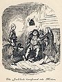 Plate III: The Jack-boots transformed into Mortars
 Plate IV: The long-nosed Stranger of Strasburg
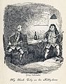 Plate V: My Uncle Toby on his Hobby-horse
 Plate VI: Trim's relation of Tristram's misfortune
 Plate VII: The Quarrel of Slop and Susannah
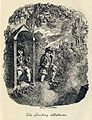 Plate VIII: The Smoking Batteries (Already an FP, listed for completeness)


.jpg)
_Edit2.jpg)
_Edit_3.jpg)


.jpg)


 . This should really have been done as a delist and replace. --jjron (talk) 12:31, 10 December 2009 (UTC)


.jpg)


.jpg)


.jpg)
.jpg)
.jpg&action=edit§ion=T-1)
.JPG)
![[5]](https://astrogeology.usgs.gov/Projects/Clementine/images/albedo.simp750.jpeg)
.jpg)
![[11]](http://worldofstereoviews.com/images/ww/evenmoreww999998.jpg)


