Comment: I find these stitched, panaramic photos to be disorienting when applied to citiscapes, especially in the way the streets line up like 'W's'. The photo has great detail and a lot to recommend (though the sky could be prettier), but I can't support because of the warped perspective. SteveHopson23:55, 25 April 2006 (UTC)[reply]
Weak support. Some minor quality issues at maximum resolution, and it's of dubious value located in its two current articles (since it illustrates neither the Eiffel Tower nor the Arc de Triomphe particularly well). Otherwise, it's quite detailed and as interesting as many other panoramas. I agree with SteveHopson that panoramic photos are disorienting, but I don't think this shot is especially so. bcasterlinet00:54, 26 April 2006 (UTC)[reply]
Comments: 1)There is an important optical distortion along the second street from the left, as if there was a massive source of heat. 2)The picture does not illustrate the Arc de Triomphe at all, since it is taken from it. The Eiffel Tower is only a few pixels out of a whole panorama. IMHO, this picture should be removed from the two articles and inserted in Paris. After all that's what it is supposed to illustrate isn't it? Glaurung06:05, 26 April 2006 (UTC)[reply]
I just realized that this picture was added to the Paris article, but removed by editors thinking the article had enough pictures already -Glaurung06:11, 26 April 2006 (UTC)[reply]
I believe that the optical distortion you see is a stitching fault. Panorama stitching software can sometimes do this, either by not aligning the images correctly, or simply because the frame itself was out of focus or motion blurred due to camera shake. Its hard to tell what has happened in this case. Diliff | (Talk)(Contribs)06:54, 26 April 2006 (UTC)[reply]
Weak opposefor the following (fixable) reasons: The horizon is dipping slightly in the middle. Colors are somewhat murky. Also, something needs to be done about the caption - a statement about this being a 360° (?) panorama would help - otherwise someone may believe all the radial roads in Paris are parallell... ;-) --Janke | Talk06:07, 26 April 2006 (UTC)[reply]
Support If anything, this should go in the Paris article..? I saw a few stitching flaws (actually just one where two cars overlap) but I'm very impressed anyway. drumguy8800 - speak02:51, 27 April 2006 (UTC)[reply]
Oppose. I like it, but I don't think it is good enough to be representative of anything. It lacks focus. As mentioned previously, it isn't in the Paris article, but I don't think it validly depicts either the Arc de Triomphe or Eiffel Tower. It lacks relevency to the articles. Diliff | (Talk)(Contribs)09:00, 27 April 2006 (UTC)[reply]
Support Great image. I really like the way the streets look - really interesting angle. Also nice to see the Eiffel Tower in a less cliched idylic setting. --Fir0002www10:04, 29 April 2006 (UTC)[reply]
Oppose. It's just a bunch of buildings. It doesn't show the layout of Paris because the layout is destroyed by the perspective, and the view isn't particularly spectacular. I see the two towers poking out in the distance, but the rest is just generic and doesn't tell me anything. Night Gyr08:25, 2 May 2006 (UTC)[reply]
Are you "Jean-Pierre Lavoie" and, if so, what license are you releasing this picture under? Currently the picture has no copyright information. We can only feature pictures that are under an open license (see WP:WIAFP). In fact, the picture will eventually be deleted if a license is not provided. Here is the link to the pantheon article: Panthéon, Paris. BrokenSegue00:20, 27 April 2006 (UTC)[reply]
Support centered. The windows glare, which is somewhat distracting -- but I don't think that's reason enough to oppose, and otherwise it's a good shot. Definite encyclopedic value. bcasterlinet01:32, 27 April 2006 (UTC)[reply]
Comment: I'd like to see some improvements before voting: The outer columns are tilting inwards, and they appear to be slightly curved. Also, how would a rectilinear stitch look? I'm bothered by the curved walkways on both sides. The windows are OK, you can't do anything about that (unless you happened to bracket all your exposures, and combine shots before stitching...) --Janke | Talk05:57, 27 April 2006 (UTC)[reply]
I can tell you that if the panorama has a greater angle of view than about 120 degrees, it is impossible to make a realistic looking rectilinear panorama due to the preservation of straight lines. The edges would be extremely warped. In fact, looking at the image again, it looks to be approximately 180 degrees or more, in which case a rectilinear projection would be logically impossible. ;) Diliff | (Talk)(Contribs)08:34, 27 April 2006 (UTC)[reply]
True, it's more than 180 degrees. It is shot from just in front of the "fence", seen at the pillar bases both left & right. (Just curious, trying to learn: How wide was the Grand Central panorama? With some unorthodox fixing, we got that into a reasonable rectilinear image. Here, that technique might work by leaving out the outermost pillars, i.e. cropping this to 120 degrees or so?) BTW, there are tarpaulins or screens hanging under the ceiling left & right - is that something temporarily there? It is a bit distracting... --Janke | Talk09:52, 27 April 2006 (UTC)[reply]
Yeah, it could be done with this image if it were re-stitched in rectilinear. I can't remember exactly what the angle of view was on the Grand Central pano, but I would guess that it would be around 100-120 degrees. Maybe I'll have a go at this panorama next time I'm in Paris. :) Diliff | (Talk)(Contribs)12:05, 27 April 2006 (UTC)[reply]
Support centered version. I don't know if we're looking at different images or what... I think this looks fantastic, with only the windowlight in the upper windows being a tiny bit distracting. If that were to be tastefully fixed, great, otherwise I think the centered version is FP quality. Staxringold14:24, 27 April 2006 (UTC)[reply]
Support I like how the areas with only stone (such as the columns) almost see as if it's in black and white, while the paintings have a nice warm glow. It really makes them stand out. I don't really mind the picture being as soft as it is. --Lewk_of_Serthiccontribtalk20:19, 27 April 2006 (UTC)[reply]
Strong Support - The picture itself is good, but the edited version brings it over the top. Amazing how just centering a picture can make it better.--Jonthecheet16:59, 1 May 2006 (UTC)[reply]
Oppose. It's a ship. A good sharp picture of a ship, but still an uninteresting picture of a ship... -- P19901:51, 29 April 2006 (UTC)[reply]
Unless you can provide some kind of reason for opposing (like bad lighting, blury angles, etc) I would ask that this vote be counted only as neutral. TomStar8102:13, 29 April 2006 (UTC)[reply]
Well, we do have a handful of nay ships that have reached featured status, among them two navy battleships and (if memory serves) one guided missile cruiser, but we have yet to feature any destroyers. I thought this one would be the best one to attempt an FP run because it gives a lot of detail to the ship. TomStar8108:23, 29 April 2006 (UTC)[reply]
Weak oppose - it's a nice pic of the ship, but it's pretty boring. I'm curious what BWF89 means by "it would be cool to have a Navy ship as the featured picture" - why would that be cool? Also, this wasn't taken by a Wikipedian, so I don't see much redeeming interest. Preference for the cropped version, fwiw. Stevage10:02, 2 May 2006 (UTC)[reply]
I think this is a good image with a very good angle. It's a replica of the Statue of Libery in Paris, France. It appears in the Statue of Liberty article.
Nominate and support. - M2K e 21:17, 27 April 2006 (UTC)
Photo showing the Rover on the far side of Plum Crater.
Nominate and support- I think its a greatly significant and important photo, however i can see that the quality is poor and would like to try and edit it and maybe find a higher resolution one. Kingstonjr18:25, 28 April 2006 (UTC)[reply]
Support I belive an image from the moon landings is appropriate for this. It was one of the greatests achievments in human history. -- Jason Palpatine07:11, 6 May 2006 (UTC)[reply]
Oppose - Unfortunately, it doesn't have a source from where it came from, the top-left hand corner has a few colour "blurbs", and the top has two white blobs. Sorry, Kilo-Lima|(talk)20:26, 28 April 2006 (UTC)[reply]
Support The good old days when the NASA still went to the moon —The preceding unsigned comment was added by BWF89 (talk • contribs) 04:23, 29 April 2006.
Yet another NASA image, I'm afraid, but this is elegant, beautiful, and does exactly what it says on the tin. Used in Venus, Mars and Mercury (planet).
Oppose, I like space but this really isn't featured picture material. If it was a picture of a landform on a particular planet or a picture of a planet than I'd support it. -- BWF8904:22, 29 April 2006 (UTC)[reply]
Comment: I prefer [3], which shows all the commonly accepted planets. It seems to me that the most important point to be made about planet sizes is just how small the rocky planets are relative to the gas giants (let alone the sun). Redquark21:21, 30 April 2006 (UTC)[reply]
Support What I understood was that this picture focuses mainly on the terrestrial planets, not the gas giants. In that context, I believe this picture works very well and has a strong encyclopedia value.--Jonthecheet22:57, 30 April 2006 (UTC)[reply]
Support. I agree, the rocky planets are quite hard to distinguish on the full solar-system comparison, so this picture definitely has value. It might be nice if Pluto was included as well, but it's not terribly important. vasi19:43, 3 May 2006 (UTC)[reply]
What information is lacking? Perhaps the caption needs expansion, as Fir suggested, in which case this is a fixable problem. bcasterlinet16:23, 4 May 2006 (UTC)[reply]
It just feels really pedestrian. I've seen so many diagrams to convey this same size comparison in books about the solar system that it doesn't feel special. As far as information, a featured picture is supposed to convey a thousand words, but this one could be translated into four numbers. Night Gyr22:03, 4 May 2006 (UTC)[reply]
Oppose. I hate to be a killjoy, but I agree that this image just doesn't convey very much information. I don't see how this adds significantly to any articles. --Dante Alighieri | Talk17:13, 5 May 2006 (UTC)[reply]
I actually made this image by stitching together many shots using a panorama package,
to obtain such a wide-angle view. Coupled with the upward lean of the perspective,
this creates quite an imposing effect, which I believe to be very fitting for
such an architectural work.
I've added it to the article on Graz in the English Wikipedia.
It was stitched from about 25 overlapping shots taken by a Minolta Dimage Xt using a table-top tripod, somewhere near the tele end of the zoom. Stitching was done in Hugin, using autopano and enblend. If anyone would like to know more, I'll try to dig out the original files and post exact figures.
Update: Thanks for your responses so far. Given the general consensus, I thought I'd submit a new version with the perspective 'corrected', and also a little downsampled and sharpened. I've also tried to bring the clock face out as far as possible. I still think I prefer the original perspective, though. Any further comments would still be appreciated. Tam09:27, 29 April 2006 (UTC)[reply]
Update: I've added two more edits, with the perspective only _partly_ corrected this time (to varying degrees). To me, the perspective in the original was perhaps a bit extreme, while the totally corrected versions (Edits 1 and 2) look unnatural to me -- 'it's just not how we perceive things', as P199 said. Edit 4 is straighter, Edit 3 has more perspective, and I think I now prefer Edit 4 the most. Any comments from anyone would still be very welcome, even at this stage. I would be interested to know what you think. Tam18:36, 4 May 2006 (UTC)[reply]
*Neutral leaning towards oppose... It has a few minor issues. The main one is the fact that the sides of the building have a distinct inwards lean, particularly the right side. The perspective isn't great. Also, considering the fact that it is a mosaic, it doesn't seem to be very detailed and could probably benefit from a bit of noise reduction in the sky and downsampling for sharpness. Can you provide a bit more info on how you took it and stitched it? Eg, what camera/focal length, how many segments, what software you used to stitch it. Diliff | (Talk)(Contribs)22:04, 27 April 2006 (UTC)[reply]
Thanks for your comments. I've added some extra info on how the pic was made. As this is my first submission, I'm not quite sure what you mean in some of your suggestions. First, what do you mean by an 'inwards lean'? Do you mean that the sides of the building are not upright, or that they are somehow curved? I have experimented with correcting the former, but the result looks rather artificial at this wide focal length (rather like a purely 'architectural' photo), and I believe that the slanting edges of the building actually provide impact (although you are welcome to disagree with me ;-) Secondly, I don't understand your point about resolution/detail. This picture makes a sharp 16" x 9" print, and is rather more detailed that most of the other pictures I see here. Downsampling would not add any detail that's not there. Or are you suggesting that, when submitting to Wikipedia, I downsample the files so that they look sharp when viewed at 100% pixel-for-pixel zoom? Please let me know...
When I say the sides have an inward lean, I do mean they're not upright. I understand what you mean about it looking artificial when corrected for perspective, but I think it would look a little better than it currently does. And yes, I am suggesting that you downsample the image so that it looks sharp(er) when viewed at 100% zoom, but only to the point where it doesn't lose detail. I think you could safely downsample it significantly without losing detail, because it is currently quite soft. Also, when you comment, can you sign your comments with a four tildes (~~~~)? It helps to ensure that we know who is typing what exactly! Diliff | (Talk)(Contribs)15:12, 28 April 2006 (UTC)[reply]
Not a problem. Thanks for being open to suggestion. The FPC is often a collaborative process! I personally feel that edit is a big improvement, but evidently it all comes down to a matter of opinion. I do think that if you're putting a submitting of a building on an encyclopedia then architectural accuracy is important! Another welcome improvement is the downlight in the foreground on the left hand side has been perspective corrected out of the frame. :) This is a good attempt and I'm considering supporting it now, but you do realise that a Minolta Xt isn't the ideal camera for high resolution/quality architectural works, right!? ;) Great for travel photography though. Diliff | (Talk)(Contribs)10:13, 29 April 2006 (UTC)[reply]
Oppose, All of the lights are overexposed. Most notable is the clock, which can barely be made out as such. The sky is also very noisy. —Cuiviénen, Friday, 28 April2006 @ 04:11 UTC (Still opposing as the lights are still too bright —Cuiviénen, Wednesday, 3 May2006 @ 15:13 UTC).
Oppose due to perspective distortion, and softness left & right. Will reconsider if a straight, sharper version is provided. --Janke | Talk06:54, 28 April 2006 (UTC)[reply]
Oppose I think the quality of light and color is good though, but I oppose due to the unnecessary perspecival distortion. DVD+ R/W 20:24, 28 April 2006 (UTC)Support edit 1 or edit 2. DVD+ R/W14:43, 29 April 2006 (UTC)[reply]
Support. Perspective is good, makes it seem more imposing. Removing the perspective distortion will make it unreal. -- P19901:56, 29 April 2006 (UTC)[reply]
Thanks. Nice to see that someone agrees with me here ;-) I wonder, however if this is anything to do with encyclopaedic vs. artistic value. Tam09:27, 29 April 2006 (UTC)[reply]
Well, Edit 1 proves my point: it is too straight, without any perspective, just not the way we perceive things. I oppose the edited versions. -- P19919:11, 1 May 2006 (UTC)[reply]
Oppose, it would be a cool building to see in real life but I really wouldnt' want to see it as the featured picture if I had the choice of a more interesting building -- BWF8904:29, 29 April 2006 (UTC)[reply]
Support for Edit 1 or Edit 2. Either is an mprovement over the original. I don't completely agree with previous comment. Just as not all articles are interesting to everyone, not all FPs will be of overwhelmingly interesting and significant subjects but I think some people will be intrigued enough by this photo to learn more, and thats the purpose of a FP in my opinion. Diliff | (Talk)(Contribs)10:13, 29 April 2006 (UTC)[reply]
Support Lovely image. Really can't see the problems everyone else seems to be having with it. I've added an edit with sharpening/perspective but it appears that Tam beat me by a matter of minutes. Have uploaded my eidt for comparison anyway. My support goes for either the original (I kinda like the perspective) or my edit. --Fir0002www09:59, 29 April 2006 (UTC)[reply]
Weak Support - Edit 1. A good photograph. Great colours and contrast, but the composition is boring. Why on earth do people feel the need to plonk their tripod down dead centre in front of a symmetrical building? Plant it a bit to one side and give the eye something to chew on. --Surgeonsmate08:15, 4 May 2006 (UTC)[reply]
Edit 1 is also a bit 'boring' to me. I prefer the original, as I believe that the perspective adds interest, and draws viewers into the picture. Any thoughts on Edits 3 and 4? Tam18:36, 4 May 2006 (UTC)[reply]
Oppose. Does illustrate invasion, but seems to have some focus problems and does not strike me as 'feature picture quality.' SteveHopson13:31, 3 May 2006 (UTC)[reply]
Oppose. I like the idea. But the quality is fairly poor at full resolution, and the picture doesn't really stand out. bcasterlinet16:44, 3 May 2006 (UTC)[reply]
Oppose. Image quality is not good in full size. The idea is good, so maybe you could try once more (maybe stitching a panorama, thus having a higher resolution to start with, and then downsample from that.) --Janke | Talk17:49, 3 May 2006 (UTC)[reply]
Oppose, Doesn't show that the field is being invaded by the Lantana plant very well and it isn't striking -- BWF8922:08, 3 May 2006 (UTC)[reply]
This Litoria pearsoniana, Pearson's Tree Frog was found in Springbrook National Park, QLD, Australia. The taxonomy of this species is currently under review.The same frog but a different angle.
I believe this image lives up to the 'Feature Picture Candidates' standards, and I am nominating it because of the lack of frog pictures that are featured pictures. This photo appears in the Pearson's Green Tree Frog article and was photographed by User:Froggydarb.
Weak support, it's a beautiful specimen of a frog, technically well shot. It doesn't excite me a lot, but i'd still lend my support. —Pengo06:49, 7 May 2006 (UTC)[reply]
Weak support - everything the two above said. I suspect it's the profile shot which makes it a bit dull. If the frog was facing slightly towards us, it might be more interesting. But it's still a good photo. Stevage09:08, 7 May 2006 (UTC)[reply]
Comment Not trying to say any of you are wrong, but it isn't that dull on my monitor. On the above grayscale I can see all the circles (the 1st circle only just). Maybe your screens are not as bright as mien.
Satellite image of Cyclone Gafilo. Amongst the feature pictures, we don't have any good, straight-from-above pic of a tropical cyclone. Catarina pic is good, but we should also have a high-res feature photo from powerful cyclone showing the structure more clearly. Wikimedia Commons has similar feature pic about Hurricane Dennis, but this one is clearly better, showing great eye detail and more symmetrical spiral bands. Plus, it's a pretty pic and kinda ominous with huge cyclone next to hapless Madagascar.
Support. Very big and very clear. I wish NASA wouldn't always draw in the lines around landforms, but can't do much about that, and they seem (unusually) subtle on this image anyway. bcasterlinet00:10, 2 May 2006 (UTC)[reply]
Strong Support - Great! I love it - very clear, illustrative, big resolution, good colours. I don't mind the outline of Madagascar - it's non-intusive, doesn't show up in the thumbnail and shows clearly the size and position of the cyclone. You have my full support. —Vanderdecken∴∫ξφ17:50, 2 May 2006 (UTC)[reply]
Super NASA Support – Images like this are simply out of reach of amateur photographers (obviously!). You gotta spend billions of dollars to get the absolute best. --Cyde Weys23:19, 6 May 2006 (UTC)[reply]
Oppose. While the image shows the structure of the cyclone pretty clearly, I think it fails to illustrate the article, because the Philipines are nowhere to be seen. I think it looks too much like other cyclone FPs. - Mgm|(talk)09:42, 8 May 2006 (UTC)[reply]
Comment There is very clear reason why Philippines are nowhere to be seen in the picture...besides, Wikipedia has only two FP's on tropical cyclones, both of which are rather different, so I respectfully disagree.--Mikoyan2111:15, 8 May 2006 (UTC)[reply]
A picture of director Orson Welles on the set of his most famous film, Citizen Kane. The picture illustrates both articles beautifully, and is striking both in thumbnail and full-resolution form. There is some grain in the large picture; someone with better Photoshop skills than me might want to clean it up a little.
Strong oppose. Improper copyright information. The site this is from does not have the legal authority to release copyright to such images as far as I can tell—"We've scanned 8 x 10 glossy movie stills and publicity photos, and the resulting full-size pictures are presented for your viewing and downloading pleasure—all free." This implies that the images are all still copyrighted, and the fact that they have been scanned by someone onto the internet does not constitute a release of rights. The image could qualify under fair use, but it would not then be eligible as a featured picture. —Cuiviénen(talk•contribs), Thursday, 11 May2006 @ 02:27 UTC
I might have to take up Dschwen on his suggestion for a round the world trip. I know this is poor timing but Hotham is such a beautiful place and I like this photo.
Support yet another great picture by fir, even though it's a busy scene (which is normally a negative) and the red pole is distracting the fact that it's a wide shot compensates for that by giving you a wider range of view. Pegasus1138Talk | Contribs | Email ---- 06:22, 30 April 2006 (UTC)[reply]
Oppose I hate to rain on the party but this pic, although technically good, is just plain boring. Also the red pole spoils the pic completely. Please excuse my forthrightness! - Adrian Pingstone08:14, 30 April 2006 (UTC)[reply]
I actually think the red pole is an integral part as to my mind they typify an alpine road. You know you're on a road where it snows when you get those red poles. But that's just my perception of it... --Fir0002www09:55, 30 April 2006 (UTC)[reply]
Oppose Due to low encyclopedic value. - and it is a really boring shot. A nice sky doesn't make it a featured picture. Mikeo10:12, 30 April 2006 (UTC)[reply]
Oppose. I recommend that world trip Fir. :) Its not a bad photo but I'm opposing it for two reasons. One is that you can't keep nominating very similar photos that don't contribute SIGNIFICANTLY to an article, and two, it looks like you've overcooked it with processing. There are haloes around parts of the image, particularly the building on the right side of the frame, and it appears to be posterised in the sky. It looks as though you've used a polariser but then, due to the extremely wide angle of the panorama, you've not had an even amount of polarisation between frames so you've painted the sky in photoshop. Apologies in advance if I'm wrong, but I don't see how you could have ended up with such a deep sky and fluffy white clouds without a polariser, and you couldn't have been able to polarise the sky evenly across an almost 180 degree view. Diliff | (Talk)(Contribs)11:30, 30 April 2006 (UTC)[reply]
Oppose Loving that blue sky, awesome! However, I dont really understand the point of the photo and what it's purpose is in an encyclopedia, sorry. - Aled D19:20, 30 April 2006 (UTC)[reply]
This chart shows information on every symbol recognized by the IPA as a distinct human speech sound. This is extremely useful, well-arranged and pleasing to the eye, of high quality, and of extraordinary importance in the world of linguistics. Appears prominently in International Phonetic Alphabet. Created by User:Kwamikagami.
Oppose. It's very informative and uses a nice font, but I can't bring myself to support a boring black-and-white chart for FP. Sorry. Actually in some sense this is not even a "picture" since it looks like it was generated straight from a PDF or similar format. I might support this if it was spiced up with color and the layout was rearranged to take advantage of the fact that pictures don't have to be shaped like A4 pages. Redquark22:06, 30 April 2006 (UTC)[reply]
Oppose. LOL at previous comment. Its all been said. Informative sheet, but not a featured picture. It doesn't visually represent the article, its merely a useful reference for the article. Diliff | (Talk)(Contribs)01:08, 1 May 2006 (UTC)[reply]
Oppose That is just the kind of information that we do not want to be hidden in pictures - that is what the text in the articles is for. Mikeo07:22, 1 May 2006 (UTC)[reply]
Weak oppose. It's very informative, and organizes the information in a way that explanatory text could not. However, as per Diliff, it's a useful reference for the article but is not useful on its own. bcasterlinet12:25, 1 May 2006 (UTC)[reply]
Weak oppose If it could be made into something an english teacher would want to laminate hang on thier wall I would support. I would say it needs to be colored up nicely and put into a wide rather than tall format. More like Image:Leaf_morphology_no_title.png. -Ravedave17:40, 1 May 2006 (UTC)[reply]
Fierce, full blooded, ravenously oppose This is supposed to be a featured PICTURE Ben Payton
But this is neither. It's a table/chart. We'd be better off turning this into a table and several smaller images for the IPA article, possibly with this linked as a quickref sheet. Night Gyr08:31, 2 May 2006 (UTC)[reply]
Support just to make it clear that charts and tables (such as this one) can be nominated and promoted here (we promote images here, not just pictures). BrokenSegue21:46, 2 May 2006 (UTC)[reply]
Oppose. I agree charts could become featured, but I don't see this as an interesting picture. If it had historical value at least it might work.say198803:01, 5 May 2006 (UTC)[reply]
Oppose - heh, I'm actually intimately familiar with this chart. Every phonetics student ends up basically memorising it. It's actually extremely well presented and contains a lot of useful information. But as a picture, it's as boring as a newspaper. Stevage12:49, 5 May 2006 (UTC)[reply]
Support - I highly suggest you all revisit the page and look at its contribution to the page. From my understanding, it is the basis for the page itself! There are whole sections that are used to break down each individual section within the image which shows its complexity. Even if you vote against this, I hope you will not simply say no because its just a chart; boring or otherwise.--Jonthecheet08:16, 6 May 2006 (UTC)[reply]
Oppose, it puts some IPA characters in italics, a practice best avoided. I'm also not convinced of its copyright status: while it is not identical to the official chart of the International Phonetic Association, it is awfully close to it. Perhaps close enough to it that User:Kwamikagami does not actually have the right to release it under the GFDL, I don't know. Angr (talk • contribs) 22:53, 6 May 2006 (UTC)[reply]
Oppose - I have no problems with the image, however its not a 'picture' and will not brighten up the front page.
Oppose maybe I'm traditional, but I like roses in the garden - this one looks like it was taken in the kitchen, in a vase? :) Stevage12:47, 5 May 2006 (UTC)[reply]
Oppose. WP:WIAFP. What is the encyclopedic value of this image? The low viewpoint does not help picturing the Wadden Sea and abandoned shoes are certainly not a typical feature there. --Dschwen12:58, 2 May 2006 (UTC)[reply]
Support. Hope that my vote is accepted despite being the photographer. At low tide you can basically have a walk at the sea bottom in the Wadden Sea (thereby the name). And - maybe surprisingly - it is filled with left overs from humans such as shoes and pieces of clothing. So this view is in it self not uncommon - even though I noticed Dschwen just deleted the photo from the article.Bertilvidet18:48, 2 May 2006 (UTC)[reply]
Yeah, I replaced it. As the only photo in the wadden see article it is definitely not encyclopedic enough. --Dschwen21:01, 2 May 2006 (UTC)[reply]
Oppose not a great photo (lack of focus, highly grainy) and doesn't add much encylcopaedic info to the article. chowells00:54, 3 May 2006 (UTC)[reply]
Oppose its sort of interesting, but it has very little encyclopedic value. if anything, it should be in an article about sediment or weathering. drumguy8800 - speak04:09, 3 May 2006 (UTC)[reply]
Yes, and it's a very cool picture. But this isn't a collection of cool pictures, this is an encyclopedia and we want pictures that can illustrate things for our readers. That's a different set of criteria than what makes art. Night Gyr06:52, 4 May 2006 (UTC)[reply]
While the image could easily illustrate an article on the shoe, I have to oppose. The shoe is cut off to the left, the image is grainy and the shadow makes it even harder to see properly. - Mgm|(talk)09:45, 8 May 2006 (UTC)[reply]
Oppose. I admire whoever stuck their chin down in the sand to get this shot, but it's just weird. Also blurry on the left. Mooveeguy17:24, 12 May 2006 (UTC)[reply]
Kalmar Castle in early August sunshineEdit of original picture, has been cropped and straightened
Nominate and support. - I feel this is a beautiful picture of Kalmar Castle, Sweden, in early August sunshine taken in 2005. The colours in the picture are bright and pleasing to the eye and the tree in the foreground frames the picture well. Also has quite high definition picture quality. It appears in the English Wikipedia page for Kalmar. Electricmoose- Electrifyingtalk17:54, 5 May 2006 (UTC)[reply]
Neutral The tree really dominates the image; kalmar is relegated to a small part of the frame, leaving no detail in the thumbnail. It's a pretty picture, but it could be better illustrative of the castle if it took up more of the frame. Also, the castle itself is blurry, tilted, and obscured by a branch. Night Gyr18:22, 5 May 2006 (UTC)[reply]
Oppose The tree in the foreground does not frame the picture very well. It is just a distracting, unneeded object - especially for an illustration in an encyclopedia. Mikeo19:00, 5 May 2006 (UTC)[reply]
Oppose, the castle itself is totally obscured, in shadow, and small. And yeah, the tree dominates far too much for an image which is meant to illustrate the castle. Stevage19:11, 6 May 2006 (UTC)[reply]
Oppose. Nice subject, but lacking in sharpness and blown-out highlights (with blooming, killing lots of details). --Dschwen11:49, 5 May 2006 (UTC)[reply]
Oppose - too blurred, poor focus, blown highlights, bad detail, not very good lighting or colour. And it appears that the user created their account for the sole purpose of submitting this for FP. The account was created, this was uploaded, and it was immediately nominated. —Vanderdecken∴∫ξφ18:10, 5 May 2006 (UTC)[reply]
I know - the author/nominator originally tried to submit it (albeit incorrectly) so I removed the mangled code from the page and left a message on their talk page advising them to read the instructions properly, but to reconsider nomination in the first place. Ah well. I tried. :) Diliff | (Talk)(Contribs)20:12, 5 May 2006 (UTC)[reply]
Oppose. If your collegue created the image, you cannot legally submit it under any license and if the image isn't used in any article, it's not eligble either. - Mgm|(talk)09:48, 8 May 2006 (UTC)[reply]
Weak Oppose, I like how the monestary is contrasted to the barren and featureless landscape around it. But the photo cuts off the left part of the monistary and just shows a field of tall grass in the right. -- BWF8903:07, 10 May 2006 (UTC)[reply]
Oppose. It's a useful illustration, but has a variety of aesthetic problems. The choice of colors and textures is ugly, the composition is a little cluttered, the font used for the numbers is inappropriate and some of the edges (for example in the circle marked '5') lack antialiasing. Redquark18:34, 3 May 2006 (UTC)[reply]
Comment Another POV-Ray!!! I would support a higher-res version. Who wants to bust out POV-Ray and do some crazy rendering? I think the colors are fine, from what I remember of seeing inside of a CRT they are fairly accurate. -Ravedave20:58, 3 May 2006 (UTC)[reply]
Support Very informative. I don't see any problem with the colors, although I share Ravedave's concern about the resolution. If someone who has POV-Ray installed would like to give it a try... -Glaurung05:58, 4 May 2006 (UTC)[reply]
STRONG Oppose In addition to the (slight) aesthetic problems, there is an error in the illustration: The phosphor dots. They are actually not hexagonal, but round (made photomechanically by exposing photoresist through the mask), and also, there is a black area separating the dots from each other. As shown, even the slightest error in focus or alignment of the electron beams would cause huge color/purity errors - the black area between the dots prevents that. This needs to be fixed before proceeding. --Janke | Talk06:50, 4 May 2006 (UTC)[reply]
Oppose My eyes! My eyes! It's a good informative illustration, but not a great one. --Surgeonsmate 08:17, 4 May 2006 (UTC) (Later: I've withdrawn my opposition after seeing the edits, but I still don't think it's striking enough for FP. --Surgeonsmate07:02, 6 May 2006 (UTC))[reply]
Support very tedious work was required for this, and the result could be slightly better with better choice of colors. That red in cross-section of tube bothers eyes, but it can be featured as is IMHO... -- Mtodorov 6912:37, 4 May 2006 (UTC)[reply]
... as long as that error is fixed, i.e. add some black around round phosphor dots. That shouldn't be too much trouble, and we'd have a technically accurate image. --Janke | Talk16:31, 4 May 2006 (UTC)[reply]
I made a larger render and applied the requested changes in Photoshop (sorry, I'm not much of a POV-Ray guru - it's my first try). Of course it could be larger still, but these two renders already took the better part of a night on my lowly machine... --grm_wnrEsc19:44, 4 May 2006 (UTC)[reply]
Comment The cutaway color needs to be changed. The red in the zoom makes it hard to tell that there is a cut-away in the zoom as well. Also the cutaways near the end are still bright red, when the rest are dull red. What does everyone think the cutaway color should be? I am thinking dull orange.-Ravedave21:36, 4 May 2006 (UTC)[reply]
There should probably be a label on the big thing at the top which is the grounding cable I believe? I think they're usually a little smaller as well (or at least, could be for the purpose of this illustration). At the moment it looks like (3) is labelling it. ed g2s • talk22:50, 4 May 2006 (UTC)[reply]
I am preparing a new render, with the cuts actually changed to the dull orange / light brown Ravedave suggests in the POV-Ray stage (it's necessary because the coils reflect them). I also added a label to the anode connection (per ed g2s), and another two additional ones to the two coils. It should be finished tomorrow. --grm_wnrEsc00:44, 5 May 2006 (UTC)[reply]
POV-Ray died on me just now, and I can't keep it running over night. I've uploaded a version with all the Photoshop fixes and an approximation of the new cut color, so you can comment on them while I'm sleeping ;). I'll incorporate any suggestions into a new version when I have the new render (should be tomorrow at this time at the latest) --grm_wnrEsc01:28, 5 May 2006 (UTC)[reply]
Nice, the brown looks much better. You missed some of the red cut-out color on the middle top, by #3. Should the holes in the apature grill not be reflective? Maybe black? Grey? Also can you provide the names for the new labels? -Ravedave02:34, 5 May 2006 (UTC)[reply]
Support Very nice, however beam coming out of the electron gun is off. Also be sure to provide the updated POVRay source, the Edit is still pointing to the original source. -Ravedave17:57, 5 May 2006 (UTC)[reply]
Support edit. This is getting better all the time. But you have my support already, since the errors are fixed. A great illustration whatever the final version will be. (PS: I don't think the "beam is off" - it's a delta configuration, not in-line.) - yes, it was off, but fixed now, I see... --Janke | Talk17:35, 5 May 2006 (UTC)[reply]
Comment I think the current brown color of the cutaway is too close to that of the copper deflection coils. Maybe we should find a different color. (perhaps a pale blue or gray?) Ghostofgauss21:07, 5 May 2006 (UTC)[reply]
Okay, fixed the beam source, and nudged the cutaway color a bit towards yellow to seperate it from the copper(grey or blue don't look good, I tried). Source is available now. Again, a cache purge is in order. --grm_wnrEsc22:37, 5 May 2006 (UTC)[reply]
Strong support -- me again, excellent improvements, just one thing: the coil that is around the tube has a brown cross-section instead of copper one. That was red in original, too. Is that too hard to be fixed? -- Mtodorov 6908:33, 8 May 2006 (UTC)[reply]
Support 1.7, great improvements. Just a little sad that they couldn't be worked into the povray source though. --Dschwen11:16, 10 May 2006 (UTC)[reply]
Most of them are by now, actually. The only really important missing one is the hexagon to round phosphor dot change, and that one would be quite difficult to do for a few reasons. Remember, the labelling / closeup compositing wasn't in the source to begin with. --grm_wnrEsc17:38, 10 May 2006 (UTC)[reply]
I saw this image quite awhile ago, and when I clicked on it, I was surprised that it wasn't a featured picture. I've now decided to nominate it, as I believe it meets all the standards. The image is currently in the Caroline Islands article and was taken by User:Marshman.
Support per nominator. One of the most beautiful sunsets I've ever seen. Surely deserves to be a Featured picture.--Hectorian03:20, 6 May 2006 (UTC)[reply]
Oppose This could be shot anywhere - thus, not encyclopedic. Also, the totally black partial silhouette of the boat and the cables at left mar the composition. --Janke | Talk06:58, 6 May 2006 (UTC)[reply]
Oppose, sunsets are triggering a knee-jerk oppose with me, and this one is too small, too arbitrary (could be anywhere, little encyclopedic value). --Dschwen07:17, 6 May 2006 (UTC)[reply]
Oppose - as sunsets go, this one is lacking a lot. The sky is not even red or orange. The clouds are actually fairly unattractive shapes, too. But worst, there is the possibility of an interesting foreground on the left (looks like the prow of a sailing ship?), but it's so dark, and there's so little of it, the effect is totally lost. Instead, we see a tiny motorboat, much less charming :) Also, not very encyclopaedic. Stevage19:02, 6 May 2006 (UTC)[reply]
Strongly oppose - The wrong kind. Doesn't illustrate anything, exposure is poor, image is noisy and too small. There are literally hundreds of sunsets on Commons and a lot of them are of considerably greater photographic merit than this one. --Yummifruitbat02:54, 10 May 2006 (UTC)[reply]
Oppose. The sunset isn't terribly well-framed (the sailboat ropes are very "noisy"). Like the sunset, and it's pretty, but it's not WikiFP material. Miwa * talk * contribs ^_^ 17:43, 12 May 2006 (UTC)[reply]
I came accross this image on Wiki Commons, and I really, really liked it. It is currently in the Beirut article, and the photo was taken by User:Bertilvidet.
Oppose for the reasons above. And please I came accross this image on Wiki Commons, and I really, really liked it? It should be I came accross this image on the Beirut page and it immediately grabbed my attention and made me read the article. Without this image I would have had a hard time understanding what Beirut actually is. But.. ..no. --Dschwen07:20, 6 May 2006 (UTC)[reply]
Oppose. It shows the geography of the place well, but I think a shot in the day-time might have more value. Also, on my monitor, even version two doesn't have much shadow detail (though I think my monitor isn't calibrated correctly). --Pharaoh Hound12:06, 6 May 2006 (UTC)[reply]
Even the third edit doesn't have enough shadow detail! And I stick to my statment that a picture in the day-time has more value. Also, I just noticed that it's blurry. --Pharaoh Hound21:19, 13 May 2006 (UTC)[reply]
Support Thank you for the input. Agree that the photo was tilted and too dark. I believe these issues are solved with the last version. Bertilvidet13:06, 8 May 2006 (UTC)[reply]
Oppose Still too dark, shadow areas lack detail (and yes my monitor is correctly calibrated) and focus not perfect. The haze in the distance obscures most of the land in a photo which seems to be primarily of the sea and sky. Not really illustrative of Beirut at all. --Yummifruitbat15:52, 8 May 2006 (UTC)[reply]
Panoramic view of the Seine in Paris with St-Michel bridge on the left and Notre-Dame cathedral to the right. I believe it shows well the Seine and it's surrounding area from a pedestrian point of view.
Panoramic view of the Seine in Paris with St-Michel bridge on the left and Notre-Dame cathedral to the rightNew edit: restitched to straighten Notre-Dame and eliminate part of wall
I think the river is totally straight at that point - certainly the near bank appears to be straight, so I doubt the far side would be bent. Stevage14:58, 7 May 2006 (UTC)[reply]
Oppose I really like the quality of light and color in this picture, much like Cafe Terrace at Night. I am not sure about the encyclopedic and informative value though. DVD+ R/W 03:31, 9 May 2006 (UTC)Neutral It shows the Seine at night, very well. DVD+ R/W03:42, 9 May 2006 (UTC)[reply]
Oppose - I'm sure it'd look great on a wall in an upmarket coffee shop or bar but it's not really very illustrative of anything in particular, except possibly perspective --Yummifruitbat23:04, 6 May 2006 (UTC)[reply]
Oppose. It's disorienting to have such a wide panorama for content so close-up; all sense of the actual proportions of the scene is lost. (e.g., how much does the river curve vs. how much does it appear to curve?)--ragesoss21:25, 6 May 2006 (UTC)[reply]
Oppose. I don't like the distorting caused by the panorama effect, and it doesn't seem necessary to have the cathedral in it. ---Pharaoh Hound12:10, 6 May 2006 (UTC)[reply]
Oppose. Not bad, nice colours but as janke said, vertical lines are not vertical and its just not an interesting enough scene to warrant FPC for me. Diliff | (Talk)(Contribs)11:15, 6 May 2006 (UTC)[reply]
Weak oppose - I'm not a big fan of 360 degree panoramas, I admit. Such wide images aren't very helpful for Wikipedia, and obviously the composition suffers as you have little control over the elements in the scene. Why not crop it to remove the quai, which is not that interesting? Then you have the bridge on the left, and Notre Dame on the right, and the only regret is the boring trees and riverbank in the middle :) But really, a panorama staring at a wall just gives me the heebie jeebies...it's very claustrophobic. Stevage19:09, 6 May 2006 (UTC)[reply]
Weak oppose. I don't see the point of having so much that concrete structure on the right. Would support a crop of just the river. howcheng {chat}07:05, 6 May 2006 (UTC)[reply]
Strong Support. Beautiful! The resolution is spectacular, the composition is excelent! This is what a featured picture should be!--Pharaoh Hound11:55, 6 May 2006 (UTC)[reply]
Support, though artistically I don't like the compositio that much - is it a picture of the bridge or the fortified city? I find it hard to know where I'm looking exactly. Stevage18:59, 6 May 2006 (UTC)[reply]
Support - Although I do wonder what this would come out like as a thumbnail on the front page... it's stunning (and enormous) at full size but I think it's going to be very difficult to see what's in the image at first glance - the fortifications are very indistinct in the thumb. --Yummifruitbat22:59, 6 May 2006 (UTC)[reply]
Support. Beautiful. I like the composition, which adds a lot of interest for the eye. It needs to be shown in the article in as big a format as possible, possibly stretching right across the page. With this amount of detail, it has got to be the result of a stitch of several tripod-mounted time exposures. Can we have some technical details, please? --Surgeonsmate04:27, 7 May 2006 (UTC)[reply]
Technical details. Yes your right Surgeonsmate, the picture is actually made of 15 tripod mounted portrait shots stitched together using a Digital Rebel XT (8Mpixels). The resulting file is massive! Of course, I used a fixed aperture for constant depth of field, fixed focus and a common white balance and exposure between each frame. The scene was a real beauty and being new to the location, I didn't expect the old bridge to be there and that was a nice surprise! In fact my goal changed at that point to show the medial city at night and the bridge with the help of the panoramic format. - Jplavoie10:31, 7 May 2006 (UTC)[reply]
Support ahah, fortified support. this is a very striking image.. i like it, and those are some cool trees. who knew those grew in France? drumguy8800 - speak03:34, 9 May 2006 (UTC)[reply]
OK, on different LCD monitors it does look different, but the artifacts are still there. I'll try to upload a "boosted" image to illustrate my concern. --Dante Alighieri | Talk17:33, 9 May 2006 (UTC)[reply]
Question is the bridge actually called "Pont vieux" or "Vieux pont"? The file name is the latter, but the descriptions etc are the former. Normally in French it would be "vieux pont", but perhaps it's so old it retains an older word order? Stevage08:40, 10 May 2006 (UTC)[reply]
The bridge is indeed called "Pont vieux" which is not usual in french. I don't know the explanation for this yet. For your info also, the bridge from where the picture was taken is called "Pont neuf" which means new bridge and is the normal word order in this case. - Jplavoie00:43, 11 May 2006 (UTC)[reply]
Support Looking on Wikipedia for places I'll be visiting on my holidays when I came across this. Stunning photo, well done. Bastun23:59, 13 May 2006 (UTC)[reply]
I took this panoramic photo (4 photos stitched together), and Yummifruitbat touched it up on Picture peer review. A very similar version is used at Château de Chambord.
Strengths of this photo:
Detail is good (but not fantastic)
Subject is interesting
No clones :)
Dead straight (thanks Yummifruitbat)
Weaknesses:
Lighting pretty dull - was pretty much midday :(
Little people in centre of photo are possibly distracting.
There are already heaps of photos of Chambord at Commons. Not sure if that's a problem.
All your comments are very welcome. I suspect this photo isn't quite up to standard, but I look forward to learning how to make the next one better.
Support Yummifruitbat's downsampled version, neutral on the other modifications. The quality at maximum resolution still leaves room for improvement, but otherwise I think it's a great shot. bcasterlinet23:49, 6 May 2006 (UTC)[reply]
Comment - When I did the editing, I considered downsampling so that the image was still 100% crisp at maximum resolution, but decided against it because it would mean losing detail (which would be needed if the photo was to be reproduced in print). Bear in mind the dimensions of this photo (6054x2155px) make it at least twice as large as it needs to be to meet FP standards. -Yummifruitbat03:27, 7 May 2006 (UTC)[reply]
Generally if it isn't sharp, you can safely downsample a bit without losing any detail, because softness usually means that there are (simply speaking) 2 pixels used to describe an object that could just as easily be described by 1. While it is certainly possible to lose detail if you downsample at an inappropriate ratio and don't check the image, I'm pretty sure there is room to do it in this image. Try downsampling to 4000 pixels wide and see if you can see any meaningful loss of detail. I tried and couldn't see any. Diliff | (Talk)(Contribs)08:27, 7 May 2006 (UTC)[reply]
Neutral I like the picture, but I'm going to hold off because the image isn't in any articles yet. The key factor that distinguished between a pretty image and a featured picture is whether it's illustrative, and while I'm sure this picture could be, I can't vote in good faith for an image that no one's seen fit to include in an article yet. Night Gyr07:27, 7 May 2006 (UTC)[reply]
Comment: OK, I've downsampled to 75% of the original size, and you're right, Diliff, there doesn't seem to be any noticeable loss of detail. --Yummifruitbat16:10, 7 May 2006 (UTC)[reply]
Support Cropped, edited version. I would however like to see this picture redone. This shot is OK, but the lighting is terrible - and such a lovely subject I think can be done better. I like the colors and composition of Image:France Loir-et-Cher Chambord Chateau 03.jpg better, but the quality is pretty poor. My ideal would be something like this. I've uploaded three edits for consideration.
The next time I'm in the area, I'll have another crack! (not likely to happen anytime soon) I regret not trying again later in the afternoon when there was really some nice afternoon sun. I agree with everything you say basically. Stevage14:30, 8 May 2006 (UTC)[reply]
Strongly oppose retouched versions. Why the hell would anyone clone out the people? They do not obstruct the building but rather give the image a sense of scale. Again another totally unnecessary photo manipulation. --Dschwen12:12, 8 May 2006 (UTC)[reply]
Just on personal taste, I found a couple of the people distracting (right in centre, two people taking a photo, another woman walking towards camera). I suppose I like people sitting down, or wandering around, but when they're being unaesthetic, like taking photos, I'm not sad to see them go. That said, I have no strong preference either way, I can see the arguments for or against cloning them out. Stevage14:30, 8 May 2006 (UTC)[reply]
Support for the original(not the edited version) I agree with Dschwen, the people give a sense of scale and don't distract from the subject in any way. Besides that, a very good image! --Pharaoh Hound12:53, 8 May 2006 (UTC)[reply]
I agree that the retouching is unnecessary.. I don't think I can offer my support due to the bland lighting as it just doesn't do it for me. If anything, as far as a crop goes, I would prefer a little taken away from the foreground lawn and a little from the left and right edge of the frame, but keeping the proportions the same. Diliff | (Talk)(Contribs)13:20, 8 May 2006 (UTC)[reply]
Yummifruitbat's cropped version
Yet another edit - Not a big fan of Fir0002's edits I'm afraid, the sky looks artificial and I agree with Dschwen about unnecessarily removing the people when they're not obstructing the subject. If the activities of the people in the shot are 'unaesthetic' then presumably we should say the same about the photographer on the bridge in Carcassonne? I think Diliff's suggestion about the crop has merit and have tried a version with the same proportions. --Yummifruitbat19:24, 8 May 2006 (UTC)[reply]
Well I guess it's a matter of personal taste, but to my mind a sky without completely burnt out details is less realistic to one which has them partially recovered. Also I find that the original has a blue caste which has also been correct in my edit. But obviously the edits were just there to give people choice, and you are free to make yours (choice that is) --Fir0002www11:12, 9 May 2006 (UTC)[reply]
Comment since people are enjoying photoshopping it, just pointing out the original untouched image is available here. Fwiw, I think I do prefer the version with the people cloned out, and will probably print it for my wall. :) Stevage20:06, 8 May 2006 (UTC)[reply]
Support - I kind of like the people in the shot.. but the one without it is fine too. That is an absolutely gorgeous structure. drumguy8800 - speak03:32, 9 May 2006 (UTC)[reply]
I have nominated this picture, made by myself (Nicki Mennekens), because I have noticed that there are not many motorsport related featured images. The image up for vote appears in the article Belgian Grand Prix.
Oppose as it's very blurry. Yeah I know he was probably moving quite fast :) To get crisp photos of race cars, you either need to speed up the shutter, or move the camera in the direction of the car as you take the photo. The latter can give a nice effect, causing the background to blur while the car remains quite crisp. Stevage18:55, 6 May 2006 (UTC)[reply]
Oppose. I think there could be more automotive FPs, but this isn't one of them. It's blurry, I would like more contrast, and it's too small. --Pharaoh Hound12:58, 8 May 2006 (UTC)[reply]
Oppose. Sorry. The foreground is empty, and the elements in the background (the mug and the bread) are distracting. Dr Zak13:51, 6 May 2006 (UTC)[reply]
Weak Support. The background has distracting elements. Good resolution, the subject is well prepared and contributes well to its article. --Pharaoh Hound17:40, 6 May 2006 (UTC)[reply]
Weak Support of both versions. Much improved. The "salad platter" looks fake (for some odd reason), however it probably is more encyclopedic. I like the close-up view of the cropped one, but it may be too close cut, and the distracting elements -though mush less visible- are still there. --Pharaoh Hound13:10, 8 May 2006 (UTC)[reply]
Weak support - could someone crop some white space out of the front though, and maybe out of the back? Stevage18:56, 6 May 2006 (UTC)[reply]
Oppose. It is a nice appetizing image, I find the blank foreground jarring, and the cropped sides as well. I do like the bread and mug, though.--ragesoss21:28, 6 May 2006 (UTC)[reply]
I prefer the totally uncropped version. Not sure why you were trying to keep the bread out of the original one :) Stevage09:09, 7 May 2006 (UTC)[reply]
Oh there're two different shots (obviously of the same thing). I just perfered to close up one. I don't know why but I'm really partial to that white "clean" look which I think the first one really has. To my mind it's a nearly perfect stock shot. But that's just me :-) --Fir0002www09:28, 7 May 2006 (UTC)[reply]
Weak Support of both versions. Much improved. The "salad platter" looks fake (for some odd reason), however it probably is more encyclopedic. I like the close-up view of the cropped one, but it may be too close cut, and the distracting elements -though mush less visible- are still there. --Pharaoh Hound13:10, 8 May 2006 (UTC) ( moved from original context higher in the page )[reply]
Oppose. Full-size, the photo looks rather unremarkable. I think it's the lighting. The angle of the plate is also offputting, but as I don't think it's FP-standard, I'm not experimenting. BigBlueFish21:41, 11 May 2006 (UTC)[reply]
Oppose. The white background makes this photo look too artificial even though the plate itself looks good. I think that having a plate out of context is not very encyclopedic-- not a good explanation of the purpose of salad (i.e. to be eaten) Bonus Onus22:14, 11 May 2006 (UTC)[reply]
Oppose all versions. Uninteresting subject photographed as if for advertising purposes. It's nice enough, but this looks like something out of an upscale supermarket circular. Mooveeguy17:12, 12 May 2006 (UTC)[reply]
Um why exacatly is it a problem that it looks like an "upscale supermarket circular". I would have thought that a good thing. Certainly I can't see it as a valid reason for opposing. --Fir0002www07:50, 13 May 2006 (UTC)[reply]
Closing comment: splitting up the vote like that halfway through really did not help me make the closing count! Some of the oppose votes left above the line, I judge as being equally applicable to the final version too (Adrian's, for example). With hindsight, I think it would have been better to start a new nom, or just to leave all versions in a single section — those of us who close these regularly are used to having to tot up support for differing versions. Anyway, gripe over with, the second vote passes 14/6 even if we still count Adrian's and chowells' opposes. I discounted ragesoss's oppose which obviously only applied to the original crop ~ Veledan • Talk10:14, 14 May 2006 (UTC)[reply]
This is an unusal nomination. I'm not nominating it for looks but rather functionality. The colours are standardised as per Wikipedia:WikiProject Maps, so I can't change that. My reasons for nominating are for:
Highest resolution image available, (drawn to scale) on the internet: (1486x1734 px) + SVG
Most comprehensive NPOV map available on the internet. Shows the following disputed areas by way of shading and borders:
Kashmir: Pakistan-administered (Indian-claimed), Indian-administered (Pakistan claimed), Chinese-administered (Indian-claimed), area ceded to China by Pakistan (Indian claimed).
Additional Western sector claims/administration by China in the states of Himachal Pradesh and Uttranchal. No India map on the internet has such a level of detail covered.
Note: I've compiled the map from 4 sources. I believe that the map will go a long way as a base for the long standing demand for NPOV India maps. Regards, =Nichalp«Talk»=06:47, 8 May 2006 (UTC)[reply]
Comment. Would you mind putting a list of what the various colored areas mean on the image page? It will make it easier for future reference. Cheers! --PS2pcGAMER (talk) 06:51, 8 May 2006 (UTC)[reply]
Comment - the four colours are very similar, and it's particularly hard to see the difference between the first pair (India, disputed area 1) and to a lesser extent, the second pair (disputed areas 1 and 2). Consider changing them? Stevage09:24, 8 May 2006 (UTC)[reply]
Umm.... I've used transparencies rather than a different colour to depict the two disputed regions. I wanted the colours to blend from yellow to orange to show the differences. Since the gradient from yellow to orange is not much, it does not contrast too much. To mitigate this problem somewhat I'd used different border styles. Awaiting further suggestions. Regards, =Nichalp«Talk»=09:55, 8 May 2006 (UTC)[reply]
Support. Minor issue being that similar colour need to be fixed for clarity in first glance. Map featurable as highly functional and trend-setter in NPOV maps. -Ambuj Saxena (talk) 09:31, 8 May 2006 (UTC)[reply]
Reluctant neutral - I'd love to support this as I agree strongly about the importance of NPOV mapping on Wikipedia. At the moment, though, the colours of the disputed regions are far too similar - on this LCD panel (at uni) you can't distinguish between them at all. Also, you mention that the map is compiled from 4 sources - what is the copyright status of these sources and what effect does that have on the resulting status of a compilation map? I'll definitely support if these issues are addressed. --Yummifruitbat11:28, 8 May 2006 (UTC)[reply]
Colours: I'm not sure what to do about the colours. (See my reply to Steveage). I'm trying to think of something that is not to flashy and has a wider gradient. Do you have any suggestions?
Image copyrights: Three of the four sources are PD, the fourth is copyrighted. According to international copyright laws, geographical and political boundaries cannot be copyrighted for obvious reasons. What is copyrighted are the style and creativity. See Wikipedia:Image use policy#User-created images and Wikipedia:Fair use#Policy (#1 Maps and diagrams can often be redrawn from original sources...) Regards, =Nichalp«Talk»=11:49, 8 May 2006 (UTC)[reply]
I haven't tried this, so just a suggestion, but could you simply make the orange colour a bit darker, and the yellow perhaps slightly lighter, so as to widen the gradient? At the moment the orange particularly seems fairly pale, although I agree about not making it too 'flashy' :) --Yummifruitbat16:06, 8 May 2006 (UTC)[reply]
Support - although I do have a small comment :) I personally think the un-disputed international border would look better if it was a dark black line without dashes. Also there is gap in the border between Madhya Pradesh and Rajasthan. Sukh | ਸੁਖ | Talk12:28, 8 May 2006 (UTC)[reply]
Support - I have a minor issue. In its highest resolution, I could see a black mark (shape of 'U') in the space between Sri Lanka and Tamil Nadu. Can that be fixed? - Ganeshk(talk)15:42, 8 May 2006 (UTC)[reply]
Unfortunately yes, I agree with you. :( I would like to try enhance it while keeping it within the ambit of recommendations made by the Maps wikiproject. Please feel free to make any suggestions. Regards, =Nichalp«Talk»=11:12, 9 May 2006 (UTC)[reply]
Sorry, let me be clear. I don't think it fulfills #5. I don't see how the blank map is useful for the article. Now, a filled-in one might be, but that's not what's being voted on at the moment. I'd have to see a filled-in one to decide if I'd support that one. At an absolute minimum, the legend needs to be on the map, not on the description page. --Dante Alighieri | Talk17:28, 9 May 2006 (UTC)[reply]
Thanks for elaborating. :) We plan to use the map as a locator map for towns and cities in India. We'll be modelling the location based on the work done on Template talk:Infobox protected area. This map will be the base map for all Indian cities, and the location will be superimposed over it. The map will thus be used across a thousand articles. Regards, =Nichalp«Talk»=17:49, 9 May 2006 (UTC)[reply]
Strong Oppose, I'm sure you spent alot of time working on it and I commend you for that. But It's just a blank map. I like looking at a featured picture thats vivid or exciting. -- BWF8903:14, 10 May 2006 (UTC)[reply]
No problems. I agree with you. As I've said, I nominated it for its utility value, not looks as it's to be a locator map. I could have jazzed it up, but decided to keep it simple. Regards, =Nichalp«Talk»=05:56, 10 May 2006 (UTC)[reply]
I'm with Nichalp. FPC is first and foremost meant to encourage people to spend time and effort making pictures for Wikipedia. Out of interest, how many hours did it take you to make? Stevage08:36, 10 May 2006 (UTC)[reply]
I'm not sure on the exact figure. It took me six days (I do it on weekends and started on 16th April). Rough figure: ~10-12 hrs. I'm not a professional, and I taught myself to draw maps over the past few months. I'd also like to add that shading in SVG maps is kinda' difficult and had to use many layers to get the final output. =Nichalp«Talk»=08:47, 10 May 2006 (UTC)[reply]
Oppose. It's a fine map, but not particularly striking or visually interesting. There are many maps on Wikipedia that are just as good or better. Also, it could be more useful. There's no distinctions between the areas claimed by Pakistan and those claimed by China. In fact, there is no indication of where China, Pakistan, and the other neighboring countries are. If you plan on using it for Indian cities articles, readers would want to know if a city is near the border with Pakistan, Nepal, Bangladesh, etc. What about labeling the major cities, or at least the capital? For this map to be useful in any article, it would require major additions. As such it fails criterion #5. --dm(talk)22:57, 10 May 2006 (UTC)[reply]
I could spice up the map as per your suggestions, but this is meant to be a locator map and having the detail you mentioned would be an overkill. As I said, this is the recommended format, else I could spice it up like my other featured map: image:Goamap.png. Regards, =Nichalp«Talk»=08:46, 12 May 2006 (UTC)[reply]
Oppose even though it may be a good map and somewhat useful. I think as an image it is too sparse (especially in the upper part) and not at all visually interesting. Bonus Onus22:03, 11 May 2006 (UTC)[reply]
Could you elaborate on what is sparse, and if I can take care of your objection? =Nichalp«Talk»=
Yes, I admit being guilty of the aforesaid charge. I wanted it to be reviewed by all concerned parties concerned, not just WP:FPC. However I would like to honestly add that I did not clamour for support votes, people could have also opposed the candidature. I didn't want a scenario to occur later saying "how could this POV map be featured!?" =Nichalp«Talk»=12:57, 13 May 2006 (UTC)[reply]
Oppose It'll be every bit as useful as you say and I applaud you for the excellent job you've done, but I just don't think a blank locator map is the best way to represent any country's topology for FP. To fulfil criterion #7 an FP should be a good representation of the subject in itself — a featured country map ought to show features of interest such as places, or perhaps interesting geographic details. This will be a good locator map, but promoting what is basically a blank template seems a bit bizarre to me ~ Veledan • Talk20:41, 12 May 2006 (UTC)[reply]
Oppose. The legend is confusing, as are parts of the border regions. The legend lists two different dash-dot lines (of different thickness), and I can't tell which parts are one and which are the other. And the solid line around most of the country does not appear in the legend; what does it mean?--ragesoss20:51, 12 May 2006 (UTC)[reply]
Oppose. Nice work. Yet, a FP needs to be something special, either by being very descriptive or by being an eye-catching illustration. This one is neither. In addition to that, I also agree with the comment made by Veledan. Mikeo12:20, 13 May 2006 (UTC)[reply]
Hi! Thanks for your feedback. From [6], Talpatty island is a riverine island. These islands would be too tiny to depict on this map. The same applies to Sir Creek and the Indian and Bangladeshi exclaves. For example, the islands of Lakshadweep (a union territory) is almost invisible at lower resolutions because of small area of the islands. =Nichalp«Talk»=14:43, 13 May 2006 (UTC)[reply]
Support Excellent work. Perhaps a sentence should be added to the associated details stating something along the lines of "Boundaries correct as of 2006"? CheekyMonkey17:35, 14 May 2006 (UTC)[reply]
Promoted Image:India-locator-map-blank.svg(+23 / -8) While I did factor in the vote (74% in favor), due to Veledan's concerns of (unintentional) vote stacking I also considered the arguments of those in favor of promotion and against. "It's just a map" is not really a legitimate objection, nor one which can be addressed; another "oppose" vote was too vague to be addressed; and the concerns of two other "oppose" votes were addressed. Others opposed cited WP:WIAFP criteria #5 and #7. I find its usefulness (#5) as a locator map difficult to dispute. And since the subject of this image is India's profile and regional divisions, not India itself, I don't see that it fails #7.
Ultimately, I'm not convinced that this image falls far short of any of the criteria, if it falls short at all. So, with a significant majority of voters in favor, I'm promoting it. -- bcasterline • talk17:18, 16 May 2006 (UTC)[reply]
Neutral. You're right, that is a tough subject to get through. Anything subject that simple has to really stand out to get the votes here. I do like it and I'm not entirely sure how it could be improved.. Perhaps better framing, with no tulips in the background cut out of the frame. Perhaps a more vertical crop. I'm not sure. :) I'll keep an open mind. Diliff | (Talk)(Contribs)10:24, 8 May 2006 (UTC)[reply]
I'm afraid that's all of the shot I've got to work with. This pic wasn't taken by me but a friend, and that was all he took. --Fir0002www10:30, 8 May 2006 (UTC)[reply]
Strong Support. Beautiful. Good resolution, nice lighting. The composition is fairly attractive. Maybe I'm baised because I love gardening, but I think this image is FP material. --Pharaoh Hound12:48, 8 May 2006 (UTC)[reply]
Conditional support. Has a bit of simplicity I think since the flower's interior side or something like that is not shown. --Brandспойт13:07, 8 May 2006 (UTC)[reply]
Weak support agree, the flower is not doing anything terribly exciting, but that's more of an artistic consideration. It would illustrate Tulip very well indeed. Stevage 14:42, 8 May 2006 (UTC) I was too harsh. Support. Stevage08:18, 9 May 2006 (UTC)[reply]
Oppose. It's nice, but I don't see what qualifies it as an FP. It's neither striking nor adds significantly to the article, IMO. There are many other shots in the article just as good. --Dante Alighieri | Talk15:55, 9 May 2006 (UTC)[reply]
Weak Oppose See Dante Alighieri. Also the top of the flower is not clearly seen on the background of other tulips.Olegivvit09:50, 10 May 2006 (UTC)[reply]
Oppose per Dante. Would have more value it it showed an entire plant and the inside of the flower pod. Plus I do find the pic neither striking nor does it make me want to read the article. --Dschwen11:13, 10 May 2006 (UTC)[reply]
Support. Colours and overall picture are beautiful here. One of the things I really liked about this picture, and that IMO makes it FP worthy rather than just a nice picture, is that the focus tulip is in classic tulip shape, but the near background includes various stages of tulips budding, as well as flowers now slightly beyond this stage and opening out, along with the leaves of the plant, thus illustrating various stages in the lifecycle of this plant in one photo. In response to members above that want to see the inside of the flower, please remember it's a tulip, you're not meant to see the inside (at least of this variety) unless you want it dissected or well past this ‘classic’ stage. Have to be upfront about possible bias - it's my photo, which Fir0002 uploaded and nominated for me. --jjron13:14, 14 May 2006 (UTC)[reply]
Support A lovely picture and good for tulip too, despite that fact the article's a bit of a gallery already. I disagree that a shot showing the inside would be more encyclopedic - yes have a pic of the innards in the article too, but this angle is more iconic for tulips ~ Veledan • Talk20:29, 14 May 2006 (UTC)[reply]
Not by me. It doesn't say anything on the source page, so my assumption is no (if any modifications have been made, it usually says so). The ASTER page doesn't have any information about it either. howcheng {chat}20:58, 8 May 2006 (UTC)[reply]
My guess is that it has been modified, or at least, that is not a natural representation of the colour. A quick look at Google Earth will quickly show you that there is a vast variance in the quality of the imagery. Some satellite imagery isn't even visible colour but rather based on the amount of reflectivity. Diliff | (Talk)(Contribs)21:16, 8 May 2006 (UTC)[reply]
The latter is more likely. Considering ASTER stands for "Advanced Spaceborne Thermal Emission and Reflection Radiometer" it's probably not a natural-color image. howcheng {chat}21:34, 8 May 2006 (UTC)[reply]
However, our own article on ASTER states that it takes visible spectrum images too, and since NASA makes several references to the color without any mention of it being false color, this is probably actually the real colors, and we should not presume otherwise. Night Gyr22:56, 8 May 2006 (UTC)[reply]
Comment strangely, I would actually prefer a cropped version, especially to appear on the main page. You can't actually make any detail out in that thumbnail. Perhaps by cropping it you could at least see the circles and get an idea. Two questions not answered on the image page: What orientation does the image have (is there some reason not to "straighten it" from its current ~10° slant to the left)? Also, what is the road(?) running through the image? Stevage20:01, 8 May 2006 (UTC)[reply]
I don't think that is going to help. There have been situations where I've wished that there was a way of allowing a cropped thumbnail to link directly to a full sized image but in this case, I think you just have to accept that it looks abstract and click on the thumbnail to see it at 100%. It wouldn't be any more recognisable when cropped anyhow. Diliff | (Talk)(Contribs)21:16, 8 May 2006 (UTC)[reply]
Support - These are fascinating, particularly if you've ever used GoogleEarth to see how much of Kansas is covered by them. Really makes you think about the demand that feeding the Western world places on its environments. A quick GE of the coordinates shows that the road is Highway 56 which runs 640 miles from Springer, New Mexico to Kansas City, Missouri. --Yummifruitbat21:39, 8 May 2006 (UTC)[reply]
Comment - Also, there's no obvious reason for the orientation of the image as the grid of circles runs N-S/W-E with remarkable precision. --Yummifruitbat21:43, 8 May 2006 (UTC)[reply]
(getting horribly addicted to GoogleEarth!) - The two settlements alongside the Highway are the small towns of (lower left) Sublette and (upper right) Copeland.
So then the only possible explanations I can come up with for the tilt are (1) that's how the satellite was oriented, or (2) it was an artistic choice by the NASA person who processed the image. howcheng {chat}22:11, 8 May 2006 (UTC)[reply]
Edited version - I've uploaded a straightened and cropped edit as the rotated version is misleading IMO. One of the interesting features of this landscape is the meticulous geometric arrangement. --Yummifruitbat23:49, 8 May 2006 (UTC)[reply]
Support Original, Oppose edited. Straightening the image just makes it look unnatural, I think. The grid is easy to see even angled, and it feels more like reality when things haven't been messed around with just for the sake of perfect alignment. I think the rotated version is more misleading, because it implies that the satellite lines its images up perfectly with the crop grid. Night Gyr00:20, 9 May 2006 (UTC)[reply]
It is unnatural, and the perfect alignment is part of what makes it interesting. When the fields were originally created, they were laid out on a measured North-South, West-East, 0.5- and 1-mile grid. Presenting the image at an angle suggests that they were arbitrarily oriented - isn't that a bit like drawing a map of the Americas with Canada in the bottom right hand corner? --Yummifruitbat00:43, 9 May 2006 (UTC)[reply]
It's a picture, not a map, and I think we can trust our readers to know that. I've been on cross-country flights before, and seen the pattern, so I know how it runs, and it seems more natural to me for a picture of the pattern to not align perfectly, since even the satellite isn't seeing it straight on. This picture is not a map. The change is more comparable to taking a picture like the blue marble and spinning it to line up with a map--completely unnecessary, insulting to our readers' intelligence, and distorting the compositional appeal of the original. Night Gyr03:52, 9 May 2006 (UTC)[reply]
I disagree with putting "the original" on a pedestal in that way. The original rotation was totally arbitrary anyway. Why not rotate it to 45 degrees, 37 degrees, or 344? If you find the roughly 10 degrees to the left more appealing than ramrod-straight, then that's one thing. But considering 0 degrees (the apparently "true" alignment) to be "arbitrary" and the 10 degrees left to be more canonical is, well, very arbitrary indeed. Stevage08:16, 9 May 2006 (UTC)[reply]
I do find the original more appealing, and I don't like the rotation because it takes away everything about the image that distingushes it from a generic satellite photo or map. There are plenty of places out there that can show you the precise north/south grid, but I feel like showing it at an angle makes it feel less like a map and reminds you that you're looking at a photograph rather than a drawing. Night Gyr08:41, 9 May 2006 (UTC)[reply]
It is a generic satellite photo, but it's the subject that distinguishes it, not the 10º rotation which adds nothing to the encyclopaedic nature of the image. You may have been lucky enough to fly over this scene but the vast majority of readers/viewers will not have, nor can one assume that they will have found the circles using GoogleEarth and happen to have had the Lat/Long overlay switched on at the time. Straightening the image increases its informational content - this is supposed to be an encyclopaedia after all. Should we refrain from straightening, say, a landscape nominated for FP with the horizon tilted 10º because the photographer's tripod was lopsided? --Yummifruitbat11:19, 9 May 2006 (UTC)[reply]
It doesn't really add to the informational content. Why would a straightened image lead the viewer to assume that the fields themselves were straightened along a grid? Personally, I don't think I would ever make that assumption. It would need to be stated somewhere (the caption, for example), which would be equally necessary for both versions. Fitting to a grid is different than leveling a horizon. bcasterlinet12:59, 9 May 2006 (UTC)[reply]
It's a good idea to include that information in the caption. Perhaps my choice of phrasing was poor above - straightening it doesn't really increase its informational content, but IMO rotating it by an arbitrary 10º reduces the information conveyed because then the rotation becomes a feature of the image, even though it is of no real relevance to the content. Lots of images (eg. of buildings) are either opposed on FPC or edited, because walls aren't perfectly vertical or exhibit perspective distortion. It strikes me as a case of double standards, then, to say that rotating it to align a clear North-South grid with North is "insulting to our readers' intelligence". --Yummifruitbat13:47, 9 May 2006 (UTC)[reply]
Maybe there is a double-standard (although I don't myself oppose the straightened version). But nature shots, except where there is a visible horizon, aren't always straightened with relation to anything in the picture -- see Image:Tulip - floriade canberra.jpg below, for example. The focus of this image is the crop fields, not the gridding of Kansas. And, as a matter of personal preference, I find them more interesting when not perfectly aligned in a square. bcasterlinet14:12, 9 May 2006 (UTC)[reply]
Well put, I can see your point. From a purely aesthetic point of view I quite like the angled shot, but I personally think the straightened one is more encyclopaedic. --Yummifruitbat14:55, 9 May 2006 (UTC)[reply]
Weak support original, support edit, and I would strongly support an edited version that lined up the edges of the image and the edges of the outer crop circles. It just looks more striking when perfectly north-south and east-west. —Cuiviénen (talk•contribs), Tuesday, 9 May2006 @ 01:29 UTC
I had a go a this but it didn't look all that great as the pattern doesn't line up perfectly all the way along. I think there's either some distortion in the corners (which I tried to correct but couldn't) or the guy with the measuring tape had been in the sun too long... --Yummifruitbat11:23, 9 May 2006 (UTC)[reply]
support Original. Un-rotated highlights difference between natural and man-made, controlled and random. The rotated version make it look too orderly and possibly fake. Witty lama14:23, 9 May 2006 (UTC)[reply]
Oppose its a meh picture for me, if I had to I would take the straigtened edit. —The preceding unsigned comment was added by Ravedave (talk • contribs) 17:41, 9 May 2006.
Support Original, At first I was like "what is that, it can't be real" and then I click on it and zoom in and see that it's an actual photograph. -- BWF8902:41, 10 May 2006 (UTC)[reply]
Actually we're not sure of that. It's an image, but whether it's visible light ("an actual photograph") or a generated image by some other method, we're not sure. Stevage09:49, 10 May 2006 (UTC)[reply]
Since the rotation of the above image is totally arbitrary, I propose we vote on which way to rotate it for the final image. Consider that 0 degrees is the straightened version above, and -10° degrees is the version as originally nominated. If your preferred angle is not included, feel free to add it in the list where it fits. If you oppose the image, please say so above this section.
0° (straightened)
Comment: I support either versions,but I think it would be more encyclopedic to represent it in its conventional orientation with the North pointing upwards. The original picture has a totally arbitrary orientation, and even if it just looks nicer, Wikipedia is primarily an encyclopedy and not an art gallery. Glaurung06:30, 11 May 2006 (UTC)[reply]
IMHO, the best thing to do would be to present the angled version as the FPC, but probably use the straightened one in the actual article, but I suspect that would be against the spirit of FPC. There is obviously an inherent conflict between what is aesthetically pleasing ("striking", "best work") and what is encyclopaedically useful. A simple example is that often heavily cropped versions or even details of pictures are more useful for actual articles, whereas a full, uncropped image would be better as an artwork. Stevage14:21, 11 May 2006 (UTC)[reply]
-10° (original)
Support. Original image. How is it arbitrary? Do you know for a fact that the source image isn't oriented to magnetic or global north or something? --Dante Alighieri | Talk15:57, 9 May 2006 (UTC)[reply]
Ok, support - not convinced that the -10 is meaningful, but in retrospect it's a more captivating image. Sorry for being a pain. I think the straightened one is probably more "encyclopaedic" but the original is more "striking", and at the end of the day, FPC *is* a beauty contest. Stevage20:50, 9 May 2006 (UTC)[reply]
Support either, the original is minutely more aethetically pleasing; the straightend one hints that north is up (minutely more informative). I can't decide which is better. If north isn't actually up on straightened version then I support the original. —Pengo02:52, 10 May 2006 (UTC)[reply]
Good idea - it'll be interesting to see what other details about the image they can give us. Even if there's no reason for the rotation, I'll go with the consensus and support the original as this image deserves to be FP in one form or another. --Yummifruitbat16:50, 10 May 2006 (UTC)[reply]
-10°. The straightened one loses detail from cropping, gains no aesthetic value or informative value as far as I'm concerned. People saying that the angle makes it look less diagrammatic have a point too... unless you zoom in you could easily think it wasn't photographic at all. The angle helps to this effect. BigBlueFish21:35, 11 May 2006 (UTC)[reply]
Support original This picture is a great example of central pivot irrigation, and is a well-structured picture at the original angle. Looks a little weird when viewed as a thumbnail, but good on the image page. The edited one looks too artificial. Bonus Onus21:59, 11 May 2006 (UTC)[reply]
I had sent an email querying the ASTER team as to some details about the image. They graciously responded and answered all the questions:
I can answer your questions:
1) the image is aligned with the satellite orbital track, which is in a 98
degree tilted orbit. North is not "up". Rotate the image about 10 degrees
clockwise to align the roads north-south.
2) The image is a false-color presentation made to simulate natural color.
The 3 bands that were used are in the green, red, and near infrared parts of
the spectrum. ASTER does not have a blue channel, so we have to create one
from the other bands.
Michael Abrams
ASTER Science Team Leader
NASA/Jet Propulsion Laboratory
Now that we know the reason for the tilt, people may be more comfortable deciding which tilt they prefer. Also, we should add the bit about false-color to the picture summary. --Dante Alighieri | Talk20:32, 15 May 2006 (UTC)[reply]
Thanks for doing that. Interesting that my original hypothesis about the arbitrary angle is essentially true - it's basically akin to looking out of a plane, pointing straight down, and taking that angle as gospel. However, the fact that it's false colour really wrecks it for me. It's now little more than a computer generated image of some geographical data. Along with an arbitrary angle, we have arbitrary colours. Hmm. Stevage11:37, 16 May 2006 (UTC)[reply]
Well, not precisely... I mean, the green and red channels are real data via visible light, presumably... given that they also have infrared data, and they probably have other data from the Terra satellite (or other satellites), they can probably do a lot more than "guess" at the blue channel. I'd say that rather than "false color", we might want to call the image "adjusted color" or something like that. The base image is still real visible data. As for taking the angle as "gospel", it's not so much that, it's just that that's what the satellite really "saw"... so why bother altering it? --Dante Alighieri | Talk14:45, 16 May 2006 (UTC)[reply]
Well, when someone takes a wonky photo of a building, we straighten it. But yeah, we've talked about the issues of straightening this image for long enough, and most people prefer the unstraightened version. Stevage18:03, 16 May 2006 (UTC)[reply]
Support original. The "false" color are common in satellite images - scientifically, there's less use for a blue channel. But, it is entirely possible to create a "synthetic blue", as is (was) done with blue-screen special effects filmig, so I'd say the colors actually look pretty natural. --Janke | Talk18:39, 16 May 2006 (UTC)[reply]
Weak support. Certainly a unique shot, but the false color looks strange. The original black and white might be better, but, looking briefly at the NASA source for this image, I didn't see any link to it. bcasterlinet00:45, 10 May 2006 (UTC)[reply]
Oppose barely scrapes in resolution wise, but it's simply not "striking" enough. Maybe I've seen too many astronomy pics. It's also not that great "encyclopaedically" - where exactly is the storm? Is it that white streak about half way up the image? Lastly, the colours are, um, unconventional - the fluorescent blue of the rings is slightly disturbing. Overall, it's not awful in any of the FPC categories, but it's not stunning in any of them either. For a NASA shot, we should be a bit more picky. Stevage08:31, 10 May 2006 (UTC)[reply]
Oppose. Agree with Stevage here. Colours seem a bit oversaturated and we have to be pretty picky with NASA shots. The article that it represents is rather lacking in information, too. Diliff | (Talk)(Contribs)12:44, 10 May 2006 (UTC)[reply]
Neutral. While I agree that it's not really on par (quality-wise) with other NASA shots, this is a unique shot of an event that we have no other way of illustrating. I don't know if that should outweigh the "issues" with the image, but it potentially could (look back at some of our other FPs that are "low-quality" but "important", like this one). --Dante Alighieri | Talk16:15, 10 May 2006 (UTC)[reply]
Yeah, the planet's border and the lower ring are oversaturated, meanwhile I didn't see Dragon Storm images in natural colours, web-based at least. --Brandспойт18:02, 10 May 2006 (UTC)[reply]
Oppose. Although it is indeed very encyclopedic, the storm is just too small in the picture, and if it's used as a photo of Saturn, there are better ones being used in the article now. howcheng {chat}00:10, 11 May 2006 (UTC)[reply]
Very weak oppose; as far as NASA pics go, this one is not great. The colors are oversaturated, the image is too dark... really, I expect more from my tax dollars. :P However, I do like Dante Alighieri's reasoning above. --Golbez15:44, 12 May 2006 (UTC)[reply]
I'm concerned that the bird article should have an FP. This is the current picture on the page. Please let me know if it's good to keep! Photographer is one Aaron Logan, uploaded to Commons by Solipsist.
Oppose Too low res (by today's standards) and I don't like the tight cropping much. Otherwise a pretty nice photo. --Fir0002www11:33, 11 May 2006 (UTC)[reply]
Comment What the hell? You put my fairy wren photo (a FP) on that article ages ago. I don't really know when it changed, but I thought you would remember putting it there. --liquidGhoul11:42, 11 May 2006 (UTC)[reply]
OK, it turns out, User:TestPilot change the photo, doesn't give a reason. Oh and I Oppose. It is beautiful, but the size, and detail, are lacking. Also, the cropping could be better. If you are concerned about not having a featured bird photo for the article, you could re-add mine, or use one of the many bird photos in WP:FP. They are a popular subject. --liquidGhoul11:46, 11 May 2006 (UTC)[reply]
The reason was to inspire kids with a picture of nice looking/non ordinary bird. Y kids? Look at amount of vandalism on this article - kids clearly generete a lot of trafic for this article. As to nomination - I Oppose, as of low res. TestPilot07:17, 13 May 2006 (UTC)[reply]
Oppose great bird, but it needs to learn to pose better. The bird off to the right (same species, but different sex?) is distracting. The bird's pose is just awkward overall. Stevage14:28, 11 May 2006 (UTC)[reply]
Very weak Oppose. I love birds, and would love an image like this to be a FP, however this image just doesn't cut it. It looks good at first glance, but when you look longer you realize that it's to small, and the pose of the Flamingo doesn't really work. --Pharaoh Hound23:52, 11 May 2006 (UTC)[reply]
Very weak support due to photographic quality and the photogenicity (is that a word?) of the bird. Due to size and content (the other birds, the angle, etc), however, it can't be a full-on support. I changed from weak oppose to weak support just to show love for it. :) --Golbez15:41, 12 May 2006 (UTC)[reply]
Oppose A blind monkey on rollerblades could take just as good a picture of a flamingo. They're highly photogenic creatures, and it's not an amazing shot. —Pengo13:25, 14 May 2006 (UTC)[reply]
Oppose. I like this picture, the colours are brilliant, though they grate on me a bit as isn't the traditional colour of flamingos that pink rather than having so much red? This bird has been eating some strange stuff. Cropping is bad, too close to the head, and the legs are cut off - it needs more height and less width. --jjron09:14, 15 May 2006 (UTC)[reply]
Oppose. Too small, by current standards. Dark foreground objects are very distracting. It is a nice object, not a good photo (due to composition, perspectzve, resolution). Mikeo06:48, 12 May 2006 (UTC)[reply]
Comment: Much higher resolution source TIFs are available from the Library of Congress. User:Zantastik has uploaded nice higher resolution versions for a few of the Produkin-Gorskii photos (e.g. Image:Prokudin-Gorskii-19-v2.png), though not for this one. The only one I can find is here, which is unfortunately a version which has not been processed.--Eloquence*07:46, 12 May 2006 (UTC)[reply]
That url didn't work and appears to refer to a temporary file.. I got the error "Temporary file open error. Display failed.". I'll try to find a copy tonight and 'process' it - not sure what processing is necessary though. Diliff | (Talk)(Contribs)09:00, 12 May 2006 (UTC)[reply]
Comment: It's a very nice image. However, given that it's not a Wikipedian-generated image, we should be picky. The low resolution (800px wide) is a problem - it wouldn't print that well. I'm undecided. Stevage09:57, 12 May 2006 (UTC)[reply]
Strong Support. Love it. Fairytale castle design, wonderful colours, looks just surreal. I'm not at all worried about low resolution - it's big enough for me, and we have FPs that are smaller. No edits needed. —Vanderdecken∴∫ξφ15:35, 12 May 2006 (UTC)[reply]
Support, beautiful, fantastic. A little small, but not too small. However, going back and taking a larger picture of as close to this shot as the photographer can would be wonderful. --Golbez15:38, 12 May 2006 (UTC)[reply]
Weak Support. Overall a good image. I don't like the resolution much. It might benefit from a crop of the grass in the foreground. --Pharaoh Hound16:14, 12 May 2006 (UTC)[reply]
Weak Support. I love Prokudin-Gorskii's work, but I agree that the resolution could use a bump up. Excellent composition. Miwa * talk * contribs ^_^ 17:32, 12 May 2006 (UTC)[reply]
Excuse me? Can we please remember that this was one of the first colour photographs ever? The image quality's not exactly going to be top notch if it was taken in 1910. —Vanderdecken∴∫ξφ14:33, 13 May 2006 (UTC)[reply]
Of course we can remember that, unfortunately it was not particularly clear that that was the case when I voted (I missed the "ca 1910" in the image description). I will support if a larger resolution image is made available. chowells21:46, 13 May 2006 (UTC)[reply]
Support original only I am surprised that some people support edits to historical images, IMO it's like cutting a historical painting in half and throwing the bit you don't like away chowells13:23, 18 May 2006 (UTC)[reply]
Support considering that this color photograph was taken around 1910 when it was not yet even possible to make color prints Tokugawapants03:44, 13 May 2006 (UTC)[reply]
Support Really amazing, especially for such an old photograph. —The preceding unsigned comment was added by Michaelpb (talk • contribs) 23:51, 13 May 2006.
Changing to support for the huge version. Suggestion: could this illustrate an article on the technique used to colour it as well as the monastery article? I remember thinking when I opposed it before that I might have supported it in that context ~ Veledan • Talk07:51, 14 May 2006 (UTC)[reply]
Support Fantastic, now that the resolution is up to par. Beautiful composition and colors. This is from like 1910, people!--Zambaretzu00:14, 15 May 2006 (UTC)[reply]
Comment. I oppose the edits because this image is historical and the photo in its entirety is of equal or perhaps even greater significance than the view it portrays. It would be wrong to crop the Mona Lisa in an effort to improve its composition, for example. ;) Diliff | (Talk)(Contribs)15:59, 17 May 2006 (UTC)[reply]
Support the high res version, it's lovely. Note significant colour misalignment at the bottom, but presumably an artefact of the very old technology. Aesthetically pleasing, encyclopaedic, historically significant photo of an interesting subject in a high res image - how can we say no? Stevage11:08, 15 May 2006 (UTC)[reply]
'Note significant colour misalignment at the bottom' that's because three separate exposures of the image were taken of the red, green and blue components, and the water was moving, so they don't match up precisely. A very fascinating process. chowells22:44, 15 May 2006 (UTC)[reply]
Support Edit 1. Fantastic pic of the building, especially given its historical value, but I don't like all that gunk in the foreground. Also the file size is way too big (remember lots of people are still only on dialup). I have uploaded an edited version of this pic which gets rid of the bottom part and also removed a lot of the artefacts through downsampling. --jjron04:10, 16 May 2006 (UTC)[reply]
This is meant to be a user friendly online encyclopaedia. The 'edits' are more accessible for all users. --jjron11:13, 16 May 2006 (UTC)[reply]
No, it's depriving those that want it of the highest quality images. There are *already* smaller versions for dialup users automatically generated by mediawiki from the largest version. chowells11:42, 16 May 2006 (UTC)[reply]
On that argument you should be uploading everything as RAW, or at least TIFF files, so we can all get the highest quality. It's nonsense. The whole point of using jpg is to save file size, you always lose quality. There's no reason for a jpg photo of those dimensions to be over 8MB. --jjron13:33, 16 May 2006 (UTC)[reply]
Yes, I would upload TIFFs if possible. Images scanned from my scanner are archived as TIFFs, and images from my camera are RAWs, and then developed into TIFFs, before being archived. Of course I make low quality resolution JPEGs for previewing. chowells13:19, 18 May 2006 (UTC)[reply]
Fully agree with jjron on this issue. Broadband users mainly are unaware what it's like to have a slow connection. And chowells, Mediawiki does an OK job, but it gives a imaget that is a direct ratio of the original file size. For instance an image which is about 500kb and is reduced from 1600x1200 to screen size by media wiki, loads up heaps quicker than the same image resized from an 8mb image. A more dramatic example is uncompressed PNG's such as this. It takes an age to load. Not to mention the fact that we (dialup users) want to see something that is full screen as well you know! Not just an image in a website. --Fir0002www09:10, 17 May 2006 (UTC)[reply]
Actually I used dialup for many many many years, and I still use dialup or GPRS on a frequent basis. Fix MediaWiki if it bothers you; don't deprive those in the future of large images by fixing the symptoms. chowells13:19, 18 May 2006 (UTC)[reply]
We are not just being selfish or pernickety dialup users who want to deprive you of your big pictures. There are other considerations. Remember chowells that you are an expert user. As a teacher and network admin, I deal everyday with kids, and adults for that matter, who are fumbling around and don't really know what they're doing. I direct them to Wikipedia as a great resource, but they don't realise that clicking on that one link for this big 8MB photo will cost them a tenth of their default internet access for the year, and what's more, they shouldn't have to. Now, surely isn't one of the key target groups for Wikipedia students and the education market? (And please no one give some flippant comment about 'why don't I teach them to use it properly' - multiply my experience by a worldwide audience of people that don't want to think or know about the details of how it works; they just want to use it.) I reiterate my earlier argument with some added detail - if we are the experts, we should be making it user friendly whilst maintaining quality. The general principles that myself and Fir0002 are espousing are attempting to find that balance. If we fail to do that then I think we have lost sight of the purpose of this project. And if you still don't want to consider the 'average' user who doesn't understand all the computer technicalities, and dialup users, then consider Wikimedia itself; if we all start uploading everything as 10 or 20MB files...well I shouldn't need to spell out what effect that would have on either loss of functionality or blowing out their hardware and bandwidth needs and therefore costs to cope with the sudden surge in demand. Perhaps if you really want photos at that high quality you should be getting them from specialist photographic websites. --jjron16:13, 19 May 2006 (UTC)[reply]
Support Either of the two edits. Has a great fairy tale quality to it. Have uploaded another edit for consideration. --Fir0002www08:16, 16 May 2006 (UTC)[reply]
Support any. Since this is a historical photograph, it would be nice if those who made edits could explain on the image description pages exactly what processing was done (cropping, color adjustments, etc.).--Eloquence*09:51, 16 May 2006 (UTC)[reply]
Support - I pretty much love all of Prokudin-Gorskii's photographs. They show an era that most of us wouldn't have thought we'd be able to look back at in colour. I wonder how much of it has changed since then? - Hahnchen14:50, 17 May 2006 (UTC)[reply]
Strong support I already voted on the non-editted version, but I support this one even more (hence the 'Strong'). High quality, beautiful scene, and a lot of history--what more could you want? michaelbTalk to this user01:35, 18 May 2006 (UTC)[reply]
A Prothonotary warbler perched on a tree branch.Edit 1 - Removed most of the noiseEdit 2 - Diliff's slightly better job of removing the noise and better (lower) compression to maximise detail. Less JPEG artifactsTags completely removed
The bird itself has a very striking coloration, especially for a non-tropical bird, and this image captures the bright coloration very well in a high-resolution profile. Comparable to Image:Sitta-carolinensis-001 edit.jpg, a current featured picture of similar size and quality (but of a different bird). It appears in Prothonotary warbler and List of Kansas birds and was taken by User:Mdf.
Oppose. Pretty picture, but not particularly striking. The framing and composition are boring, and the bracelet on the bird's leg detracts from the picture. --Zambaretzu02:15, 11 May 2006 (UTC)[reply]
Support whichever edit with the most noise removed. I find the colors striking. And the picture, being quite clear, has definite encyclopedic value. bcasterlinet03:16, 11 May 2006 (UTC)[reply]
And I'm fairly opposed to removing the ring and tag. 23:30, 14 May 2006 (UTC)
Weak support. The diagonals of the tree trunk and the bird's posture give some small interest and the yellow is indeed eye-catching. Not a picture that makes me jump around in wild excitement, though. --Surgeonsmate03:50, 11 May 2006 (UTC)[reply]
Comment The grey background to the right is very noisy, or has dithering artefacts or something. Can someone with some expertise tell me what's going on there, and whether it can be fixed? Stevage11:14, 11 May 2006 (UTC)[reply]
Support My original edit. Diliff's version has lost detail through his noise reduction on the beak. Also I think the tail is sharper on mine. I don't think that the removal of the tags was necessary, so I don't have a preference for my second edit. Sensational Picture. We really need to nominate more pix of Mdf's as they are all really good (Canon 1DS Mark II !)--Fir0002www11:32, 11 May 2006 (UTC)[reply]
Better, but now there seem to be a lot of JPEG artefacts in the background? I know, I'm never happy. :) Agree that Mdf's stuff is great. Stevage14:19, 11 May 2006 (UTC)[reply]
I really don't think there is any detail lost in the beak. There is a tiny amount of texture (which could in all honestly have been noise - its difficult to tell) lost but not any real detail lost. Its not worth worrying about but I personally think the nasty artifacts introduced by the poor compression levels in edit 1 outweigh it. Its probably a bit late in the process to introduce a third image with the beak more excluded from noise reduction though. Diliff | (Talk)(Contribs)12:17, 15 May 2006 (UTC)[reply]
Support Fir's edit but Oppose any with bands removed. I actually think the dull background helps the image as it serves to highlight the bird's bright colouration... but although cloning out the rings is very impressive, I don't see what makes it necessary in an encyclopaedia. --Yummifruitbat11:44, 11 May 2006 (UTC)[reply]
Support, even with minor background blemishes. Great photo. I suspect photos like these are under-appreciated because we're so used to seeing them taken by professionals. When Wikipedians take them, we should give them the respect they deserve. Stevage14:19, 11 May 2006 (UTC)[reply]
I suspect that this guy is no armchair amateur - the camera used to take it is worth $USD8000-10000! I know that doesn't automatically mean professional, because there are plenty of rich retired birdwatchers! ;) Diliff | (Talk)(Contribs)12:24, 15 May 2006 (UTC)[reply]
Neutral. It's either a captive bird or being studied for something (note the leg tag)... I'd prefer that it didn't have that, but I'm not sure it's worth opposing over it. --Dante Alighieri | Talk15:42, 11 May 2006 (UTC)[reply]
Often, birds are simply tagged and then released in order to track migrations. I think almost a quarter of all birds in the US are currently tagged that way. —Cuiviénen(talk•contribs), Thursday, 11 May2006 @ 15:55 UTC
Interesting, we have two extremes: those who want all photographs to come from zoos, ideally with the cage's caption so we can be sure it's really that bird (not original research), and those that want the photos to be totally natural and thus not have tags or look as though the animal is caged. I have no opinion. Stevage17:14, 11 May 2006 (UTC)[reply]
Support for edit 2 as a preference. It sucks to waste a Canon 1Ds Mk II's resolution on a 1024x1024 image. Perhaps he can upload a higher res version. Excellent image, though. Diliff | (Talk)(Contribs)20:16, 11 May 2006 (UTC)[reply]
Weak support Nic pic but it's a pity about the ankle rings. Stevage, I'm not sure which nomination you are referring to, but you won't find many examples of your first extreme. In my experience images are far more likely to fail for looking unnatural/in a zoo ~ Veledan • Talk21:23, 12 May 2006 (UTC)[reply]
Oppose altered versions. Generally I don't mind alterations in illustrations to enhance their illustrative power, but by removing the tag on the bird we actually make the image less informative. Neutral on the image overall. It's a nice photograph and I'm glad we have it, just not sure it's the best we have to offer. --Gmaxwell21:52, 14 May 2006 (UTC)[reply]
Can you elaborate on "less informative"? I'm keen to understand the arguments of those violently opposed to touching up images to remove such artefacts. One concern I have is that if you had not seen the original, you almost certainly wouldn't have detected the change, or complained about it etc. Should we not judge the end result, not the process at which it was arrived at? Stevage07:10, 15 May 2006 (UTC)[reply]
Oppose "tag removed" version (neutral on other versions). Great job removing the tag, but it doesn't go down well with me either. —Pengo07:24, 15 May 2006 (UTC)[reply]
Weak Support Fir0002's Edit 1. The bird is great, but the background is bland, which is why only weak support. Edit 1 is definitely the best, far sharper in beak detail and back/tail feathers than Edit 2. Removal of the bands is unnecessary - strong preference for leaving them in. --jjron08:59, 15 May 2006 (UTC)[reply]
Support Edit 1, Oppose "tag removed" version. Edit 1 is the best to me, and removing the tag makes that area look off. Not enough leg to work with I think. JQF20:50, 18 May 2006 (UTC)[reply]
Weak opposeNeutral - he has his eyes closed, and the green leaf behind is exactly the same colour, which reduces the utility of the image in an article. The closed eye is the biggest defect though. Stevage09:55, 12 May 2006 (UTC)[reply]
Weak Oppose. The frog seems to be saying:"AAA, my eyes, that flash is too bright!". Other than that, it's just not a very impressive image. --Pharaoh Hound16:56, 12 May 2006 (UTC)[reply]
OK, let me rephrase that, I don't like the lighting. I didn't really mean to refer to weather his pupils are dialated or not. --Pharaoh Hound17:24, 13 May 2006 (UTC)[reply]
Comment The problem with using natural lighting is when you photograph a frog you want to have the highest shutter speed possible so no blurring occurs, when you take a photo with natural light even when it is a very bright day you will have to drop the shutter speed so that the picture isn't under exposed, this will usually cause blurring on the image, I could use a tripod but most of the time when you are taking frog pictures, either the ground is too bumpy or the frog is in a place where you can't use a tripod, eg you want to take a photo of the side of a frog and it is on the ground. If you used a tripod you would be taking a picture of the top of the frog. Froggydarb23:15, 13 May 2006 (UTC)[reply]
Fwiw, my tripod can take photos about 5cm off the ground. Of course, its maximum height is only 20cm, so I wouldn't recommend it as your *only* tripod :) You have my sympathies though. Stevage18:05, 14 May 2006 (UTC)[reply]
Support. Looked quite ordinary as a thumbnail but it's quite amazing in full res. Great depth of field (ok, so it's daylight) and superb detail and has species identified and all that. I'm not sure how the green leaf could possibly be confused for the frog.. The line between them is very clear. —Pengo18:22, 13 May 2006 (UTC)[reply]
I didn't say they could be confused, but the leaf is certainly distracting being the same colour and right behind the frog. Stevage18:06, 14 May 2006 (UTC)[reply]
Support I agree with Pengo on this. Although it is not the best pose, it is a very nice photo. The eye is especially beautiful. --liquidGhoul13:30, 19 May 2006 (UTC)[reply]
Support. This is a nice frog, however the pose of the frog makes it look more lanky than it actually is. The standouts of the photo are the eye and leg colouration.--Tnarg 1234512:03, 20 May 2006 (UTC)[reply]
Celosia cristata (yellow toreador)Edit 1: Cropped version
It shows the flower with details. I particularly like the focus on the object. Furthermore, the "development cycle" of the species is observable at the background. (are you guys buying that?) One possible problem is that the main subject is not at the center. Tried to get some help at peer review but nobody's there.
Also placed at page Celosia. The page itself needs lots of work but I sincerely believe the photo illustrates the page's subject well.
Comment (I'm too chicken to commit myself early :)) - it's certainly a good photo, but it actually lacks detail closeup - does it need a sharpen? By comparison, these plant photos are just that bit sharper and the flower in focus stands out more from the background. However, we should give someone else a go...:)Stevage11:14, 12 May 2006 (UTC)[reply]
Comment Well, the thumb version doesn't show much detail. The larger version at Image:CelosiaCristataYellowToreador.jpg is pretty sharp, considering that I focused on the crest, leaving the background blurred. But I'll try to sharpen it in Photoshop and see what will happen next. Thanks for the comment. __earth(Talk)11:41, 12 May 2006 (UTC)[reply]
Support. A good photo. Very nice celosia, I'm not familiar with the cristata type, my family only grows plumosa, but this makes me more interested. It could be cropped a bit more. --Pharaoh Hound16:19, 12 May 2006 (UTC)[reply]
Weak oppose. I would prefer a tighter crop around the main flower or a deeper depth of field. If you want to keep the background, however, don't center the subject. howcheng {chat}18:22, 12 May 2006 (UTC)[reply]
Hmm, it's still not up to FP standards IMHO. Now I think it needs a shallower depth of field (yeah, I'm inconsistent). Good try, though. The subject matter is intriguing so maybe you can play around with the angles and depths of focus and see if you can't come up with something better. howcheng {chat}07:01, 14 May 2006 (UTC)[reply]
Weak oppose per howcheng. The flower doesn't really stand out, which gives the picture overall a relatively bland appearance. bcasterlinet19:23, 12 May 2006 (UTC)[reply]
Oppose Flower photos need to be really exceptional. And I know I'm biased, but I much prefer the Tulip nomination below. Nice pic for it's article tho --Fir0002www04:16, 14 May 2006 (UTC)[reply]
Oppose. This is a wonderful flower and good photo, but unfortunately I can't support. The hi-res version shows the flower to be a bit unfocussed and with too much noise in the background. I tried sharpening it and got the flower way better, but it would take a fair bit of work to get both flower and bg right. BTW I would buy the 'development cycle' argument if everything in the bg wasn't so blurred at hi-res. --jjron10:57, 15 May 2006 (UTC)[reply]
Oppose. Actually I disagree with the previous comments. There are no signs, as far as I can see, that this image has been over-compressed. ~2mb is the typical output size for a 5 megapixel Sony DSC-H1. Check the sample pictures from DPreview here [8]. There are little to no JPEG artifacts. What artifacts are there are mainly due to the fact that this image was taken at ISO 200, which is reasonably high for a P&S digital camera. Typically, the camera will run an internal noise reduction algorithm that degrades detail and I think this is what you may have been refering to. That said, I think its the conversion to black and white that does little for this image. B&W may have some artistic value occasionally, but I don't think it helps an image that is supposed to be describing a current landmark. Diliff | (Talk)(Contribs)09:38, 13 May 2006 (UTC)[reply]
Oppose. Agree with Diliff. There is no need to use B&W here. The ugly house in the background is also rather distracting. Perspective could also be better, as the bridge cannot be seen completely. Mikeo12:04, 13 May 2006 (UTC)[reply]
It's not the importance of the subject that matters, it's the ability of the picture to illustrate the subject. --BRIAN091816:11, 13 May 2006 (UTC)[reply]
But if the photo doesn't illustrate the subject properly then it is a valid reason for opposing. And I think that the importance of the subject does factor into a vote. A rare and interesting image is going to be judged less harshly because of its significance. Diliff | (Talk)(Contribs)19:53, 13 May 2006 (UTC)[reply]
Yes, that is the exception, but we aren't talking about an exceptional case. "It's just some random bridge" alone isn't sufficient grounds for opposition when the subject has its own article. --BRIAN091820:30, 13 May 2006 (UTC)[reply]
Support an excelent example of black and white photography. Its sad that most people today lack the apreciation needed to this in a picture. TomStar8101:19, 14 May 2006 (UTC)[reply]
Oppose. Black and white may add artistic value but reduces encyclopedic value. Among other things, it may misled the viewer into thinking it's an old photo. Redquark02:31, 14 May 2006 (UTC)[reply]
Oppose the b&w totally kills it for a modern photo. We tolerate it for old photos - we do not appreciate or encourage it. It's really nice and artistic, but not that helpful for Wikipedia. I agree with comments that the subject is not a problem - it's about how well it illustrates, not what illustrates. Would like to see a colour ver if there is one. Stevage18:02, 14 May 2006 (UTC)[reply]
Neutral black and white is fine, judging by the obvious noise reduction this picture would likely look like a mess of color noise in color anyways. The purpose of images in Wikipedia is illustrate subjects and the lack of color here doesn't substantially hinder that goal. Many of the images we feature are over oriented towards pretty that their purpose as informative content is substantially hurt, I don't see why we should oppose due to it being black and white. That said, it's a nice picture.. and I'm glad that someone took it. But it's not quite the best of what we have to offer. I hope Jayann contributes more photographs in the future, I'd gladly trade all the pretty pictures we feature here for many more free Wikipedia created illustrations where we have none. --Gmaxwell21:45, 14 May 2006 (UTC)[reply]
Oppose - This is an encyclopedia, not a modern art exhibition. There's no excuse for desaturated images like this one when colored photos are so much more encyclopedic. --Cyde Weys21:20, 15 May 2006 (UTC)[reply]
So you'd prefer a image with an artificially inflated saturation which shows colors inaccurately over a black and white image which shows the luminance of the image accurately and with less distracting noise? Many of the images that are features have significantly inaccurate colors. Even if the uploader did not intentionally make color changes, most digicams increase the saturation of well lit images substantially, and even when they don't, getting the correct color rendition requires correcting for the while balance of the overall illumination which cameras do automatically but usually get wrong. Getting proper color rendition is fairly difficult unless you have complete control over illumination, or the opportunity to take measurements.... and of course this is ignoring the vulgarities of the cameras sensor, or your monitor's inability to render all colors that exist... all of which can cause substantial color shifts. And when it comes down to it, images with correct colors are usually pretty boring. I'm not opposed to images which misrepresent, so long as it doesn't interfere with their encyclopedia value. Such images are all around us, they are the norm. The scientific grade measurment photgraph is a rare animal. I am a bit annoyed by the folks here who are opposing this obvious and non-confusing incomplete representation because black and white isn't what the world really looks like, while at the same time supporting images which have been saturation enhanced, dramatically white-balanced, sharpened beyond the inverse of the imaging system's point spread function, and noise reduced at the expense of fine detail that people here consider inconsequential. Sure, you call these things 'enhancements' but they could just as equally be called subtle lies. At least a black and white photo only fails to tell the whole story but never promised anything else, it isn't an outright fabrication. Will we next start rejecting photos because their finite spacial extent fails to include the entire known universe, thus telling us an incomplete story as well? :-/ --Gmaxwell03:20, 16 May 2006 (UTC) (who has no B&W photos on wikipedia)[reply]
Ok, calm down :) A black and white photo is less *useful* to the encyclopaedia. We don't know the real colour of the bridge - is it brown like the Eiffel Tower, is it gunmetal, is it rusted, is it green? We don't know the colour of the water - blue, green, brown? The banks of the river - grass, dead leaves, snow? You're stretching a bit to see hypocrisy in that we accept images which are slightly tweaked for boldness, while we reject images with no colour whatsoever. No one's asking for complete scientific accuracy, but just a useful image which reperesents a subject well. Lastly, for this specific image, I would find the image more useful again if we could see the entire bridge. As it is, we have lost the parts where it joins the banks, and it's not clear for example how many arches the bridge has. 3? 4? 5? For me, this image adequately illustrates "some bridge over a river", but much less well Intercity Bridge . Stevage11:33, 16 May 2006 (UTC)[reply]
Comment: When I was putting together the article for Intercity Bridge, I was debating whether to use the black-and-white picture, or whether I should get a color picture. As it turns out, I took some pictures from the St. Paul side and used two of them in the article. More recently, I took a couple pictures from near the water's edge by the lock and dam, and I think one of them might show the bridge in more color (with the trees leafing out in the spring and so on). On the other hand, I'm hesitant to remove the current picture from the article since it's a featured picture candidate -- that would just be bad karma. I'll see if I can find the pictures tonight and put them up for comparison. (Also, the Intercity Bridge isn't "just another bridge" -- it's on the National Register of Historic Places.) --Elkman - (talk)20:20, 19 May 2006 (UTC)[reply]
Here's the one I took, in color: The Intercity Bridge taken from the west side of the Ford Dam.
Does this do a better job of illustrating the Intercity Bridge article? I'm not sure I would have nominated this one for featured picture status, so I'm not trying to usurp the nomination or anything. --Elkman - (talk)22:47, 19 May 2006 (UTC)[reply]
Hi Resolution, excellent detail, and beautifully captured. Well-mixed natural and urban elements; Mountain and Sky in background, Fauna and terrain in foreground, breathtaking skyline focus.
Oppose, I'm afraid. I think I would like it higher resolution, so that we could look into the city more, and I'm not keen on the photo credit in the bottom corner, or on the other photographer on the right hand side. --BillC19:17, 13 May 2006 (UTC)[reply]
Oppose. I feel the same way. It is quite a pleasing view, but the copyright information spoils it a little and it would certainly benefit from a higher resolution copy. The lights look a bit squashed and undefined. Diliff | (Talk)(Contribs)19:55, 13 May 2006 (UTC)[reply]
Support. I really like the angle, lighting, and the city view. It would be nice to get rid of the copyright info as well. sikander21:28, 13 May 2006 (UTC)[reply]
NOTICE: Creator contacted for permission to touch up and to remove copyright info from photo. For future votes, consider photo without copyright in corner and without photographers in foreground.Soakologist20:59, 13 May 2006 (UTC)[reply]
Support Wow what a view! Conditional support however that we can either clone or crop out the photographer's name. Great clarity/colors --Fir0002www04:14, 14 May 2006 (UTC)[reply]
I thought we were against cloning out of people/defects/watermarks
Resolution is disappointing for a panorama - we should get the original from the creator
The clouds are particularly blurry and stitchy
There is too much foreground for my taste, for this to be a good city panorama photo. Nice for your office wall, not so good from an encyclopaedic point of view.
Copyright status a little uncertain...who created the image, and are they the same person who uploaded it and use the "I am the creator of this image" GFDL tag?
Oppose. I would love to support, but the "photo credit" in the lower right spoils the image entirely. I can't support it with that there. (I am assuming, of course, that the uploader and taker are the same person.) —CuiviénenT|C, Sunday, 14 May2006 @ 17:41 UTC
Okay, Conditional Support as long as the photo credit is actually removed. —CuiviénenT|C, Monday, 15 May2006 @ 11:56 UTC
Support (Conditional) based on someone fixing up that credit info. The overall photo is stunning, the sky is just brilliant. One area of the clouds could do with the stitching fixed up a bit more. Those other photographers don't concern me, I don't think they detract from the image. The 'streetlight' just in front of them is actually more off-putting. --jjron09:28, 15 May 2006 (UTC)[reply]
Oppose - All sorts of cloning/stitching issues in the foreground, most notably the plants and the other photographer. --Cyde Weys21:19, 15 May 2006 (UTC)[reply]
Support. Stunning view, gives a good impression of the city skyline. Would be better if the watermark were gotten rid of. enochlau (talk) 07:22, 20 May 2006 (UTC)[reply]
Conditional Support: that copyright watermark has to go. A higher resolution would be nice, but this is still a stunning photograph. --Hetar19:26, 20 May 2006 (UTC)[reply]
Oppose I appreciate that this is a historic image, but you've got to draw the line somewhere on quality/historic value. I just don't think the quality is up to scratch. --Fir0002www04:12, 14 May 2006 (UTC)[reply]
In all fairness to that comment it is hard to find big quality photos from the WWII era that have more going for them than just "historical value". I picked this one out on account of the fact that it captured the launch of a twin propeller bomber from the back as it took off without the aid of a catapult. TomStar8104:27, 14 May 2006 (UTC)[reply]
Iwo Jima will be featured the instant its fair use tag morphs into a PD tag, of that I think we are all certain; its just a matter of who puts it up here first ;-) TomStar8108:13, 14 May 2006 (UTC)[reply]
Image:Lowering the flag on Zuikaku.jpg should be allowed to be of a lower quality, since the photo depicts something more historically important (and is also striking in its content), just as the first photograph ever, which is also an FP, can be an unrecognizable mess and still become Featured. The content is more important historically. This image is of a random B-25 launching from a random carrier. Now, if it was a photo of the first plane to be launched from carrier, or a photo of the Enola Gay taking off, for example, maybe you'd have a case. --BRIAN091816:12, 14 May 2006 (UTC)[reply]
If this image is of a random B-25 launching from a random carrier, why isn't Image:Lowering the flag on Zuikaku.jpg a picture of a random carrier being sunk in a random battle? I think the Doolittle raid is historically significant, just as Leyte Gulf is signifcant, and a plane fromn the Doolittle raid is significant, just as a as a carrier from the attack on Pearl Harbor is significant. Especially given the technical achievements involved in flying a B-25 off a carrier. But I guess historical significance is a matter of personal opinion. bcasterlinet16:27, 14 May 2006 (UTC)[reply]
I think the point was the rarity of the historical moment caught on camera — there must be more photos of planes taking off carriers than there are photos of doomed soldiers scrambling up the side of a capsizing ship in order to salute their flag one last time before they drown (which half of them did). More photos means we can hold out for better quality. ~ Veledan • Talk20:55, 14 May 2006 (UTC)[reply]
Fair enough, but I think this photo deserves more credit. As far as I know, B-25s were never launched from a carrier before the Doolittle Raid or since. There were only 16 bombers involved in the raid; no one on board the carrier knew what the bombers were doing; and certainly no one was intentionally put on board to document the occasion. So I think it's very likely that this is the only photo in existence of not only the Doolittle Raid, but, since the raid itself was so unique, anything like this. -- bcasterline • talk14:51, 15 May 2006 (UTC)[reply]
There's a difference that you're not grasping. This image is supposed to be historic for the rarity of its content, but you don't even know anything about the B-25 in the image (you just call it "a B-25"), why it was launched, what its mission was, etc. For anyone who looks at the photo, all they see is a plane taking off from a carrier (if it was "the Enola Gay" launching to drop the atomic bomb, you would have a case). In contrast, the rarity of the sinking ship, with its crew saluting before they drown, is self-evident, as Valedan clearly explained above. --22:02, 15 May 2006 (UTC)
Again, I disagree. You don't know anything about Image:Lowering the flag on Zuikaku.jpg until you read the caption, either: there's nothing self-evident about that. I agree that it's extremely rare -- and obviously so -- but I don't see why this image is significantly different. I think a B-25 flying off a carrier is dramatic; and it only happened on one occasion. But, again, perhaps significance is largely a matter of personal opinion. -- bcasterline • talk23:01, 15 May 2006 (UTC)[reply]
If I'm reading this source correctly, 16 B-25's took off from that carrier (or other carriers as well?) for that mission, and that page includes a different photo of a B-25 takeoff. Whatever the truth, it's all subjective at this point. --BRIAN091802:49, 16 May 2006 (UTC)[reply]
I do see bcasterline's point here, and I guess that if I knew as much about WWII or fighter aircraft as he did, I'd agree about the significance of this pic. I expect that's what it ultimately boils down to in the end: FPs will be that subset of good pictures which happen to have appeal even for those people with little or no appreciation of the subject matter. That's a good use of FPs IMO, because they can engender an interest where there was none before, but I appreciate it is frustrating for people who do know something about the subject and can see pictures in a different light ~ Veledan • Talk15:55, 16 May 2006 (UTC)[reply]
The historical imporatnace of the picture (for those interested in it): This was the first launch of the first bombing raid against the Japanese home island by the United States. This was the only time that United States Army Air Force Pilots (Now the United States Air Force) staged off of a US Navy carrier. This was also the first time that a bomber had ever been used aboard an aircraft carrier (Note that many fighters carried bombs, but a bomber and a fighter are to seperate types of aircraft). The raid could also be pointed to as the first step toward the American victory at the battle of Midway, as the psychological effect of the raids conducted by these 16 B-25s caused the japanese to transfer certain assets back to the home islands rather than dispatch them to attack US interests. B-25 bombers such as the ones pictured here were also notable in that they could not land on the carriers they were launched from due to the distance required for them to stop, so a carrier launching bombers would not retrieve them. If memory serves Hornet had to dispense with her fighter contigent to make room for the bombers, which ment that Enerprise was solely responsible for the entire task force’s air cover. TomStar8103:45, 17 May 2006 (UTC)[reply]
Oppose - we should remind ourselves that we're not promoting images which adequately depict fascinating subjects, but rather, images which stunningly depict ordinary subjects. And this image is, well, fairly dull, and of particularly low quality. I wonder whether, if cropped, anyone could even identify the type of aircraft from this photo. Stevage16:41, 14 May 2006 (UTC)[reply]
Oppose Cameras were not that bad 64 years ago. Bad quality might be excused if your ship is about to sink or if you are in the middle of an attack. Mikeo16:46, 14 May 2006 (UTC)~[reply]
Oppose, as per above. To me this is just some old photo of a plane taking off from a ship. There's no way to identify either of them. It's too small and quality is terrible (look at that banding across the top, and what's with that UFO above the plane?). Fine to use the pic, but it's no FP, it's not that historic. --jjron10:10, 15 May 2006 (UTC)[reply]
oppose. You must draw the line somewhere between historical significance and quality. As for previous comments you say this was the first bomber launched, should that not be included in the caption? (though I wouls still oppose) As for compared to Zuikaku, I see men standing on the side of a ship, I will look at it and read the caption as how often do you see a picture of that, but the other just appears to be a picture of a bomber taking off and you see lots of pictures of that.say198803:43, 18 May 2006 (UTC)[reply]
Comment: pretty sure we already have a different version of this same horse as an FP. And it was on the front page not that long ago. Stevage07:14, 15 May 2006 (UTC)[reply]
Comment -- I just wanted to say that, as the creator of the image, I didn't really intend for it to show anything. I used to have the non-animated one on my user page, then I thought it would be fun to try and animate it. I prefer the "multi-frame" animation to the "single frame" one, but it is for purely aesthetic reasons. For those who are confused by it -- it was meant to be historically subversive; it is animated but it retains the frames of pre-animation (aren't I clever). Anyway, just thought I would explain -- I'm really just amused it was nominated. --Fastfission01:24, 17 May 2006 (UTC)[reply]
I said it was confusing, but actually agree with you Fastfission, it is clever, and interesting; however for encyclopaedic value and as a FP, it would be confusing for users. The other two make much more sense in that context. --jjron14:48, 19 May 2006 (UTC)[reply]
Oppose I not really confused by it, in fact I thought it was kind of neat how it was done, but I think that the single frame would be more encyclopedic in most situations. --Lewk_of_Serthiccontribtalk21:47, 17 May 2006 (UTC)[reply]
Comment - can you tell us more why it should be an FP? I probably have the same bias as others here - it looks pretty, but it's currently only used to illustrate Water, for which it's not the best photo. Technically there are certain obvious deficiencies - bottom left out of focus, awkward lighting, looks like your reflection just right of centre at the bottom, a reflection of an overhead light etc. For such an "abstract" photo (illustrating a concept, rather than some concrete in the world), these things are distracting. All in all, neither this nor the other versions of the photo really "do it for me". I have to admit that I like most of the other photos at Commons [9] better - they're sharper, have more detail, more interesting shapes, and more interesting backgrounds than the vague blue wall well and truly beyond the depth of field. Stevage11:59, 16 May 2006 (UTC)[reply]
Support - This picture shows the waveform(s) created. Aesthatically, it's striking in that even a mundane occurence as a drop of water can be beautiful. asnatu16:50, 16 May 2006 (UTC)[reply]
Oppose. I don't like the lighting. I think that the light is too uneven with a burnout on the bottom left and is too dark around the drop itself. I find some of the other, similar, files in the Commons to be better photos overall, although they also exhibit lighting problems. SteveHopson21:23, 16 May 2006 (UTC)[reply]
Oppose. Not that special. An image this easy to reproduce should be perfect, and even if it were, I'm not sure if this is FP material. If you compare it to lets say the dripping faucet animation the encyclopedic value of this image would rate rather low. --Dschwen12:08, 18 May 2006 (UTC)[reply]
Oppose - in the end, I don't think it's good enough. It's not especially encyclopaedic, and there are too many flaws when compared to some better examples out there. And I bet you can get a better one, Fir0002. Stevage14:08, 18 May 2006 (UTC)[reply]
Oppose. I'd be happy to support this on Commons FPC, but it's a little uninformative, given the animation as mentioned by Dschwen. enochlau (talk) 07:27, 20 May 2006 (UTC)[reply]
This is one of my favorite pictures (that I have taken). I am nominating it because I feel like it is of high quality and is a good representation of a Carolina Anole and an unfortunate Praying Mantis. It was taken on the Outer Banks of North Carolina.
Weak support - his mouth is kind of blurry, but it really is a good photo that is easily useable at several articles. Haven't checked that it satisfies various criteria. Stevage11:24, 16 May 2006 (UTC)][reply]
Oppose. It's a nice picture, but the key parts - lower jaw, tongue, and meal - are partly unfocussed and blurry (probably because it was 'chewing'). I also dislike the way its front leg is cut off. --jjron12:54, 16 May 2006 (UTC)[reply]
Weak oppose. Geogrous resolution. However, FPs aren't all about resolution. The subject (though very cute) is cut off, and slightly blurry. --Pharaoh Hound15:10, 16 May 2006 (UTC)[reply]
Oppose the out-of-focus lower jaw. A pity because the pic is otherwise really appealing, and I've grabbed it for my desktop this week :-) Thanks for nominating it even if it doesn't get through ~ Veledan • Talk19:42, 16 May 2006 (UTC)[reply]
Support The eye of the subject is sharp, focused on the viewer, and draws immediate attention. Soft motion blur in the lower jaw brings life to the image. Upward motion in the jaw juxtaposes the downward sloping branch; amalgam of blended colors makes for a beautiful background that at once allows the subject to stand out while highlighting the motion in the image. Alive. It is a shame such amateurs have commented negatively. User:DanSikorski22:42, 16 May 2006 (UTC) —The preceding unsigned comment was added by MFkillA (talk • contribs) 04:36, 17 May 2006.[reply]
Considering the voter attempted to pretend to be someone else with a fake signature (see [10]), and the account was apparently created for the sole purpose of this vote (it's the only edit), I would suggest that this vote of support be ignored. chowells17:49, 20 May 2006 (UTC)[reply]
I'm nominating this picture because it is large and of high quality. It's a picture of a chocolate chip cupcake, ovbiously. It's not mine; it was created by Fir0002.
Oppose as per howcheng. Nothing wrong with shallow DOF, but that's going too far - only half the subject is in focus. Stevage12:10, 16 May 2006 (UTC)[reply]
Oppose. Good resolution, however the image doen't have many other positive features. The depth of field is too narow, and the image isn't very encyclopedic. --Pharaoh Hound15:05, 16 May 2006 (UTC)[reply]
Comment I too don't really think this is FP worthy. I took the image like that because that was the effect I wanted - it fitted perfectly in the bottom of a white page as a footer. So that's no crop, that's the photo. --Fir0002www22:20, 18 May 2006 (UTC)[reply]
Oppose It does really really make me want a chocolate chip cupcake, but the image is both blurry and cropped to cut off the whole bottom part of the subject. Staxringold11:47, 18 May 2006 (UTC)[reply]
An wide range of candies on display on a market in Barcelona, Spain.
I think this one really adds to our article on candy. The picture shows a market stall in Barcelona, with a staggering variety of sweet, delicious stuff. If you thought I tinkered with the colors, you'd be wrong :-) They use BÄRO food lighting, which gives the colours an insane intensity.
Comment I suspected people would object to the DOF. Unfortunately, the in-focus version looked extremely busy and overloaded, so I didn't keep it… Mstroeck18:00, 17 May 2006 (UTC)[reply]
Oppose as per most of above. A deep DOF with no distracting background elements, and cropped to include *only* lollies and nothing else (à la some of Fir0002's images of hazelnuts, raspberries etc) would be really good. The cropping to the left is uncomfortable as well. Stevage14:13, 18 May 2006 (UTC)[reply]
Oppose do not like the skewed angle, if this was straight on and not blurry I probably would have supported but being somewhat a sideview and having much of the picture in the unfocused area makes it unsuitable. Pegasus1138Talk | Contribs | Email ---- 00:46, 19 May 2006 (UTC)[reply]
Neutral If it was not blurry I would support. Try to get a non blurry and upload it. But its a good picture other wise! --Actowne15:18, 23 May 2006 (UTC)[reply]
Animation of the tsunami caused by the 2004 Indian Ocean earthquake showing how the tsunami radiated from the entire length of the 1,200 kilometer (750 mi) rupture AN ALTERNATIVE VERSION without the Malaysia jerk and with an end-pause ~ Veledan • Talk
This animation is already featured on Commons, but I think it's wonderfully informative and belongs here on Wikipedia. I added it to 2004 Indian Ocean earthquake in place of a smaller but incomplete version just two days ago — maybe not long enough to judge whether an image has been accepted in most circumstances, but as it happens the article itself was promoted to Featured status that day, and so it has had plenty of attention since.
It was originally a public domain NOAA movie, but has been converted to an animated gif for wikipedia by User:Malu5531 (see the talk page here for evidence of authorship — it isn't made clear anywhere on the commons image page itself). The wave depiction is accurate: the reason the leading fronts sometimes seem to hesitate before hitting the shore is that waves slow down in shallower water. Tsunamis travel fastest in the deeper ocean.
Very Strong Support. This image is definitely some of wiki's best work! It is informitive, good quality, and very encyclopedic! --Pharaoh Hound19:05, 16 May 2006 (UTC)[reply]
Support with suggestion - could the last frame pause for a few moments before restarting the cycle? It's a bit jolting as is. Stevage19:29, 16 May 2006 (UTC)[reply]
I agree that could well be an improvement. I'm sure one of the gracious and talented contributors who frequent this page and know how to do it would be good enough to give it a go.... *looks hopeful* ~ Veledan • Talk19:55, 16 May 2006 (UTC)[reply]
Support. 100% informative and encyclopedic. Interesting to see how the island chains slow the wave, and how there actually is a reflection of it from the coast of Sri Lanka and India. However, if someone could fix the slight glitch (the image jitters when the wave starts), it would be even better. --Janke | Talk05:41, 17 May 2006 (UTC)[reply]
I don't see any jitters... What I have found in the past is that some computers stumble over large high frame rate animated gifs. Anyone else? Perhaps analying each frame might help. Or maybe I'm just not perceptive enough. :) Diliff | (Talk)(Contribs)16:09, 17 May 2006 (UTC)[reply]
On my Mac G4 (which should indeed be fast enough), the Malaysian peninsula moves 1 px to the right just as the wave starts. Anyne else seeing that? --Janke | Talk18:13, 17 May 2006 (UTC)[reply]
OK I have tried to fix in in ImageReady (first time I ever tried using it) and it seems to have worked. I've also put a 1.5 second pause on the last frame. If there are no major flaws I haven't spotted, I'll use it to replace the original nomination. I'll upload it as a text link because of size ~ Veledan • Talk18:38, 17 May 2006 (UTC)[reply]
Well it was a big earthquake! You could excuse it for jittering around a bit ;). Yeah, I see it now. I assumed you meant the animation jittered in terms of continuity (which it does, but not overly offensively). Diliff | (Talk)(Contribs)09:11, 18 May 2006 (UTC)[reply]
Support for Image:2004 Indonesia Tsunami edit.gif. Is a bit long, but the wait for loading is worth it. I have a few minor issues and would like to know if they can be addressed. Firstly, the waters below Africa have a different shade. Can it be fixed? Furthermore, if one waits for the water front to reach the lower parts of the globe, one can see that they move out of the animated frame. This is a bit distracting only if one starts noticing it as its usually not very apparent as most people tend to concentrate on the active regions not the serene ocean. This animation shows me something I was quite unaware of. It shows that the Tsunami waves bounced back from India and hit Thailand. Then they bounce back again to hit India (though with substantially lower intensity). Did this happen? Did this get mention in the media and does the article mention this? -Ambuj Saxena (talk) 14:39, 18 May 2006 (UTC)[reply]
The edit reduces the file size by 15%, if that helps. I agree your suggestions might be more pleasing, although I don't think the waters are a different colour below Africa — I reckon that part simply doesn't have the water layer drawn on it (i.e., we are looking at the ocean bottom there). Unfortunately, amending any of the above would mean drawing in the extra detail on 122 frames :-/ I can't do it, but I'll take my hat off to anyone who does! As for the wave deflection, the article does discuss it in interesting detail but it doesn't mention that specific point. If you want to read further, check out the NOAA site itself which discusses how the wave height and velocity was reconstructed from the readings of four radar satellites, all of which were in the right place at the right time purely by chance. It does mention, ..the wave was still large enough after all that elapsed time that it was still bouncing around in the Bay of Bengal ... ~ Veledan • Talk16:50, 18 May 2006 (UTC)[reply]
I was expecting that it was missed in the original too and would be difficult to correct. Anyway, its still good enough. Thanks for providing the link. -Ambuj Saxena (talk) 17:09, 18 May 2006 (UTC)[reply]
Oppose. Ocean colour is inconsistent towards Antarctica. Madagascar is too small. Maldives and other islands are invisible. Waves don't seem to hit South Africa which is factually inaccurate and contradicts the associated article. Substandard quality animation. தல போல வருமா19:26, 18 May 2006 (UTC)[reply]
Strong Support edited version. This is brilliant, but one suggestion. To me it is in an illogical place in the article. If we can't have it as the first picture (which I would prefer as it's so good), shouldn't it be in the 'Tsunami' section, not the 'Tectonic Plates' section? --jjron14:34, 19 May 2006 (UTC)[reply]
I've replaced the original in the article with my edited version Image:2004 Indonesia Tsunami edit.gif as promised above. It fixes the 1-pixel South Seas twitch in frame 1 as requested by Janke, it has a pause on the end as requested by Stevage, and it reduces the file size 15% with zero loss to the relief of all ~ Veledan • Talk20:32, 24 May 2006 (UTC)[reply]
For Allies to show the different times that allied countries entered WW2, and the area of control of axis and allies. Uses contemporary boundaries and based on Joaopais's Image:WWII.png that is in turn based on Vardion's Image:BlankMap-World.png
neutral. This one is hard to make a decision. One thing I would like is a legend added to the image itself, so that if you view it full size it will still be visible. Other than that, I notice a problem a the end. I would think at least one more map should be added showing boundaries at the time of Japanese surrender, following the Soviet invasion. I don't know if I could support it with thse changes anyways, but they would improve it in my eyes.say198802:50, 19 May 2006 (UTC)[reply]
I had thought that it would be better showing only numbers since they are the same in most languages, rather than writing. Added a map showing after Japans surrender from your request --Astrokey4404:53, 19 May 2006 (UTC)[reply]
Oppose because the timeline is uneven - it jumps from 1 month to 6 months at a time. I will definetly support if this is fixed. Renata05:39, 19 May 2006 (UTC)[reply]
The time periods were chosen based on when the most changes occured - for instance there are four from 1941 when the Germans and the British went back and forwards in North Africa. Showing say one every six months would be less useful in terms of what was going on, but one every month may make a large file size. --Astrokey4406:42, 19 May 2006 (UTC)[reply]
That is the main flaw I see with it, but if you pt it consistanly 1 month it would be too long in my view. Put it as 6 monhs it would exclude many times. I could see a imexcale of say 3 months, bu I dont think any fixed timescale would be too good. Though I also agree with the other statement colours could be changed. Black I find a poor colour for most maps/diagrams (except for borders and letters), and that blue seems bad to me, but the red workd well (what better colour of the USSR)?say198819:28, 19 May 2006 (UTC)[reply]
Alright I will try to make one with an even timeline, this will take alot more time and research so I may renominate when finished. Also will probably change the colors. Do you think green would be better for the axis? I was thinking a duller blue and red at least. Also I should ask does the rate the pictures change feel right? Its now set on 300 ms (3 seconds) but that can be changed to anything --Astrokey4402:49, 20 May 2006 (UTC)[reply]
Conditional support, as per Renata. A smooth time scale is desirable. This is a very, very informative image. I've never really got a grasp of the timeline as well as this before! --Janke | Talk06:36, 19 May 2006 (UTC)[reply]
weak oppose IMHO, animated gifs are not well suited to presenting information of this sort. No one can take in the information at that rate, and without any controls to go forward/backwards, the user gets frustrated and gives up trying to follow it pretty quickly. Also the dates chosen are arbitrary. It would work better if it ticked forward at a constant rate (1 month at a time) - you would feel the difference in speed better. Lastly, the colours are pretty hideous :) That blue and that red really aren't very lovely. As for the utility of the image...well, I would find it easier to support Image:WWII.png, which is very easy to grasp at a glance. Stevage13:35, 19 May 2006 (UTC)[reply]
Support. Highly valuable illustration for quite a few WWII-related articles. The non-equidistant timescale is OK - it does not confuse me at all. The pace is OK - just observe the regions you are interested in once at a time - and you are fine. Mikeo17:39, 19 May 2006 (UTC)[reply]
Question. Was French Guiana actually occupied by Nazi Germany or Vichy France? (It seems unlikely.) If not, it shouldn't be colored black. —CuiviénenT|C, Saturday, 20 May2006 @ 01:33 UTC
Support I really like the concept behind this picture. I do agree that it is difficult to decide on a proper time interval. Perhaps you should just decrease the timing between the frames and lower the interval to one month. Just saying. --Alphachimptalk07:29, 20 May 2006 (UTC)[reply]
Oppose, I'd find it much more useful to have the sequence laid out as separate frames, without having to wait for the gif to cycle to them. Night Gyr12:06, 20 May 2006 (UTC)[reply]
Weak oppose The idea behind this is great, and I would definitely support this nomination if it was executed better. I would try relocating the date lettering to the top of the picture where the animation tends to develop. The animating time interval should be set at a specific figure. Finally, it would be absolutely ideal if a smooth transition between the frames was created (possibly a fade), as this would enable the viewer to react as the animation changes. mcshadypl01:06, 21 May 2006 (UTC)[reply]
Weak support. Great concept, and the image is very informative. But it's difficult to follow because it's slow. (An even timescale would help.) -- bcasterline • talk22:57, 21 May 2006 (UTC)[reply]
Oppose, I don't like how the time in the corner changes as if it were showing minutes and seconds. It doesn't change at a constant rate and it's difficult to follow. I'd prefer it if it was a list of dates with an arrow or highlight showing the current one, so that all dates are shown at once and the current one highlighted. I'm not sure I'd support it even if this were fixed though. E.g.:
Oppose. Nice idea, but it's too confusing. There's too much information to take in at any one step and I can't keep track of who joins what side at every new frame. This kind of thing would work great as a Flash animation (or image/Javascript slideshow) with controls that allow me to navigate at my own speed. howcheng {chat}19:03, 22 May 2006 (UTC)[reply]
Oppose Too confusing, although I appreciate the work that must of gone into it. The choice of dates is controversial, as is seperating the Soviets/Communists from the allies. Myciconia20:47, 23 May 2006 (UTC)[reply]
French Guiana should be marked black until 1943 because its government pledged allegiance to the Vichy government,despite the huge support for Charles de Gaulle.
The Southern Banjo Frog, Limnodynastes dumerilii insularisEdit 01 ( by Froggydarb ). (Just a bit sharper and rotated.)Edit02Alternate Version-The same frog from another angle
This is one of the five sub-species of the Eastern Banjo Frog (Limnodynastes dumerilii), this photo clearly demonstrates the features of this sub-species: strong blue colouration on the sides and a pale cream dorsal stripe. This photo gives a strong comparison to the photos of the other Banjo Frog sub-species on the same page.
Comment nice pic, but I suspect it could be touched up a bit to be even more stunning? Bring out the colours a bit more, sharpen it, etc...? Stevage13:30, 19 May 2006 (UTC)[reply]
I don't get it, this is where the frog habits, it is a ground dweller on the forest floor. Not all frogs can live in trees. --liquidGhoul21:48, 19 May 2006 (UTC)[reply]
Comment. I have a few more pictures of this frog, but I thought the one where he was sitting almost upright best demonstrated the blue on the sides.--Tnarg 1234521:59, 19 May 2006 (UTC)[reply]
I think it's that his right front leg is "missing"... any that fix that "problem"? If this is really the best to show off his blue, I'll vote on this one, but I'd prefer a different pose. That's just my personal preference though. --Dante Alighieri | Talk22:07, 19 May 2006 (UTC)[reply]
I've just uploaded another photo of the frog, it's in a more "natural" position this time, however in all the photos of this frog I have the front arm is hidden by the head.--Tnarg 1234522:27, 19 May 2006 (UTC)[reply]
Support. Either one is fine, but I think the second one does a better job showing off the white dorsal line. If none of the shots show that missing leg, it's a shame, but not enough reason to oppose. --Dante Alighieri | Talk02:24, 20 May 2006 (UTC)[reply]
Comment. This is headed and captioned here as Southern Banjo Frog, but is on the Eastern Banjo Frog page - nowhere on that page is there a mention of the Southern Banjo Frog, even in the description of this subspecies or the picture caption on that page. Is there a mistake somewhere? Also the picture proportions are a bit odd - have you cropped the width, because I feel a more normal width in screen proportions would look better at full size, as I think the background is nice. I couldn't find any others of this species in FP list, so assume none of the other candidates got through? There is a bit of excess flash reflection, but in general I would tend to support (but will wait to see some of the questions resolved). --jjron17:36, 19 May 2006 (UTC)[reply]
Comment. The species Limnodynastes dumerilii is refered to as the Eastern Banjo Frog, however this specific sub-species, Limnodynastes dumerilii insularis occurs in southern portion of this frogs range, to avoid confusion, ie. calling all 5 sub-species Eastern Banjo Frog, this sub-species has been called the Southern Banjo Frog, I will add the common names to the Eastern Banjo Frog page.--Tnarg 1234522:05, 19 May 2006 (UTC)[reply]
I have to agree that it is not the most beautiful of the ground dwelling frog. However, I wouldn't call it bland, it is bright blue! I rate the Mixophyes genus as the most beautiful Australian frogs (including the Hylids). --liquidGhoul09:04, 20 May 2006 (UTC)[reply]
Yes, I don't understand this criticism. The background is aesthetically pleasing to me (the rust colour contrasts the blue skin nicely), and is encyclopaedic. It's also mostly out of focus, which is good. Seems perfect to me. Stevage14:39, 20 May 2006 (UTC)[reply]
Support original version. OK, I'll support now that the Eastern Banjo Frog page has been modified to include common names and reduce confusion. I would still like to see a wider version, but accept that these proportions fit in with the page. The colours on this frog are amazing. Don't see any problem with the background - this is its habitat, it's what the ground in the Australian bush looks like; in fact, IMO, it adds to the picture's value. --jjron11:23, 21 May 2006 (UTC)[reply]
Support Froggydarb's edit. It's a very attractive image to me, encyclopaedic, no technical blemishes (though not that keen on the shadow behind his head). Obviously the opposers above just have different tastes ;) Stevage15:22, 21 May 2006 (UTC)[reply]
Oppose - the image seems to be a bit on the dark side...but if this is the natural habitat of the frog, then I guess it's okay. --HappyCamper15:23, 21 May 2006 (UTC)[reply]
Support Edit 02. Nice colors. I've uploaded an edit in which I've tried to soften the harsh fill flash lighting. --Fir0002www07:53, 22 May 2006 (UTC)[reply]
Weak oppose. There seem to be a lot of noisy pixels in the background, especially at the borders of the leaves and the shadows. Other than that I like it. howcheng {chat}19:07, 22 May 2006 (UTC)[reply]
Kailash temple at Ellora, IndiaEdited version of Kailash temple at Ellora, India with slightly lower contrast and brightness
The Kailash temple at Ellora, India. This temple is one of the finest examples of rock cut architecture. The temple is constructed by scooping of an estimated 200,000 tonnes of rock over 100 years. Listed in the UNESCOWorld Heritage site list, this is claimed to be the largest such architecture in the world.
(pl. see the larger version of the image)
Oppose. Looks a worthy topic to have a FP, but a hard one to capture really well. Sorry, I don't think this pic quite does it justice. --jjron17:49, 19 May 2006 (UTC)[reply]
Oppose. Blown-out highlights, and also I think there must surely be a better location to take the pic from; I'm not too fond of the composition. Good effort and subject, though. Redquark19:07, 19 May 2006 (UTC)[reply]
This is my first nomination, but hopefully I have got everything right. The image has a high resolution, it is of good quality, and I really think the angle and the layout of the subject make it eye-catching. It is currently being used in the Mont Saint Michel article.
Comment I'm just confused by the phrase "spire of Mont St Michel". The Mont is actually the hill itself, at the top of which is an abbey, whose name I'm unsure of - our article on Mt Saint-Michel is pretty vague on details of the abbey itself. I was actually there a couple of weeks ago, but couldn't get into the abbey due to masses of tourists. Didn't get any photos as nice as this anyway. :) Stevage02:05, 21 May 2006 (UTC)[reply]
Weak oppose. I like many things about this picture, especially the lighting and the clouds. What stops me is the lack of perspective control, causing the tower to look like its falling backwards. While the photographer (who is obviously very talented as demonstrated by this and his other photos) did a good job hiding the PC problem by squaring the tower in the center and I realize that PC is difficult to obtain with small format cameras, I still can't support the photo for that reason. SteveHopson17:04, 21 May 2006 (UTC)[reply]
Support -- While I did not even think when I posted this photo that it would be nominated to be part of Featured Pictures, I now see the difference between it and most of the other images on Wikipedia. Due to the clarity offered by the high resolution on the photo, I believe my attempt to convey the sheer height and grandeur of the abbey/spire was successful. Though I experimented a bit with the contrasting and brightness, I realized that changing those features would in fact take away from the "natural" lighting...believe it or not, the sky was that brilliantly blue that day. The photo is rare due to the fact that this particular angle is difficult to capture. I had to sit on a perch several hundred feet above the ground to frame this photo...meaning that further attempts to gain perspective control would have been impossible to achieve without great personal risk. I assumed that the uppermost section of the abbey would be called the "spire" since "steeple" is a more informal and Americanized term. The eye is naturally drawn upwards, making the spire itself, not the abbey, the focal point of the photo. Thank you all for your constructive criticism...I'll keep it all in mind in the future...and a special thank you to those of you who nominated and support this photograph. Nilington04:07, 22 May 2006 (UTC)[reply]
Just to clarify, it's the juxtaposition of "Mont St Michel" and "Spire" that is confusing - mountains don't usually have spires :) If I knew the name of the abbey, I would suggest that instead. "Spire" is fine. Stevage09:31, 22 May 2006 (UTC)[reply]
Oppose. Boring composition, and the lighting makes the hieroglyphics on the monument difficult to see. Also, slanted to the right and visible artifacts in the sky. Redquark00:58, 22 May 2006 (UTC)[reply]
Oppose per Redquark. While it's a cool photo, the subject matter comprises almost none of the photo. A FP of this subject would be some kind of closer-up stitched together photo so we can get detail from the surface, or at least something closer-in and higher-res. Staxringold11:46, 22 May 2006 (UTC)[reply]
Comment Okay, I get the picture of what you are looking for in a FA picture, and it's not 'art'. Wasn't even sure if I was doing the right thing in nominating my own photo. All the same, if you would like to peruse others with a theme similar, have a look here. Thank you and good day, ladies, gentlemen... THEPROMENADER17:07, 22 May 2006 (UTC)[reply]
I discovered this some time ago while begining my study for finals. I decided to note the page I found it on a place her for nomination here later. Photo was uploaded by Solitude and can be found in the article Bagpipes.
It's unfortunately a bit too small for a featured picture (needs to be 1000 pixels square or bigger), and has some technical defects such as overexposed socks, and a distracting background. Thanks for pointing it out, but we're pretty picky here! :) Stevage22:14, 21 May 2006 (UTC)[reply]
I know ya’ll are picky, it took me over a year to get my first featured picture. I am one of those who keeps trying, even if the odds do not look good. Besides, as they say, ya never know until you try. ;) TomStar8101:16, 22 May 2006 (UTC)[reply]
Oppose - Quality is too low and the thing is unnecessarily cropped very close in to the subject, eliminating a lot of the context of the scene. --Cyde↔Weys03:19, 23 May 2006 (UTC)[reply]
Oppose, unfortunately. I find the background with the sharp shadow cutting through the subject and the overblown socks both to be quite distracting. BillC00:17, 25 May 2006 (UTC)[reply]
Oppose. The tentiacles are cut off. Jellyfish are best photographed against black, it brings out more detail and makes them look more vibrant. Also, I don't like the lighting. --Pharaoh Hound16:43, 20 May 2006 (UTC)[reply]
Comment maybe with some creative cropping the cut off tentacles would be less of a problem? It's bad having so much space above and below, but then cutting off to the sides though. Agree about the blue - maybe some touching up could make that less offensive, but still - don't think it's going to get there. Stevage19:03, 20 May 2006 (UTC)[reply]
Oppose. JPEG compression artifacts and lots of speckels. Perhaps this was a scanned image? Plus the composition is lacking. howcheng {chat}19:16, 22 May 2006 (UTC)[reply]
Oppose. I really don't like the background, and there are a fair number of artefacts. The white dots aren't that pretty either. Also, doesn't appear to be used in any articles. GeeJo(t)⁄(c) • 11:19, 29 May 2006 (UTC)[reply]
This picture aptly shows the history of the Mercedes-Benz S-Class, and is a testament to these astonishing flagshipluxury sedans. As an automotive enthusiast (with a special interest in Mercedes-Benz, BMW and Porsche) I find this picture an important one, because the cars in it have had a huge impact on today’s automotive industry. It is thanks to the countless, pioneering world-first technologies and safety equipments, first featured in these cars, that has made and will continue to make, all cars a safer and more pleasurable environment.
Just some of the innovations pioneered in the pictured cars are listed in the 'trivia' section in the Mercedes-Benz article. Recently pioneered features in S-Class cars, not listed in above article, include: Proximity radar parking aids, car satlight navigation, satlight navigation with integrated hard disc, Pre-Safe and other accident anticipation systems, first fully digital surround sound car audio system, infa-red head lights, and many more.
This image appears in the Mercedes-Benz S-Class article. This image is classed as 'promotional' and I believe it was initially uploaded by user, "Sirnik"
Nominate and support. - JCW 01:06, 31 May 2006 (UTC)
Not promoted I am closing this nom now as there isn't really a point in leaving it open. JCW, if you do find a free version of an S-Class that looks this great, be sure to nominate it. --PS2pcGAMER (talk) 09:34, 31 May 2006 (UTC)[reply]
Will Do - I wasn’t sure about the copyright status when I nominated it, so thanks. And will keep looking...--JCW 10:13, 31 May 2006 (UTC)

 Support If anything, this should go in the Paris article..? I saw a few stitching flaws (actually just one where two cars overlap) but I'm very impressed anyway. drumguy8800 - speak 02:51, 27 April 2006 (UTC)
 Support Great image. I really like the way the streets look - really interesting angle. Also nice to see the Eiffel Tower in a less cliched idylic setting. --Fir0002 www 10:04, 29 April 2006 (UTC)

 Weak Oppose
 Black and WhiteUSERTALKCONTRIBS
 Eric B ( T • C • W ) 10:58, 30 April 2006 (UTC)
.jpg)
_in_the_Atlantic_Ocean_during_UNITAS_47-06.jpg)
 Comment I uploaded a cropped and edited version. But, still both images seem "incomplete".
  Neutral on Both Images There's nothing special about it, but it does depict the topic very well.
 Strong Oppose It's way to small: 500 × 694 pixels.
  Comment First of the TfD notice is above Nrainer's vote, because the template


 Pro it was good, but edit2 would be better --Nrainer 14:17, 29 April 2006 (UTC)


.jpg)


 (the scope) धर्म 08:51, 8 May 2006 (UTC)


.jpg)


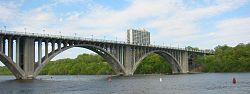

.jpg)
.gif)


![[3]](https://en.wiki.x.io/wiki/Image:Solare_Planeten99.jpg)
![[4]](https://en.wiki.x.io/wiki/Image:Close_up_yellow_rose.jpg)
.jpg)

 howcheng {chat} 06:40, 18 May 2006 (UTC)


 Neutral If it was not blurry I would support. Try to get a non blurry and upload it. But its a good picture other wise! --Actown e 15:18, 23 May 2006 (UTC)
 Support Very nice animated picture. Its a good display of how the water was affected. --Actown e 15:22, 23 May 2006 (UTC)


