Wikipedia:Collage tips
This is an essay. It contains the advice or opinions of one or more Wikipedia contributors. This page is not an encyclopedia article, nor is it one of Wikipedia's policies or guidelines, as it has not been thoroughly vetted by the community. Some essays represent widespread norms; others only represent minority viewpoints. |

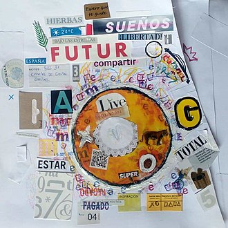
Collages are collections of images presented together in a single grid. This essay presents best use practices for making effective collages.
Should I use a collage?
editThe great benefit of collages is that they allow an article to present multiple visuals for the topic. This makes them particularly useful for leads of broad subjects such as many cities, where using a single image could never be representative enough to suffice by itself. (Note that "representative" is a lower standard than "comprehensive", which is typically impossible.)
However, they have the drawback of taking up additional space and reducing image size. This makes them a poor fit for leads of articles that already have an excessively long infobox or for topics whose images require a lot of detail.
When many images are desired, galleries are often a better choice.
Which template should I use?
editThere are currently several templates available for collages. {{Image array}} is often used for simple collages; {{Multiple image}} allows for better customization. We recommend against using a single file image for two reasons. First, it makes it more difficult to modify the set of images (e.g. if a new better option becomes available, or if one is deleted). Second, it results in an inferior experience for readers, where clicking on an image does not make it full-screen but rather just makes the collage full-screen.
Which images should I use?
editCollages should ideally represent the full diversity of the subject. For topics with a wide selection of images, try searching the relevant Commons category for Quality, Featured, and Valued images. Try to avoid systemic bias toward one geographic area or one facet. Images also need to look good at small scale where details are hard to see. It's best to avoid using any images found elsewhere in the article.
How do I compose the collage?
editWhen you find many promising images, it's tempting to create a massive collage that includes them all. Don't do this; use only as many images as you have to, and place the rest elsewhere in the article or in other articles. If a collage requires scrolling to view on a normal screen, it's too long.
Some images, particularly those with movement or strong leading lines, work better on the left or right, or the top or bottom. Place these accordingly. If a particular image stands out as the most representative of the subject, place it at the top (and per above, consider using it by itself).
You'll often need to crop images on Commons so that they focus in on the subject without devoting excess space to sky or other background elements; use Commons:CropTool for this.
It's best to have the vertical lines in the collage either entirely aligned (this often requires slight crops on Commons if a few images have unusual aspect ratios) or with clear asymmetry. Play around until you arrive at a composition that feels right.
How should I do the caption?
editThe captions can be placed either beneath each image or together in a footer at the bottom of the collage. Placing them beneath each image can work well if readers are particularly likely to seek them out (e.g. it's not clear from their appearance what they are) and if vertical space is not at a premium; otherwise, placing at the bottom is generally better.
Introduce footers with "From left to right, top to bottom:" (there is no consensus on whether to italicize or not), followed by a horizontal list. Avoid "Clockwise, from top left," as this does not match the document order and thus creates an accessibility issue.
Other considerations
editCollages, especially those in the leads of major articles, have an unfortunate tendency to be tampered with over time, often by editors whose changes do not reflect a high level of care. Consider adding an invisible comment requesting that changes be proposed first at talk, and monitor the article for a while after you add the collage.