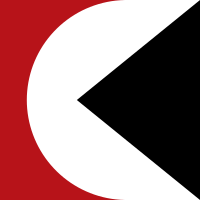
The Multimark was a logo introduced by Canadian Pacific Railway on June 17, 1968, to identify each of its various operations.[1]


The Multimark was created by the international marketing and design firm Lippincott and Margulies. It was composed of a circle representing global activities, a triangle representing motion or direction, and in contrast, a square (sometimes elongated into a rectangle) indicating stability.[1] By the 1990s, the logo was sometimes referred to as the "Pac-Man logo" by railfans for its resemblance to the early video game character.
Introduction
editThe Multimark was part of a larger rebranding effort that launched on June 17, 1968, which would see a phase out of older, traditional Canadian Pacific logos and elements, such as the script lettering, beaver and goose logos.[2] As part of this rebrand, the company would go forward known as Canadian Pacific, while its individual units rebranding under "CP", with Canadian Pacific Railway now known as CP Rail, Canadian Pacific Airlines as CP Air, Canadian Pacific Steamships as CP Ships. However the official legal name would remain Canadian Pacific Railway Company.[2]
The Multimark would be used as a unifying element across the various businesses, using the color and way the Multimark distinguish services, with the common logo was used to show a shared and connected identity.[2] CP Rail had multiple colors beyond its Action Red, which were used across various freight cars to further highlight usage and type:
- Most cars and all locomotives: Red, with a white circle and black triangle.
- Hopper car: Black, with a white circle and red triangle.
- Newsprint boxcars: Green, with a white circle and black triangle.
- Controlled temperature cars: A silver/aluminum color, with a white circle and red triangle.
- Insulated and heated rail cars and cabooses: Yellow, with a white circle and black triangle.
The Multimark
editThe Multimark was composed three key elements, a circle, a triangle and a square.[2] The circle represented global activities, a triangle represented motion or direction, and as a contrast, a square that represented stability.[2] The symbol's design enabled it to be adapted to various situations and scales and applied to a wide variety of vehicles across various modes of transport, from railway freight cars, to ship funnels to the sides of aircraft, while still being identifiable as a Multimark.[2]
Industry changes
editThe Multimark was gradually eliminated in the 1980s as the various components of Canadian Pacific Limited changed names. CP Air became Canadian Pacific Airlines and was later sold off. CP Hotels became Canadian Pacific Hotels and Resorts and much later sold off. CP Express & Transport went out of business due to deregulation. CP Telecommunications was merged into CNCP Telecommunications which soon went out of business due to the changing industry. (Unitel was then created to acquire what remained.) CP Ships became Canadian Pacific Ships and was finally sold off in 2005. CP Rail became known as CP Rail System in January 1991, with the acquisition of the bankrupt American Delaware and Hudson Railway. The marketing name included Soo Line Railroad which had become 100% owned. (CPR had long had controlling interest in it).
The use of the Multimark on CP Rail slowly faded away with no official announcement. September 1987 saw the first diesel to be repainted without it, a GP7 yard engine numbered 1684[citation needed].
Legacy
editWhile the two companies, other than owning the same ship (RMS Empress of Canada, later Mardi Gras) at different points of the ship's life, are completely unrelated, it has been said that Carnival Cruise Line's logo is a derivative of the Multimark, with the Multimark's edges being rounded out, and the colors changed to red, white and blue.[3][4]
Colours
editEach operating division was assigned a different colour while taking on a new identity:
| Division | Colour | Hex triplet |
|---|---|---|
| CP Rail | Action red[5] | B71319 |
| CP Transport CP Express |
Blue | |
| CP Ships | Green | |
| CP Telecommunications | Yellow ochre[6] | E6B036 |
| CP Air | Orange[7] | EE851E |
| CP Hotels | Gray[8] | 86918B |
References
edit- ^ a b "CP Rail's New Image". Railmodel Magazine. Vol. 1, no. 2. Don Mills, Ontario: Doncath Publishing. April 1970. p. 6.
- ^ a b c d e f "A bold stroke carefully applied". Spanner. Montreal, Canada: Canadian Pacific. July 1968.
- ^ "Cruise marketing top 10 greatest moments". Cruise Market Watch. 13 December 2008. Retrieved 19 August 2022.
- ^ Pollard, Garland (1 March 2010). "The 'Lone Cedar' Effect and the Founding of the Carnival Brand". BrandlandUSA. Retrieved 19 August 2022.
- ^ "CP Action Red". art-paints.com. Archived from the original on 11 December 2012. Retrieved 16 April 2023.
- ^ "CP Yellow". art-paints.com. Archived from the original on 11 December 2012. Retrieved 16 April 2023.
- ^ "CP Action Yellow". art-paints.com. Archived from the original on 2 December 2014. Retrieved 16 April 2023.
- ^ "CP Gray". art-paints.com. Archived from the original on 11 December 2012. Retrieved 16 April 2023.