This help page is a how-to guide. It explains concepts or processes used by the Wikipedia community. It is not one of Wikipedia's policies or guidelines, and may reflect varying levels of consensus. |
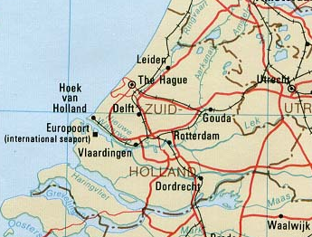
Texts (also with links) and images can be positioned such that they partly cover an image with code like:
<div style="position: relative">[[Image:Map South Holland.png]]
<div style="position: absolute; left: 244px; top: 67px">[[Image:Tst.png]]</div>
<div style="position: absolute; left: 249px; top: 72px">[[Image:Tst.png]]</div>
<div style="position: absolute; left: 264px; top: 112px">[[Image:Tst.png]]</div>
<div style="position: absolute; left: 10px; top: 10px">[[Image:Text North Sea transparent.png]]</div>
<div style="position: absolute; left: 10px; top: 50px">
{| style="background:transparent"
|-
|[[w:en:South Holland|South Holland]] (Netherlands)
|}
</div>
</div>
giving:
This can be used for locator maps.
As demonstrated, the small images can also cover each other, so the order in which they are listed matters.
Example where all map labels are superimposed:
<div style="position: relative">[[Image:Zeeuws Vlaanderen.png]]
<div style="position: absolute; left: 5px; top: 25px">
{| style="background:transparent"
|-
|[[w:en:Sluis|Sluis]]
|}
</div>
<div style="position: absolute; left: 50px; top: 40px">
{| style="background:transparent"
|-
|[[w:en:Terneuzen|Terneuzen]]
|}
</div>
<div style="position: absolute; left: 100px; top: 25px">
{| style="background:transparent"
|-
|[[w:en:Hulst|Hulst]]
|}
</div>
</div>
gives
Thus all labels and all standard symbols (such as a dot for a town) can be superimposed on a map, and the map image itself needs to show only the curves for coasts, rivers, boundaries, roads, railways, etc., possibly with areas filled with colors.
This has the advantage that labels can be linked, and that it is much easier to edit the map with regard to:
- adding, deleting, moving, and changing symbols for e.g. towns
- adding, deleting, moving, and changing texts and changing their fonts
- changing the background map to another version, keeping what is overlaying it
Note that the result also depends on user settings such as:
- character size (as much as possible, avoid overlaps, even if the user uses a large font)
- whether the user uses a background color for links (these may override the background "transparent")
- whether images are shown with an edge, e.g. because of being a link (for a separate image this is a minor thing, for an image inside another image this looks quite different)

