Wikipedia:Wikipedia Signpost/2021-08-29/Gallery
Gallery
Our community in 20 graphs
What could be more interesting than ...?
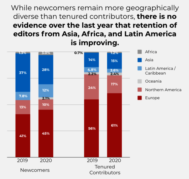
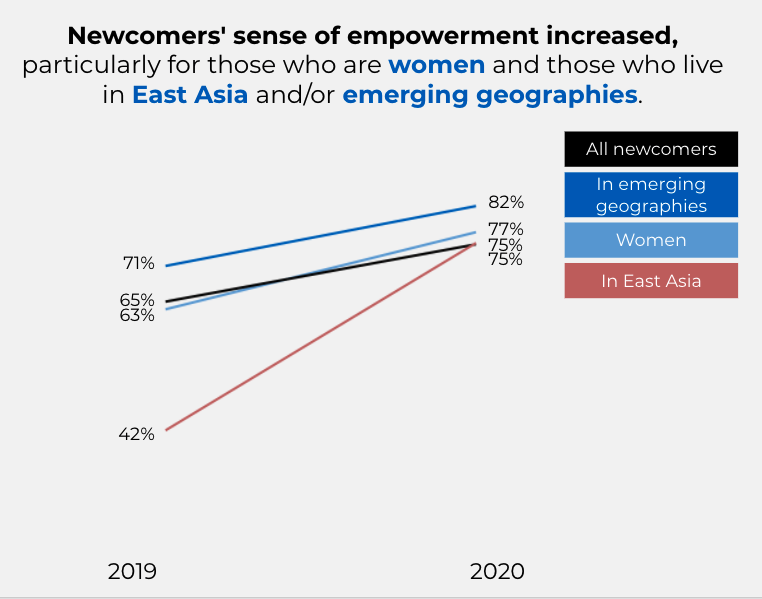
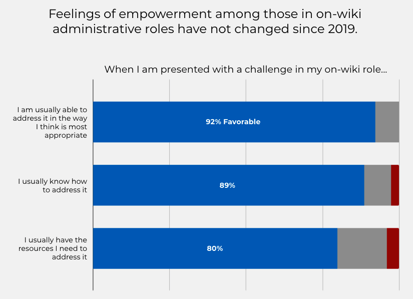
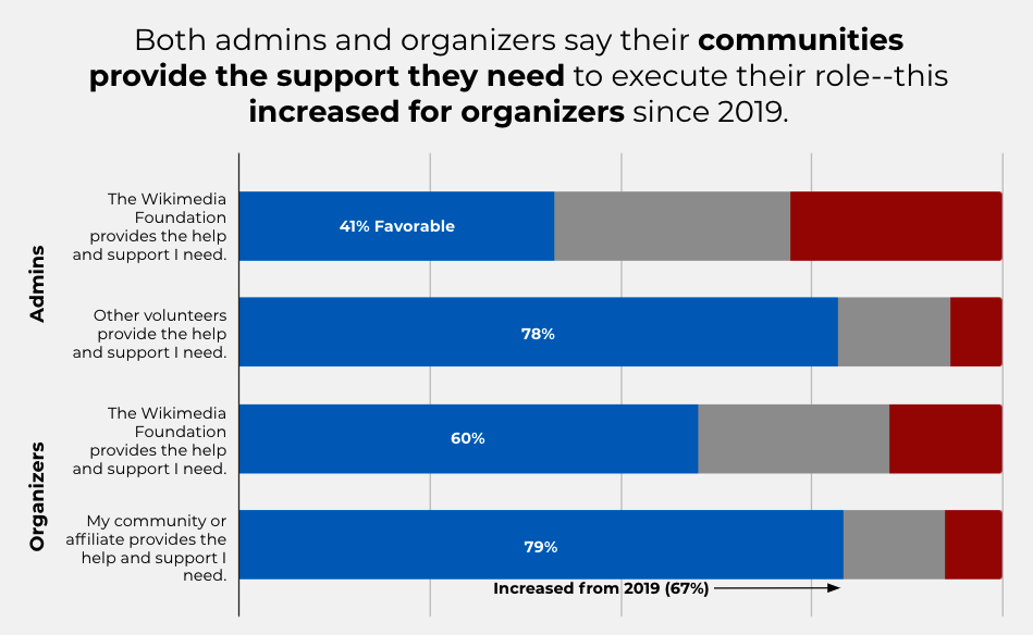
How Wikipedia editors compare demographically to the world's population? What proportion of our editors are women? Who are the people who are harassed or feel unsafe on-Wiki? How many users are dissatisfied with WMF software? What could be more interesting to the Wikipedia community than knowing who is part of our community?
The WMF took a survey during the second half of last year that gathered statistics on these and other questions and published the Community Insights 2021 Report in May. It's probably a very good report, but I just couldn't get all the way through it. Too many words. Too much fine print. Boring!
Let's let the graphs speak for themselves.
Demographics
Feeling unsafe, harassment
Empowerment, belonging, and engagement
Technical support, software


Discuss this story