|
| A screenshot of Wikipedia's new navigation interface (enlarge)
|
|

|
| A screenshot of the basic page editing interface (enlarge)
|
|

|
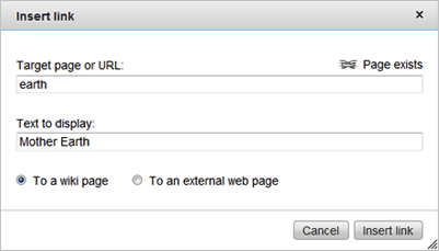
| A screenshot of the new dialog box for entering links
|
|
The Wikimedia Foundation's User Experience Team worked in 2010 with volunteers from the community to make things easier for you. We are excited to share some improvements, including a new look and feel and simplified editing features. These changes are intended to make it easier for new contributors to get started, and are based on our usability testing conducted over the last year. Improving the usability of our projects is a priority of the Wikimedia Foundation and we will be sharing more updates in the future. For more details, visit the related Wikimedia blog post.
Here's what we have changed
- Navigation: We have improved the navigation for reading and editing pages. Now, the tabs at the top of each page more clearly define whether you are viewing the page or discussion page, and whether you are reading or editing a page.
- Editing toolbar improvements: We have reorganized the editing toolbar to make it easier to use. Now, formatting pages is simpler and more intuitive.
- Link wizard: An easy-to-use tool allows you to add links to other wiki pages as well as links to external sites.
- Search improvements: We have improved search suggestions to get you to the page you are looking for more quickly.
- Other new features: We have also introduced a table wizard to make creating tables easier and find and a replace feature to simplify page editing.
- Wikipedia logo: We have updated our logo. Read more at the Wikimedia blog.
Feedback?
We would love to hear from you. Please visit our feedback page or, if you are interested in our ongoing efforts to improve the software, visit our usability wiki for more information.


