Wikipedia:Colour contrast

If you have default settings on Wikipedia, and are reading this page on a screen, then you probably can't read the following:
- This is a secret message
because it has blue text on a blue background.
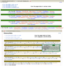
Text that you probably can read, such as red on green, may present a similar problem to people who have colour-blindness.
Text with low contrast, such as light grey on dark grey, presents a similar problem to people with other eyesight-related conditions.
The more severe their condition, the higher the contrast has to be for them to be able to read it.
The non-discrimination policy is "approved by the Wikimedia Foundation Board of Trustees to apply to all Wikimedia projects. It may not be circumvented, eroded, or ignored by local policies."
It says: "The Wikimedia Foundation prohibits discrimination against current or prospective users... on the basis of... disability"
.
To avoid these problems, you should ensure that text meets the guidelines set out in WP:COLOUR.
Resources
editSnook's Colour Contrast Check provides a comprehensive check of whether a particular choice of foreground and background colours meets WCAG 2.2 standards for brightness difference, colour difference and contrast ratio.
You can find the text colour and background colour as a hexadecimal value by using the "Inspect element" function that most modern browsers provide. The default colour for blue-linked text with the Vector skin is #3366cc ( ) and for visited links is #795cb2 ( ). Both should always be checked in addition to black #202122 ( ) against any proposed background colour in case links are added later.