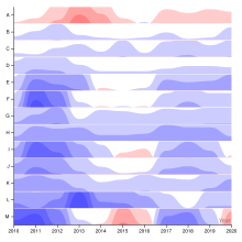
A horizon chart or horizon graph is a 2-dimensional data visualization displaying a quantitative data over a continuous interval, most commonly a time period. The horizon chart is valuable for enabling readers to identify trends and extreme values within large datasets. Similar to sparklines and ridgeline plot, horizon chart may not be the most suitable visualization for precisely pinpointing specific values. Instead, its strength lies in providing an overview and highlighting patterns and outliers in the data.[1]

History
editThe technique of constructing the horizon chart from an area chart was first developed by Takafumi Saito et al. at the Tokyo University of Agriculture and Technology in 2005.[2] This technique was referred to as two-tone pseudo coloring. Subsequently, Panopticon Software independently commercialized the procedure and referred to the resulting visualizations as horizon charts.[3][4]
Overview
editThe horizon chart is a variation of the area chart. Having established a horizontal axis, negative values are mirrored over the horizontal axis, while positive values retain their position. As an alternative approach, rather than reflecting negative values, they can be shifted so that the smaller value aligns with the horizontal axis. Layers are formed by dividing the areas into equal horizontal intervals and overlaying the resulting bands.[2]
Color is an essential visual element in horizon charts. It serves to differentiate positive values from negative values, and its intensity corresponds to the magnitude of the values. Typically, the color of each area in the horizon chart is obtained by overlaying multiple transparent bands, with more intense colors indicating larger values and less intense colors representing smaller values.[1]
Horizon charts facilitate a reduction in vertical space, resulting in a more compact chart that resembles a heat map. This enables the consolidation of a substantial volume of data into a single visualization. The compact nature of the horizon chart enables easy comparison of different data series within a single visualization. It also lends itself well to the creation of small multiples, where multiple horizon charts can be displayed side by side to analyze and compare various datasets simultaneously. This compact design enhances the efficiency and effectiveness of data analysis and interpretation.[5][6][7]
Chart construction
editWhen creating a horizon chart, the selection of the origin for the vertical axis, which determines the placement of the horizontal axis, is crucial. In most cases, the origin is set to zero. However, this characteristic of the horizon chart can be leveraged to emphasize trends based on an arbitrary value. By selecting a different origin point, such as a specific threshold or benchmark, trends and comparisons can be highlighted in relation to that value. This flexibility allows for the visualization to be tailored to specific analytical needs or to draw attention to particular trends or deviations from a chosen reference point. Once the origin of the vertical axis is determined, the quantitative variable is assigned to the vertical axis, while the continuous variable is assigned to the horizontal axis.[7] The band layering process in a horizon chart involves dividing the range of values for a dataset into equal horizontal intervals and overlaying these bands to create the final chart. This is the main feature of an horizon chart, enabling its compact visualization. The small size of the final visualization, allows the comparison of multiple sets of data in a given series.[7]
Regarding the color scheme in a horizon chart, it is common to utilize a diverging color scheme, like red and blue. Red is typically used to represent negative values or values with a negative meaning, while blue is employed to indicate positive values or values with a positive meaning.[2] This color scheme helps visually distinguish between positive and negative values, aiding in the interpretation and understanding of the chart.[7] In their 2005 article, Saito et al. proposed a different approach to color usage in horizon charts. They utilized the concept of discrete coloring, where the range of the function is divided into multiple sequential intervals, and a distinct color is assigned to each interval. This allows for the precise reading of values based on color. Unlike divergent colors (such as red and blue), the focus is on using a continuously changing scale of colors to represent the data accurately. By employing this method, the horizon chart enables readers to interpret specific values based on the assigned colors within the chart.[6]
Implementation
editHorizon charts can be created using various open-source tools. These tools provide the necessary functionalities to generate horizon charts from data. Some popular open-source options for creating horizon charts include D3.js,[5] R[9] and RAWgraphs[10] among others.
See also
editReferences
edit- ^ a b Schwabish, Jonathan A. (2021). Better data visualizations: a guide for scholars, researchers, and wonks. New York: Columbia University Press. pp. 164–166. ISBN 978-0-231-19311-5.
- ^ a b c Heer, Jeffrey; Kong, Nicholas; Agrawala, Maneesh (2009-04-04). "Sizing the horizon: The effects of chart size and layering on the graphical perception of time series visualizations". Proceedings of the SIGCHI Conference on Human Factors in Computing Systems. CHI '09. New York, NY, USA: Association for Computing Machinery. pp. 1303–1312. doi:10.1145/1518701.1518897. ISBN 978-1-60558-246-7. S2CID 15483568.
- ^ Camoes, Jorge (2012-06-11). "The Horizon Graph Is a Reorderable Matrix Too: Unemployment Rate 1976-2012". The Excel Charts Blog. Retrieved 2023-07-05.
- ^ Few, Stephen (2008). "Time on the Horizon". Perceptual Edge
- ^ a b Bostock, Mike (2023-06-21). "Horizon Chart". Observable. Retrieved 2023-07-05.
- ^ a b Saito, T.; Miyamura, H.N.; Yamamoto, M.; Saito, H.; Hoshiya, Y.; Kaseda, T. (2005). "Two-tone pseudo coloring: Compact visualization for one-dimensional data". IEEE Symposium on Information Visualization, 2005. INFOVIS 2005. IEEE. pp. 173–180. doi:10.1109/INFVIS.2005.1532144. ISBN 978-0-7803-9464-3. S2CID 17952223.
- ^ a b c d Reijner, Hannes. "The Development of the Horizon Graph". Panopticon Software
- ^ "Greenhouse gas emissions by source sector (source: EEA)". ec.europa.eu. Retrieved 2023-07-06.
- ^ kjytay (2022-03-31). "What is a horizon chart? | R-bloggers". Retrieved 2023-07-05.
- ^ "How to make a horizon graph". www.rawgraphs.io. Retrieved 2023-07-05.
Further reading
edit- Tufte, Edward (1983). The Visual Display of Quantitative Information. Cheshire, Connecticut: Graphics Press. p. 13. ISBN 0961392142.