Wikipedia:Wikipedia Signpost/2011-10-24/WikiProject report
Great WikiProject Logos
This week, we took a break from our regular interviews to look at the creativity behind designing WikiProjects. Like businesses, organizations, governments, products, websites, and a variety of other entities, WikiProjects often use images and logos to brand themselves and communicate their purpose. Depending on the design, a project's imagery can make the project look more inviting, exciting, or professional than basic text and section headings. Some projects opt for simple icons or use pictures taken from Commons to make the project easily recognizable, while others prefer a traditional wordmark or nameplate to establish the project's identity.
It should be noted that distinct designs do not guarantee a project's success. Branding by itself should not be expected to save a struggling project, and attractive projects can lapse into inactivity just as quickly as projects with only black-and-white text. (See our special report on Reviving WikiProjects for details on the many challenges facing WikiProjects and tips for improving a project's organization, scope, and membership.)
Nonetheless, many Wikipedians have chosen to invest a little of their time and creativity in designing WikiProject logos. The list below showcases fifteen examples of interesting design that stood out among the many projects surveyed by one Report writer. We hope these logos will serve as inspiration for members of other WikiProjects to liven up their project pages. This list is in no particular order and is by no means exhaustive. For great logos we may have overlooked, we invite our readers to post their favorite WikiProject's logo in the comments section of this report.
Ubiquitous bars
First up is a popular design among many WikiProjects, featuring the project's name sandwiched between horizontal bars with a flag or other symbol sitting on top. The earliest example appears to be the WikiProject Iceland logo created by Maxí in 2007, with nearly a dozen country-specific projects creating their own versions since then. Non-country projects like WikiProject Animation (interviewed a couple months ago) have also made use of the design.
Beer or bière?
WikiProject Beer doesn't need to spell out its name. Their beer mug icon is probably the most universally understood graphic on our list. So it should be no surprise that WikiProject Beer borrowed the icon from French Wikipedia's Projet Bière. The icon was created in 2007 along with several variations by French contributor Caribou.
Olympic feats
Designed by Parutakupiu in 2007 for WikiProject Olympics, the Olympic pictogram (leftmost image) features a running athlete composed of stylized Olympic Rings. The project's logo is part of a large collection of images (four sampled below) that Parutakupiu created to provide a uniform look to pages regarding the various sporting events at previous Summer and Winter Games. In our 2010 interview with the project, Parutakupiu noted with amazement that he had received "e-mails from sports event organizations and television channels asking me for permission to use these images!"
Simplicity
A white pigeon perched on Wikipedia's capital letter "W" forms a tranquil scene for WikiProject Public Art. The young project formed in 2009 under the name "Wikipedia Saves Outdoor Sculpture," later renamed "Wikipedia Saves Public Art," has reinvented itself many times. Its current logo is actually an adaptation of an earlier effort seen here. Both versions were created by the mysterious HazelBee.
Art works
The logo for WikiProject Japan (interviewed earlier this year) was actually created as a banner ad intended to advertise the project on Wikipedia. The image incorporates part of Gaifū kaisei (South Wind, Clear Sky), one of the Thirty-six Views of Mount Fuji by Japanese artist Katsushika Hokusai. Wikipedia user Nihonjoe brought it all together in 2009.
In the eye of the beholder
WikiProject Visual Arts is represented by the palm-shaped amulet Hamsa which is popular in the Middle East and North Africa. It is recognized as a sign of protection and a defense against the evil eye. The image was created specifically for WikiProject Visual Arts in 2007 by Sparkit from English Wikipedia, vectorized by Swedish Wikipedian Fluff, and cleaned up by Perhelion, who bounces between several German wikis, Commons, and a few languages of Wikipedia.
Business as usual
This slick graphic is the property of WikiProject Business. It is based on an earlier briefcase image created by SaintDaveUK in 2009 that has since been deleted. The only surviving copy was uploaded by Beao in 2010. Activity at WikiProject Business appears to have entered a bear market, so additional editors are encouraged to invest some of their time in reviving the project.
Europe unified
The logo for WikiProject European Union, created and recreated by Ssolbergj, evolved from a collection of stars and text in July 2007 to a glossy button in October of that year to the current image, unchanged since January 2008, depicting the European Parliament's Louise Weiss Building in Strasbourg, France. The logo has since been translated for use on the French, German, and Russian Wikipedias.
Europe in a marble
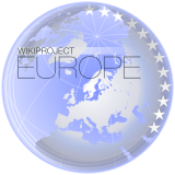
Another creation by Ssolbergj, the WikiProject Europe logo is a glossy globe highlighting Europe with stars to the right. While not as easy to read at small sizes, the image looks glorious enlarged.
Captain's logs
WikiProject Star Trek (see our July 2010 interview) opted for a basic logo reminiscent of the title cards for the movie Star Trek: First Contact and the later seasons of Star Trek: Enterprise. So why is it included on this list? Click the wikilink that leads to the project's page, where you'll find that all of the section headers are designed to match the logo. The page's minimalist layout complements the headers. From automated features such as Article Alerts and Recent Changes to static descriptions of Guidelines to ever-changing lists of Participants, the entire page features a crisp, consistent theme.
Councilors in blue
How would a list of WikiProjects be complete without the king of them all, the WikiProject Council? Simple but distinctive, the image designed by Titoxd and modernized by Neurolysis suggests that the council serves the purpose of a United Nations of WikiProjects. After a page redesign earlier this year by Kirill Lokshin, the project now has a nice blue theme that matches the image. To learn more about the WikiProject Council, check out our interview from earlier this year.
Infinite variation
WikiProject Military History and its newsletter The Bugle feature bronze/brown text in an inviting yet serious typeface (a gold version also exists). Bellhalla may have created the original letterhead in 2009, but each of the project's myriad task forces has incorporated it into their ranks by adding images to the left of the text that identify their areas of expertise. For more on WikiProject Military History, see our most recent interview from 2010.
Scout's honor
Icon creator Kintetsubuffalo describes the graphic for WikiProject Scouting (2008 interview) as "a fleur-de-lis positioned on a trefoil, in the original Scouting colors chosen by Lord Baden-Powell. To be considered for use as a non-trademark Scouting logo where questions of legality are involved." In his quest to create a generic version of the scouting emblem, he managed to make an icon that is quite attractive in its own right.
You knew it was coming
It was only a matter of time before we brought up Wikipe-tan, the much beloved and even more despised moe anthropomorphism personifying Wikipedia, which Steven Walling described in an Ignite presentation as "our creepy unofficial mascot." Created in 2006 by Kasuga, she quickly became associated with WikiProject Anime and Manga (interviewed in 2009). Fans created a variety of outfits and altered her age to adapt her for duty with other projects, including WikiProject Military History, the Christmas Task Force, Tambayan Philippines, the Counter-Vandalism Unit, and Admin Coaching. She has appeared on the main page as a Picture of the Day, illustrated a Did You Know?, and was even promoted to featured status until being delisted a year later. Jimbo Wales defended her honor in 2007, but that hasn't stopped naughty cosplayers and a fanservice picture from turning her into tabloid material. Her sisters Commons-tan and Quote-tan terrorize other wikis. Regardless of whether you love or hate her, she's the most influential icon that Wikipedia has ever seen.
Ending the alphabet
Our last example is the colorful logo of WikiProject Zoo (2010 interview). Created by ZooPro, this image shows that any Wikipedian with some basic knowledge of image editing software can spice up a project's page. Simple or complex, a single icon or a unified theme, it doesn't matter. Let your creativity guide you.
Did any of these stand out to you? Did we forget your favorite project's icon? Do you have something new you've been working on that you'd like to share? Post it to the comments section below!
Next week, we'll visit the Rugby School for some pointers on their famous game. Until then, avoid rucks and mauls by studying previous plays in the archive.












Discuss this story
Contribs • 15:10, 22 October 2011 (UTC)[reply]