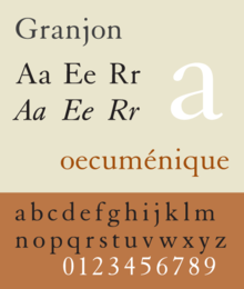
Granjon is an old-style serif typeface designed by George W. Jones around 1924 for the British branch of the Linotype company, and based on the Garamond typeface that was used in a book printed by the Parisian Jean Poupy in 1592. The roman design was from Claude Garamond and the italic version was from Robert Granjon. Because several other Garamonds were on the market in the 1920s, Jones decided to name his type Granjon. Jones, a master printer based in London, had been engaged by Linotype to improve the quality of their typeface range through the development of revivals of notable type designs of the past.[1]
 | |
| Category | Serif |
|---|---|
| Classification | Old-style |
| Designer(s) | George W. Jones (roman, italic) Chauncey H. Griffith (bold) |
| Foundry | L&M (Linotype & Machinery) Linotype |
| Date released | 1924 |
Granjon was popular in the metal type era and Beatrice Warde described it as her favourite revival of French renaissance typefaces in her famous 1926 article on the topic; it was also praised by former Linotype designer Walter Tracy.[2] (Many of the Garamond revivals of the 1920s were later shown to be actually based on the types of Jean Jannon; Granjon was an exception to this. Warde commented "It would seem that Garamond's name, having so long been used on a design he never cut, is now by stern justice left off a face which is undoubtedly his."[2][3]) Jones developed a companion bold named Bernhard, named for sixteenth-century engraver Bernard Salomon.[a] A longtime popular text type, Granjon's digital version is sometimes criticized as being "anemic" in smaller point sizes.
References
edit- ^ Devroye, Luc. "George William Jones". Type Design Information Page. Retrieved 11 March 2017.
- ^ a b Warde, Beatrice (1926). "The 'Garamond' Types". The Fleuron: 131–179.
- ^ Tracy, Walter (2003). Letters of Credit: a view of type design. Boston: David R. Godine. pp. 143–4 etc. ISBN 978-1-56792-240-0.
- ^ "Chauncey H. Griffith" (PDF). Klingspor Museum. Retrieved 13 August 2017.
- ^ There seems to be some uncertainty about Granjon bold: some sources credit Chauncey H. Griffith of the Mergenthaler Linotype Company with designing it, perhaps for the American release.[4]
- Friedl, Frederich, Nicholas Ott and Bernard Stein. Typography: An Encyclopedic Survey of Type Design and Techniques Through History. Black Dog & Leventhal: 1998. ISBN 1-57912-023-7.
- Jaspert, Berry and Johnson. Encyclopaedia of Type Faces. Cassell Paperback, London; 2001. ISBN 1-84188-139-2
- Lawson, Alexander S., Anatomy of a Typeface. Godine: 1990. ISBN 978-0-87923-333-4.
- Macmillan, Neil. An A–Z of Type Designers. Yale University Press: 2006. ISBN 0-300-11151-7.